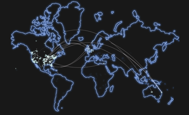
• Testing the idea of six degrees of separation, first proposed by Frigyes Karinthy, the Facebook Data Team and researchers at the Università degli Studi di Milano found that most of us are connected by even fewer degrees, and average separation is getting smaller:

    While we will never know if it was true in 1929, the scale and international reach of Facebook allows us to finally perform this study on a global scale. Using state-of-the-art algorithms developed at the Laboratory for Web Algorithmics of the Università degli Studi di Milano, we were able to approximate the number of hops between all pairs of individuals on Facebook. We found that six degrees actually overstates the number of links between typical pairs of users: While 99.6% of all pairs of users are connected by paths with 5 degrees (6 hops), 92% are connected by only four degrees (5 hops). And as Facebook has grown over the years, representing an ever larger fraction of the global population, it has become steadily more connected. The average distance in 2008 was 5.28 hops, while now it is 4.74.

    So when you see random strangers, shake their hands and say hello. You’re practically best friends.

    Too bad there isn’t an interactive we can enter random names on to see how close we are.

    [Facebook]

  • Cathy O’Neil on when there’s enough data to justify a data scientist in the workplace:

    Too much to fit on an Excel spreadsheet. And it’s not just how much, it’s really about how high quality the data is; the best is for it to be clean and for it to not be public, or at least not generally used for the purpose that your business uses it for.

    Even data that does fit in Excel can be examined more closely. Then again, if you only have that much data, your data scientist will get bored quickly.

    [VentureBeat]

  • For The Guardian, ITO World maps about 370,000 road-related deaths from 2001 through 2009, according to the National Highway Traffic Safety Association. The map is kind of rough around the edges, but it gets the job done. Easily zoom in to the location of choice either by clicking buttons, or type in the area you want in the search box. Zoom in all the way, and you’ll notice each accident is represented by an icon indicating type of accident, the age of the person who died, and year of crash.

    As you might expect, accidents are more concentrated at city centers and on highways. What I didn’t expect was all the pedestrians involved.

    [Guardian and ITO World]

  • There’s so much emphasis and attention on Black Friday, the day of sales after Thanksgiving in the states. People line up for hours before stores open at midnight in hopes that they’ll be able to get the best deal, but it looks like Black Friday isn’t even the day to get the best deals:

    For higher-end electronics, Mr. de Grandpre’s trends show, shoppers should wait until the week after Thanksgiving.

    “Black Friday is about cheap stuff at cheap prices, and I mean cheap in every connotation of the word,” Mr. de Grandpre said. Manufacturers like Dell or HP will allow their cheap laptops to be discounted via retailers on that Friday, but they will reserve markdowns through their own sites for later.

    When later? Cyber Monday is a good day to buy.

    On a whim, we found ourselves at a midnight Black Friday at the mall. I was like, “Eh, it shouldn’t be that busy this late at night.” So wrong. The avoidance of large crowds is enough of an incentive for me to wait. Although if I were a young, teenage girl in the market for a nice pair of boots, I suppose I might sing a different tune.

    [New York Times via @drewconway]

  • Address is Approximate by Tom Jenkins tells the story of a lonely desk toy who goes on a road trip with Google streetview. I’ve watched this multiple times, and can’t get enough. Beautiful and touching. [via]

  • Saturday Morning Breakfast Cereal on significant digits and statisticians’ natural disbelief in numbers. Life is so hard. [Thanks, Michael]

  • Hilary Mason, chief scientist at bitly, examined links to 600 science pages and the pages that those people visited next:

    The results revealed which subjects were strongly and weakly associated. Chemistry was linked to almost no other science. Biology was linked to almost all of them. Health was tied more to business than to food. But why did fashion connect strongly to physics? And why was astronomy linked to genetics?

    The interactive lets you poke around the data, looking at connections sorted from weakest (fewer links) to strongest (more links), and nodes are organized such that topics with more links between each other are closer together.

    Natural next step: let me click on the nodes.

    [Scientific American via @hmason]

  • This past week I was shackled by a, um, condition where it was painful to move and difficult to concentrate, and Boost nutritional drinks were my friend, and solid foods were my enemy. (TMI?) I didn’t even know this was an issue for people under 30. My caring wife, the ER doctor, looked it up in her medical dictionary, Hardwood-Nuss’ Clinical Practice of Emergency Medicine, and this is what she found.

    I guess venn diagrams are used for other things besides song lyrics and comics.

    Take your fiber this Thanksgiving holiday. Thank me later.

  • As the Eurozone crisis develops, the BBC News has a look at what country owes what to whom:

    Europe is struggling to find a way out of the eurozone crisis amid mounting debts, stalling growth and widespread market jitters. After Greece, Ireland, and Portugal were forced to seek bail-outs, Italy – approaching an unaffordable cost of borrowing – has been the latest focus of concern.

    But, with global financial systems so interconnected, this is not just a eurozone problem and the repercussions extend beyond its borders.

    Simply click on a country, whose arc length represents how much they owe, and arrows show debt.

    [BBC News | Thanks, Eugene]

  • Randall Munroe of xkcd charts the things that money pays for, from the item off the dollar menu all the way up to the total estimated economic productivity of the human race. Following the same scheme to show relative scales that he used for his radiation chart, you get a big picture, a zoom for another big picture, and so on.
    Read More

  • Ken Murphy installed a camera on top of the Exploratorium in San Francisco and set it to take a picture every ten seconds for a year. A History of the Sky is those pictures as a series of time-lapse movies where each day is represented with a grid. So what you see 360 skies at once:

    Time-lapse movies are compelling because they give us a glimpse of events that are continually occurring around us, but at a rate normally far too slow to for us to observe directly. A History of the Sky enables the viewer to appreciate the rhythms of weather, the lengthening and shortening of days, and other atmospheric events on an immediate aesthetic level: the clouds, fog, wind, and rain form a rich visual texture, and sunrises and sunsets cascade across the screen.

    Time-lapse: Yep, still fascinating.

    [murphlab via Data Pointed]

  • To get a gauge of public opinion and the Occupy movement, The New York Times asked readers what they they thought, placing their comments on a two-axis grid ranging from strongly disagree/oppose to strongly agree/support.

    On the horizontal: “Do you agree or disagree with the main goals of the Occupy Wall Street movement?” On the vertical: “Do you support or oppose the methods of the protestors?” So comments on the top right are those who strongly agree with the goals of the movement and strongly approve of protestors’ methods. You can also color the dots and grid spots based on a range of disagree to agree for statements such as “Income inequality has contributed to the country’s problems.”

    Then to bring it home, comments are listed on the bottom with a small grid showing where that person selected. Put it all together and it’s way more useful than just open threads elsewhere.

    [New York Times]

  • My many thanks to the FlowingData sponsors who help me keep the lights on around here. Check ’em out. They help you make sense of data.

    Tableau Software — Helps people see and understand data. Ranked by Gartner in 2011 as the world’s fastest growing business intelligence company, Tableau helps anyone quickly and easily analyze, visualize and share information.

    Column Five Media — Whether you are a startup that is just beginning to get the word out about your product, or a Fortune 500 company looking to be more social, they can help you create exciting visual content – and then ensure that people actually see it.

    InstantAtlas — Enables information analysts and researchers to create highly-interactive online reporting solutions that combine statistics and map data to improve data visualization, enhance communication, and engage people in more informed decision making.

    IDV Solutions Visual Fusion — Business intelligence software for building focused apps that unite data from virtually any data source in a visual, interactive context for better insight and understanding.

    Want to sponsor FlowingData? Send interest to [email protected] for more details.

  • Overhauling his migration map from last year, Jon Bruner uses five year’s worth of IRS data to map county migration in America:

    Each move had its own motivations, but in aggregate they ­reflect the geographical marketplace during the boom and bust of the last decade: Migrants flock to Las Vegas in 2005 in search of cheap, luxurious housing, then flee in 2009 as the city’s economy collapses; Miami beckons retirees from the North but offers little to its working-age residents, who leave for the West. Even fast-growing boomtowns like Charlotte, N.C., lose residents to their outlying counties as the demand for exurban tract-housing pushes workers ever outward.

    Compared to last year’s map, this one is much improved. The colors are more subtle and more meaningful, and you can turn off the lines so that it’s easier to see highlighted counties when the selected county had a lot of traffic during a selected year. Speaking of which, you can see map the data for 2005 through 2009 via the simple bar graphs in the top right.

    Update: Jon also explains how he built this map sans-Flash on his own blog.