Yes, this is real. Israeli Prime Minister Benjamin Netanyahu used a bomb-shaped diagram to illustrate the line that must be drawn to prevent Iran from creating nuclear weapons. No doubt this a serious matter, but I’m not sure the drawing lends value to the message.
-
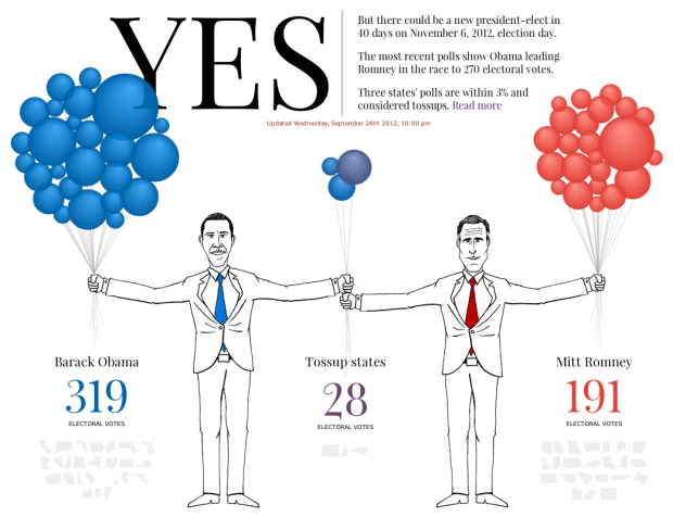
In the same spirit of the quick update site on Olympic records a couple of months ago, the Guardian and Real Clear Politics tell you if Obama is still president and if Romney is president. Each balloon represents a state, sized by electoral votes, and the number of balloons in each hand represent projected voting, based on current polls. Straight to the point.
-
-
-
Hey, I think it’s election season, and you know what that means. It’s time to dig into campaign finance data from the Federal Election Commission. The Washington Post gives you a view into the amount of money raised and spent in both camps, where it’s coming from and where it’s going. They start with the high-level aggregates, and as you scroll down, you get the time series, followed by the breakdowns for money raised.
The spending categories at the bottom are the most interesting bit. They cover advertising and mail, down to consulting and events. Payroll was a lot higher than I would’ve thought.
-
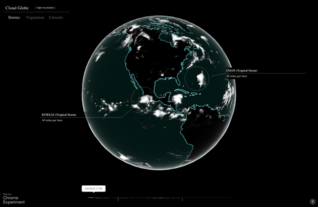
In the latest Chrome experiment, Google mapped cloud coverage around the world in Cloud Globe. The interactive animation shows coverage from July 1, 2010 to September 12, 2012, with a globe that you can move around as expected and a timeline on the bottom that indicates high levels of coverage. As the animation plays through, storms are highlighted with a circle and pointer. Finally, you can turn on the vegetation layer, and the green regions happen to be under the clouds. Imagine that.
-
Jo Wood, a professor of visual analytics, visualized five million bike rides using data from Barclays Cycle Hire.
In the animation (see below) the least travelled routes begin to fade out after about 15 seconds – “like a graphic equaliser,” says collaborator Andrew Huddart, also at City University. Around the 1-minute mark, structure emerges from the chaos and three major systems become clear: routes around, and through, the lozenge-shaped Hyde Park in the west, and commutes in and out of King’s Cross St Pancras in the north and between Waterloo and the City in the east.
Each arc represents a trip from point A to point B (obviously not a true path or we’d see roads), and flow direction indicates which way people went the most between the two. [via The Guardian]
-
-
Now that you know how color labeling changes by gender, I bet you’re wondering how it varies by language. Dave Oleson and Dawn Ho had a look in this simple color wheel. You can hover over colors for labels by country, and you can search for colors via text box.
On the whole, it looks like countries have extremely similar conceptions of color. Type “blue” into the search box, click on the different countries, and you can see the overlap. There are outliers though. Some narrower colors – such as “purple” – are used much more in Japan than in Russia. The use of certain modifiers such as “light” are used pretty uniformly across the color spectrum in English, but much more prevalently in the Blue-Green region in Japanese.
I wish there were a better way to see differences between countries. Luckily, you can download the data and have a look yourself. [Thanks, Dave]
Update: When you search for a color and then click on the flags, you can see the differences between countries.
-
-
-
Visualization is a great way to explain and describe data to people who don’t know data. Good visualization lets the data speak, as they say. But this doesn’t mean you shove your data into a program or stick it into a presentation template and expect others to care. You still have to analyze and explore the data yourself, find what’s interesting, and you present that.
“But how do I make this graphic look cool?”
Tell people something more about the data that isn’t just, “Here’s the data.”
You could use an obscure visualization method in place of your standard one, but what’s the point if you just say the same thing? You might catch an eye or two because of the novelty, but those eyes will bolt just as quickly if there isn’t any substance.
So instead of showing the same non-message in different ways, you iterate. You cut and explore the data in different ways, and you make a lot of graphics that never see the light of day. Many will be ugly, and most of them will be uninteresting, but you might also find something worthwhile. Let that something guide you.
-
I’m so glad there are people like Jake Porway in the world. The founder and executive director of DataKind gives his quick pitch on “using data in the service of humanity.”
-
I’m late to this party. TileMill, by mapping platform MapBox, is open source software that lets you quickly and easily create and edit maps. It’s available for OS X, Windows, and Ubuntu. Just download and install the program, and then load a shapefile for your point of interest.
For those unfamiliar with shapefiles, it’s a file format that describes geospatial data, such as polygons (e.g. countries), lines (e.g. roads), and points (e.g. landmarks), and they’re pretty easy to find these days. For example, you can download detailed shapefiles for roads, bodies of water, and blocks in the United States from the Census Bureau in just a few clicks.
The fun part is that you can easily customize the maps using a map stylesheet, which is similar to CSS. There are examples with the software, so you can get a feel for how everything fits together. You can also export your results as an image file or as SVG to edit in your favorite vector-editing software. Or if you want to publish your map online, it’s straightforward to upload it to MapBox with an account.
-
During the Olympics, Studio NAND, Moritz Stefaner, and Drew Hemment tracked Twitter sentiment with Emoto. This interactive installation and data sculpture is the last leg of the project.
The emoto data sculpture represents message volumes, aggregated per hour and sentiment level in horizontal bands which move up and down according to the current number of Tweets at each time. This resulted in simplified 3-dimensional surfaces which allows visitors to identify patterns in message frequency distribution more easily. And while not being specifically designed in this direction, the surfaces also nicely support haptic exploration.
The sculpture itself is black and unchanging, and it’s used as a projection surface to display a heat map and overlay text. The projection is controlled by the user, which makes for an interesting blend of physical and digital.
-
-
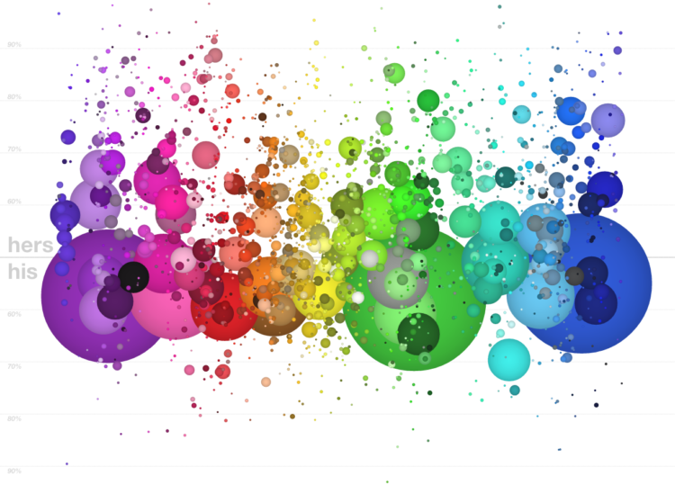
A couple of years ago, xkcd ran a survey that asked people to name colors. Stephen Von Worley plotted that data by gender in an interactive.
That’s a dot for each of the 2,000 most commonly-used color names as harvested from the 5,000,000-plus-sample results of XKCD’s color survey, sized by relative usage and positioned side-to-side by average hue and vertically by gender preference. Women tend to use color names nearer the top, men towards the bottom, and the dashed line represents the 50-50 split (equal usage by both sexes).
While his original version was static, the interactive version lets you sort by hue, saturation, brightness, popularity, and name length. Most importantly, you can see the color names now when you mouse over. I like the vertical spectrum of purple, where women use names like bright lilac, orchid, and heather, and men tend to label similar shades as purplish, lightish purple, and oh yes, very light purple. [Thanks, Stephen]
-
-
Thomas H. Davenport and D.J. Patil give the rundown on what a data scientist is, what to look for and how to hire them. It’s an article in Harvard Business Review, so it’s geared towards managers, and I felt like I was reading a horoscope at times, but there are some interesting tidbits in there.
Data scientists don’t do well on a short leash. They should have the freedom to experiment and explore possibilities. That said, they need close relationships with the rest of the business. The most important ties for them to forge are with executives in charge of products and services rather than with people overseeing business functions. As the story of Jonathan Goldman illustrates, their greatest opportunity to add value is not in creating reports or presentations for senior executives but in innovating with customer-facing products and processes.
I still call myself a statistician. The main difference between data scientist and statistician seems to be programming skills, but if you’re doing statistics without code, I’m not sure what you’re doing (other than theory).
Update: This recent panel from DataGotham also discusses the data scientist hiring process. [Thanks, Drew]
-
 It’s another label-your-axes joke from SMBC. Yep, still funny.


 Visualize This: The FlowingData Guide to Design, Visualization, and Statistics (2nd Edition)


