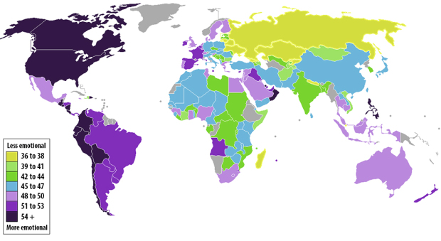
• Membership
  • Newsletter
  • Projects
  • Learning
  • About
  • Member Login
  • Solar energy potential, mapped in Cambridge →

    October 15, 2012

    Topic

    Maps

    Sustainable Design Lab at MIT and MoDe Studio estimated the potential hotspots for electric photovoltaics in Cambridge, Massachusetts and mapped it.

    “High PV Potential Area” is the footprint, in square feet, of the portions of a roof that, by considering both the real surface projection to its actual slope and this surface’s annual irradiation, yield a “good” to “excellent” result. These values are based on MIT’s calculations and are shown as orange and yellow dots on the viewer, respectively.

    If all the door-to-door salesmen trying to sell me solar panels showed me something like this for where I live, I’d be a lot more receptive.

  • How viral photos spread on Facebook

    October 12, 2012

    Topic

    Network Visualization  /  facebook, Stamen

    Number of likes and shares for a Facebook post are just simple aggregates that give you an idea of how popular that post was, but they don’t tell you anything about how that post got so popular. For Facebook Stories, Stamen Design explored how a single post can spread through the network, via three viral photos shared by George Takei.

    Each visualization is made up of a series of branches, starting from George. As each branch grows, re-shares split off onto their own arcs. Sometimes, these re-shares spawn a new generation of re-shares, and sometimes they explode in short-lived bursts of activity. The two different colors show gender, and each successive generation becomes lighter as time goes by. And the curves are just for snazz.

    So you see a beautiful burst in the beginning, as the photo is shared by people who follow Takei, and then the photo spreads within smaller groups of friends. The above is from the animation that shows how a graphic for famous failures spread.

  • Not enough donut

    October 11, 2012

    Topic

    Ugly Charts  /  donut

    From the October 10 Boston Metro. Oops. [via]

  • State of polar bear populations

    October 10, 2012

    Topic

    Maps  /  environment, Periscopic

    There are an estimated 20,000 to 25,000 polar bears in the world, and the population is expected to decline by 30 percent over the next three generations. Periscopic, in collaboration with the Polar Bear Specialist Group, highlighted the changing populations in this interactive.

    The data can be viewed by subpopulation, by nation, and by ecoregions. In the first two views, you can click on geographic regions to see more details about the area, which includes a text overview and time series for more troubling numbers on polar bears killed by humans and pollution. Finally, when you click on a time series or the pollutant levels, you can see the data at a higher granularity.

    So there are a few ways to examine the data and different angles to explore. You’ll want spend some time with this one.

  • History of Earth in 24-hour clock

    October 9, 2012

    Topic

    Infographics  /  Earth, history, timeline

    I’m not sure where this is originally from, but I found it on an intro to geology course page. What happens when midnight comes around again?

  • Patent war →

    October 8, 2012

    Topic

    Network Visualization  /  New York Times, patents

    As you’ve probably heard, Apple and Samsung have been in a bit of a kerfuffle over the past few months. We own that patent for that thing. No, we have this patent for that. The state of technology patents is all over the place. The New York Times takes a closer look. Also, don’t miss the video and side-by-side comparisons.

  • Page 257 of 392
  • <
  • 1
  • ...
  • 254
  • 255
  • 256
  • 257
  • 258
  • 259
  • ...
  • 392
  • >

Analyze, visualize, and communicate data usefully, beyond the defaults.

Become a member →

Recently for Members

May 8, 2025
When the data is not what it seems

May 1, 2025
Finding the Right Charts

April 24, 2025
Visualization Tools, Datasets, and Resources – April 2025 Roundup

April 17, 2025
Breaking Out of Chart Software Defaults

April 15, 2025
Line Chart with Decorative Neon Accents

Browse by Chart Type See All →

Surface Plot Step Chart Radar Chart Dot Map Dot Plot Unit Chart Timeline Bubble Chart Calendar Cartogram

Browse By Topic

  • Visualization

    Seeing data

  • Maps

    Seeing geographic data

  • Infographics

    Explaining data

  • Networks

    Connecting data

  • Statistics

    Analyzing data

  • Software

    Working with data

  • Sources

    Getting data

  • Design

    Making data readable

Get the Book

Visualize This: The FlowingData Guide to Design, Visualization, and Statistics

Available now.

Order: Amazon / Bookshop

Made by FlowingData

  • The Process

  • Data Underload

  • Chart Everything

  • Guides

  • Books

  • Shop

  • About
  • Contact
  • Newsletter
  • LinkedIn
  • Instagram
  • Bluesky
  • RSS
Copyright © 2007-Present FlowingData. All rights reserved.