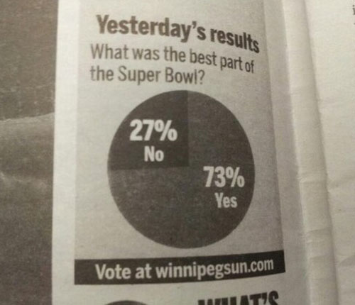
From the Winnipeg Sun. Something isn’t right here. [via]
-
-
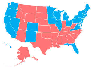 Add another way to make state-level choropleth maps. Stately, a project by Intridea, allows you to approach state mapping in the browser like you would a font.
Stately is a symbol font that makes it easy to create a map of the United States using only HTML and CSS. Each state can be styled independently with CSS for making simple visualizations. And since it’s a font, it scales bigger and smaller while staying sharp as a tack.
The process is fairly straightforward: Link to the Stately stylesheet, add some HTML markup (an unordered list of states) to your page, and then use CSS to color each state. Boom, you’ve got yourself a map.
-
-
-
In a follow-up to their map on most used languages in London, James Cheshire and Ed Manley, along with John Barratt, mapped the most commonly used languages in New York, based on the ones used on Twitter.
English (in grey above) is by far the most popular with Spanish (in blue above) taking the top spot amongst the other language groups. Portuguese and Japanese take third and fourth respectively. Midtown Manhattan and JFK International Airport have, perhaps unsurprisingly, the most linguistically diverse tweets whilst specific languages shine through in places such as Brighton Beach (Russian), the Bronx (Spanish) and towards Newark (Portuguese). You can also spot international clusters on Liberty Island and Ellis Island and if you look carefully the tracks of ferry boats between them.
-
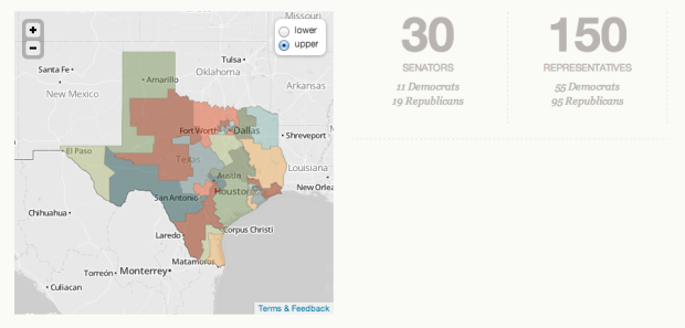
It’s not especially straightforward to know or find out what’s going on with your state’s government. Sites aren’t maintained, are unusable, or just don’t provide much information. Open States, a project by the Sunlight Foundation, aims to change that.
After more than four years of work from volunteers and a full-time team here at Sunlight we’re immensely proud to launch the full Open States site with searchable legislative data for all 50 states, D.C. and Puerto Rico. Open States is the only comprehensive database of activities from all state capitols that makes it easy to find your state lawmaker, review their votes, search for legislation, track bills and much more.
Just click on a state or enter an address, and you can quickly get information that’s relevant to where you are. There’s also iPhone and iPad apps if you prefer those, and all the data on the site is accessible via an API or a bulk data dump.
Read More -
 With Pope Benedict XVI’s resignation, 116 cardinals from various regions have to come a consensus on who will be next. Amanda Cox and Graham Roberts for The New York Times wondered what a composite of all the cardinals might look like, which looks exactly how you might expect the average to look.
 -
-
-
Chris Dancy likes to track facets of his life. A lot. Above is a bunch of automatically logged data to Google Calendar.
At the moment, he tracks everything he can, even if he doesn’t see an immediate benefit, so long as it’s relatively easy to collect — and he can save the data into Evernote, Google Calendar, and Excel. You never know when something seemingly pointless will come in handy in the future.
“If I’m on a call and my voice gets over 50 decibels, my phone notifies me,” he says. “My heart rate after a conference call usually can give me better insight into the call and my feelings about the call.”
I’m all for personal data, but at some point it’s just too much, and I’m pretty sure Dancy is close to that point, if he hasn’t passed it already. Do you really need an alert that pops up when your voice sounds a certain way? Data can tell you a lot of things, but it doesn’t have to tell you everything. [Thanks, Mat]
-
-
-
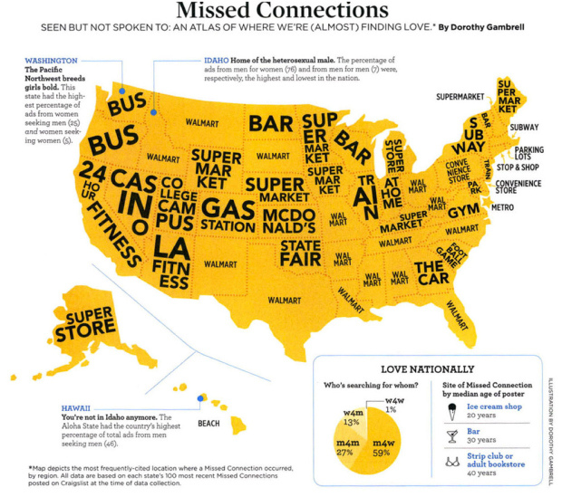
On Craigslist there’s a section in the personals for “missed connections” which lets people post missed chances at love with the (slim) hopes that the person he or she saw sees the random post on Craiglist. They usually start off like, “I saw you in that place, and you were…” Dorothy Gambrell mapped the most frequent location for each state.
In California, there’s apparently a lot of eyeballing at 24 Hour Fitness, and in New York it’s the subway, which shouldn’t be surprising. I like how bars are most mentioned in North Dakota and Wisconsin, which matches up with the bars versus grocery stores map from a couple of years ago.
-
-
There’s a corner of my desk reserved for books, notes, papers, and other things I am supposed to read or have written and need to rewrite. Each project I work on gets its own stack. But there is limited space on my desk, and if I have too many stacks going at once, everything starts to jumble into one big pile. So I try not to work on too many things in parallel.
There are typically two stacks at any given time: one for books or random projects and the other for my dissertation. The former changes often and was recently cleared on the completion of the Data Points manuscript, and the latter has been persistent for several years.
But I’m happy to finally say that now there are zero stacks.
I’m finally done. I’m officially Dr. Nathan Yau, Ph.D. (but you can still call me Nathan).
It feels weird to say that — like how I imagine lottery winners feel, suddenly being able to say they’re millionaires. It’s surreal at first, but once it sinks in, the sun shines brighter, food tastes better, and the feeling of possibilities rushes through your veins.
I’ve been asked if I would do it again knowing what I know now. After all, it took me over seven years to finish. To be honest, there were many times I wanted to quit, but now that I’m done, I can say that I would do it all again. I wouldn’t do it just for the degree though. Rather I would do it for what came from going through the process: this blog, two books, countless learning experiences in school and through it, and a perspective on work that I wouldn’t have gotten from anything else.
Most importantly, I found what I like to do. It’s awesome.
So now it’s time for a new stack. I’m excited about what it might be.
-
Shan Carter, Amanda Cox, and Mike Bostock for The New York Times, analyzed movie trailers for five best picture nominees. The horizontal axis represents time elapsed during a trailer, and the vertical axis represents when that clip occurred during the movie. The above is for Silver Linings Playbook:
“Silver Linings Playbook” follows the standard model for trailers, according to Bill Woolery, a trailer specialist in Los Angeles who once worked on trailers for movies like “The Usual Suspects” and “E.T. the Extra-Terrestrial.” While introducing the movie’s story and its characters, the trailer largely follows the order of the film itself.
Because the order of the trailer is pretty much the order of the movie, you see a straight line with a downward slope most of the way. On the other hand, the Lincoln trailer jumps around showing a zig-zag pattern.
In addition to the charts, the healthy dose of annotation provides interesting tidbits on the reasoning behind pace and scene choice.
-
-
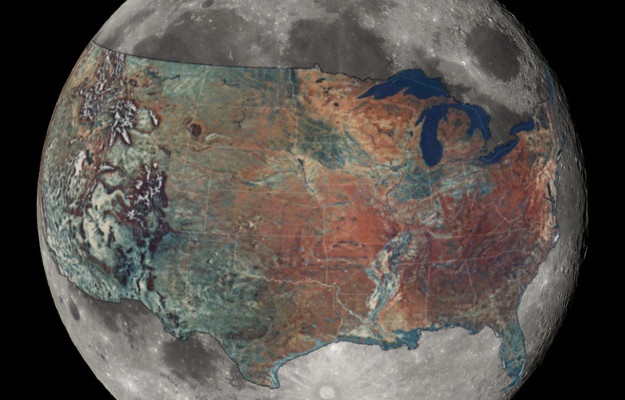
How big is the Moon, really? Reddit user boredboarder8 provided some perspective with this image of the Moon with an overlaid United States. It’s roughly estimated (and others would be better at commenting on the accuracy better than me), but after some back-of-napkin math it seems about right. The area of the United States, not including Alaska, is a little over 20 percent of the Moon’s surface area. [via io9]
-




 Visualize This: The FlowingData Guide to Design, Visualization, and Statistics (2nd Edition)


