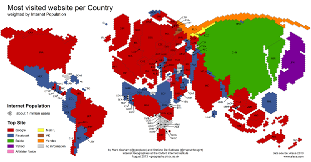
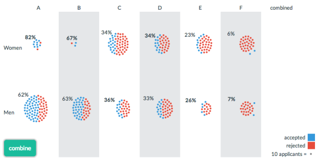
• Membership
  • Newsletter
  • Projects
  • Learning
  • About
  • Member Login
  • The Numbers Game on National Geographic

    April 29, 2013

    Topic

    Statistics  /  Jake Porway

    Jake Porway, the founder of DataKind, has a new show on the National Geographic channel called The Numbers Game. I unfortunately don’t have the channel, so the clips on the site will have to suffice for now.

    Keep in mind this show is for a wide audience though. Jake notes:

    Now for those of you who have been writing to me excited that Big Data is finally getting its own TV show, I should point out that this show is a lot more like a science show than a show about data. You won’t find discussions about Hadoop, machine learning, or even the basics of correlation vs. causation here. Instead, the show tries to make the latest statistics accessible to a wide audience of people who may just be dipping their toes in to this new world of data. It’s more Guy Fieri than Carl Sagan, but it’s a blast.

    The first of three episodes aired last week, and the second is on tonight. You should watch it.

  • Insecurities of age through the eyes of Google Suggest

    April 26, 2013

    Topic

    Miscellaneous  /  age, Google, video

    In this straightforward video, Marius Budin offers a look at our insecurities as get older through the eyes of Google Suggest. If anything, it’s clear that there’s one thing we fear throughout: loneliness. Although, the suggestions in the early years worry me.

  • A thorough Facebook analysis by Stephen Wolfram

    April 25, 2013

    Topic

    Statistical Visualization  /  facebook, Wolfram

    Stephen Wolfram analyzed the Facebook world, based on anonymized data from the Wolfram|Alpha Data Donor program. He visits topics from how people friend, how the Facebook world compares to the real one, and how people change with age.

    People talk less about video games as they get older, and more about politics and the weather. Men typically talk more about sports and technology than women—and, somewhat surprisingly to me, they also talk more about movies, television and music. Women talk more about pets+animals, family+friends, relationships—and, at least after they reach child-bearing years, health. The peak time for anyone to talk about school+university is (not surprisingly) around age 20. People get less interested in talking about “special occasions” (mostly birthdays) through their teens, but gradually gain interest later. And people get progressively more interested in talking about career+money in their 20s. And so on. And so on.

    Worth the full read.

  • Binify for hexagon binning in Python

    April 25, 2013

    Topic

    Software  /  hexbin, Python

    As an alternative to dot density maps, Binify by Kevin Schaul allows you to map with hexagon binning in Python.

    Dot density maps are a straightforward way to visualize location data, but when you have too many locations, points can overlap and obscur clusters and trends. That’s where binning comes in. Generally speaking, the goal is to look at an area on a map and then count how many points are within that area. Do that across the entire area.

    Grab the package on GitHub and go to town.

  • Stop motion video: Food you can buy for $5 in different countries

    April 24, 2013

    Topic

    Infographics  /  finance, food, video

    This stop motion video from BuzzFeed shows how much food you can buy for $5 USD in different countries. For example, five bucks will get you 7 pounds of rice in the United States and 12 pounds in China. The video is straightforward, but the animation of food appearing and disappearing — or rather, added and taken away — lends well to the context that you wouldn’t get from a quick chart.
    Read More

  • Flowchart for movie time travel →

    April 23, 2013

    Topic

    Infographics  /  flowchart, humor, movies

    Mr. Dalliard provides this handy flowchart to organize time travel movies. And yes, I immediately looked for Back to the Future and backtracked.

  • Orbiting planets found by NASA Kepler mission

    April 22, 2013

    Topic

    Infographics  /  Jonathan Corum, New York Times, space

    The Kepler mission by NASA has discovered more than 100 planets that orbit stars. Jonathan Corum for The New York Times visualized the ones with known size and orbit using small multiples. Scroll all the way down for our solar system as a point of reference.

    Kepler's tally of planets

  • Shot charts show evolution of Lebron James

    April 19, 2013

    Topic

    Maps  /  basketball, LeBron James, shot chart

    With the start of the NBA playoffs tomorrow, it’s worth coming back to Kirk Goldsberry’s analysis on the evolution of Lebron James’ shot preference. James used to hang around the 3-point line a lot, but he spends a lot more time in the low post these days.
    Read More

  • Time-lapse: Package shipped with a hidden camera

    April 18, 2013

    Topic

    Data Art  /  shipping, time-lapse

    Designer Ruben van der Vleuten was curious about the shipping process, so he did what anyone would do. He installed a camera in a cardboard box and shipped it to himself. Below is a time-lapse video of the package’s journey.

    [via Co.Design]

  • Fictional villains chart

    April 17, 2013

    Topic

    Visualization  /  cartoon, humor

    No comment necessary. [Thanks, Tom]

  • Guides  /  data literacy

    Flexible data

    Data is an abstraction of something that happened in the real world. How…

    Read More
  • Wealth distribution in America

    April 16, 2013

    Topic

    Infographics  /  finance, video

    This video clearly describes the distribution of wealth in America using a set of transitioning charts. The graphics are good. The explanation is better.

  • Visualizing the Paris metro system

    April 15, 2013

    Topic

    Maps  /  Dataveyes, metro, Paris

    Data visualization group Dataveyes looks closer at the Paris metro system from a time and crowd point of view.

    This visualization offers to challenge the way we traditionally view our 2D metro maps. Métropolitain takes on an unexpected gamble: using cold, abstract figures to take the pulse of a hectic and feverish metropolis. The metro map is no longer arbitrarily dictated by the spatial distance between two points. By playing around with two extra variables — time and crowds — users can transform the map, view it in 3D and unveil the true reality behind their daily commute.

    No doubt inspired by the Travel Time Tube Map of the London Underground by Tom Carden, Métropolitain lets you select a station and the lines morph to represent how long it takes to get to other stations. A layer underneath is a heatmap that shows annual incoming traffic per station.

    Finally, you can switch between 2-D and 3-D. I’m not sure if the extra dimension adds much from an understanding point of view, but it is fun to play with. [via infosthetics]

  • Page 241 of 392
  • <
  • 1
  • ...
  • 238
  • 239
  • 240
  • 241
  • 242
  • 243
  • ...
  • 392
  • >

Analyze, visualize, and communicate data usefully, beyond the defaults.

Become a member →

Recently for Members

May 8, 2025
When the data is not what it seems

May 1, 2025
Finding the Right Charts

April 24, 2025
Visualization Tools, Datasets, and Resources – April 2025 Roundup

April 17, 2025
Breaking Out of Chart Software Defaults

April 15, 2025
Line Chart with Decorative Neon Accents

Browse by Chart Type See All →

Variable Width Bar Chart Dot Plot Barcode Chart Sankey Diagram Dot Density Map Strip Plot Streamgraph Connected Scatter Plot Mosaic Plot Alluvial Diagram

Browse By Topic

  • Visualization

    Seeing data

  • Maps

    Seeing geographic data

  • Infographics

    Explaining data

  • Networks

    Connecting data

  • Statistics

    Analyzing data

  • Software

    Working with data

  • Sources

    Getting data

  • Design

    Making data readable

Get the Book

Visualize This: The FlowingData Guide to Design, Visualization, and Statistics

Available now.

Order: Amazon / Bookshop

Made by FlowingData

  • The Process

  • Data Underload

  • Chart Everything

  • Guides

  • Books

  • Shop

  • About
  • Contact
  • Newsletter
  • LinkedIn
  • Instagram
  • Bluesky
  • RSS
Copyright © 2007-Present FlowingData. All rights reserved.