Using data from the Earth System Research Laboratory of the National Oceanic and Atmospheric Administration, Kennedy Elliott for the Washington Post mapped average grams of carbon dioxide worldwide.
Read More
-
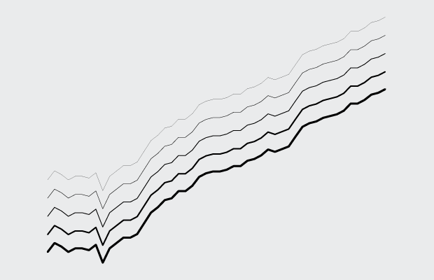
How to Make Line Charts in R
Learn to draw lines wherever and however you want, and you’ve got yourself some flexibility.
-
-

You can currently play Pac-Man on Google Maps. Just go to some location and click the Pac-Man square in the bottom left corner, and you’ll be running the local streets. Because March 31.
I only played for a little bit, but it appears to follow the same ghost algorithms.
-

Changes in gay marriage rights had changed slowly over the years, but more recently, many more states recognized same-sex marriage. Haeyoun Park for the New York Times reports, starting in 1992 just before a Hawaii Supreme Court ruling up to now. Yellow means banned by statute, orange is banned by constitutional amendment, and dark brown means legalized.
Side note: This gridded cell map approach has been popping up more as of late. I like it.
-

Redesigning a visualization can be useful in teaching a point. Make a graphic better (or “better” depending on what angle you’re looking from) with a different layout and visual encodings. Perhaps the most well-known is Edward Tufte’s redesign from his book Visual Explanations in which he reworks a diagram used in decision-making for the space shuttle Challenger launch.
However, Fernanda Viégas and Martin Wattenberg explain why such redesigns can be problematic and offer a more useful approach.
Read More -
Designer Michael Pecirno experiments with single-subject maps in his project Minimal Maps. No boundaries, just landscape.
Read More -
From Finger Magazine a few years back, in the heyday of rickrolling and humor charts. Maybe some choose to forget this era, but I’m never gonna give you up, let you down, or run around and desert you.
-
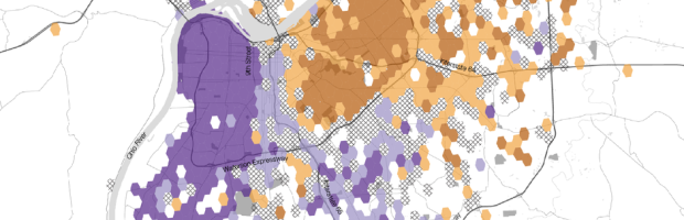
Location-based data from social media can be interesting to analyze and map, but there are a lot of inherent challenges with the data. The main one, which designers often ignore, is that it’s safe to make inferences straight from the tweets alone. That is, there’s an assumption that the data is representative of the real-life population when in fact there are a ton of social implications to consider. The folks at Floatingsheep, a team of geographers, know better. CityLab highlights some of the team’s work.
Read More -
Data journalism is relatively new as a concept, but in practice it has been around for a good while. Scott Klein for ProPublica tells the story of Horace Greeley, an editor for the New York Tribune and a congressman in the mid-1800s. Greely was displeased with a law that specified mileage compensation for travel to the capital, so he found a way to prove his point with data.
Read More -
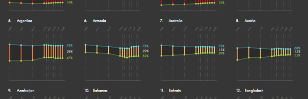
Ri Liu provides an exploratory view of gender gaps around the world through labor participation, parliament participation, and income. Be sure to try the sorting options, which help you pull out quick insights from about 160 time series.
-
-
There are a lot of beards and other types of facial hair in Major League Baseball. In case you’re wondering how many and at what level, the Washington Post has you covered with a breakdown.
Read More -
-
Jeffrey Heer, computer science professor and co-founder of Trifacta, describes the future of visualization in a short 10-minute talk. It’s one where people aren’t taken out of the analysis loop, but computers can provide a bit more help than they do now.
Watch the talk -
If you don’t want to bother with JavaScript but want to publish interactive graphics for the web or use interaction to explore your data, htmlwidgets might be for you.
Read More -
In a straightforward map, Seth Kadish shows the percentage of county residents who commute out of state, according to estimates from the American Community Survey.
Read More -
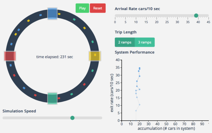
I hate all things commute- and traffic-related, and it’s probably why I like to learn about what makes commutes painful. Maybe if I know more about what’s happening, I won’t get so frustrated when I have to drive.
Transportation engineering PhD candidate Lewis Lehe has a look at bottlenecks and gridlock, creating simulations of both. The former is when too many cars want to do the same thing at once, like enter at a freeway entrance. Gridlock is when a bottleneck in one direction causes a bottleneck in the other direction, and then the same happens the other way around, starting a horrible, horrible cycle.
-
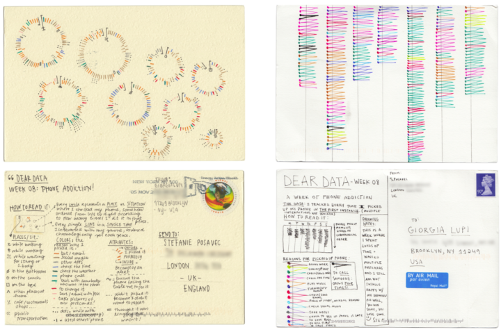
Stefanie Posavec, known around these parts for her manual data design and Giorgia Lupi, known for constantly drawing and searching for complexity, are sending each other data postcards once a week for a year. They call the data-drawing project Dear Data.
Read More -
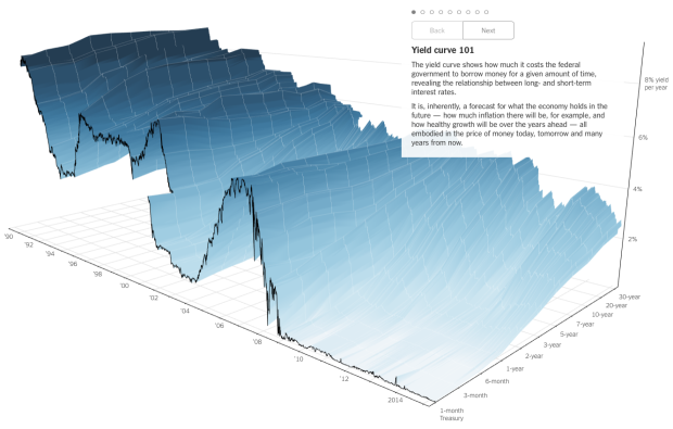
People like to poke fun at 3-D charts, mostly because they don’t work or a third dimension just isn’t needed. However, this chart by Gregor Aisch and Amanda Cox for the Upshot is a fine exception to the rule.
Read More -
For a class project, Katie Kowalsky, Dylan Moriarty, and Robin Tolochko examined changes in abortion policy since Roe v. Wade in 1973.
Read More
Recently for Members
Browse by Chart Type See All →


Browse By Topic
Get the Book
 Visualize This: The FlowingData Guide to Design, Visualization, and Statistics
 Visualize This: The FlowingData Guide to Design, Visualization, and Statistics
Available now.