Ever since Hans Rosling presented a motion chart to tell his story of the wealth and health of nations, there has been an affinity for proportional bubbles on an x-y axis. This tutorial is for the static version of the motion chart: the bubble chart.
Results for hans rosling
-
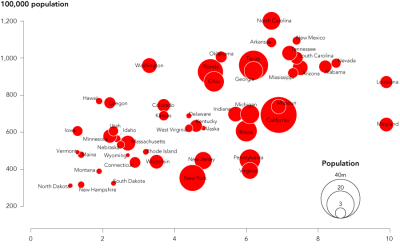
How to Make Bubble Charts
-
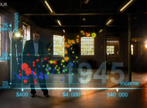
The Joy of Stats with Hans Rosling
The Joy of Stats, a one-hour documentary, hosted by none other than the…
-

The Joy of Stats available in its entirety
The Joy of Stats, hosted by Hans Rosling, is now viewable in its…
-

Think Quarterly from Google UK on data
“The problem isn’t that specialised companies lack the data they need, it’s that…
-
Visualization as a mass medium in the 21st century
In an op-ed for CNN and perhaps adding fuel to the fire, Martin…
-
Telling Stories with Data – VisWeek 2011
Note from Nathan: Last week, visualization researchers from all over gathered in Providence,…
-
Hans Rosling: Providing Data, Inspiring Change
Okay, so this video has been posted probably on thousands of blogs already,…
-

John Snow’s Famous Cholera Map
If you’ve read any books on visualization, without a doubt, you’ve seen John…
-
FlowingData Readers’ Favorite Visualizations
Last month I asked FlowingData readers, “What are your favorite data visualizations in…
-
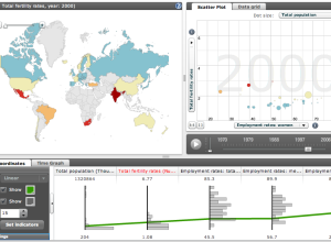
Explore World Data with Factbook eXplorer from OECD
The Organization for Economic Co-operation and Development (OECD) makes a lot of world…
-
11 Ways to Visualize Changes Over Time – A Guide
Deal with data? No doubt you’ve come across the time-based variety. This is a guide to help you figure out what type of visualization to use to see that stuff.
-

Great Data Visualization Tells a Great Story
Think of all the popular data visualization pieces out there – the ones…
Recently for Members
Second Edition
 Visualize This: The FlowingData Guide to Design, Visualization, and Statistics (2nd Edition)
 Visualize This: The FlowingData Guide to Design, Visualization, and Statistics (2nd Edition)
New tools, refined process.
Browse by Chart Type See All →


