Here is what happened in July.
Here is what happened in July.
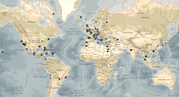
I like the framing of this interactive map “from a Bond fan to Bond Fans worldwide.” See filming locations, places in the books, and residency of the tailors. I’m actually not a James Bond fan, but this project makes me want to look more.

Adina Renner, reporting for the New York Times, provides a timeline of the war in Iran through the lens of daily attacks.
“The level of volatility, and how public the whiplash back and forth has been — that’s not normal,” Ms. Wise said. The process has been further complicated, she said, by an American government that seems focused on “getting a deal rather than making peace.”

Here is a more complete landscape of how prices have changed year-over-year, without the cherrypicking.
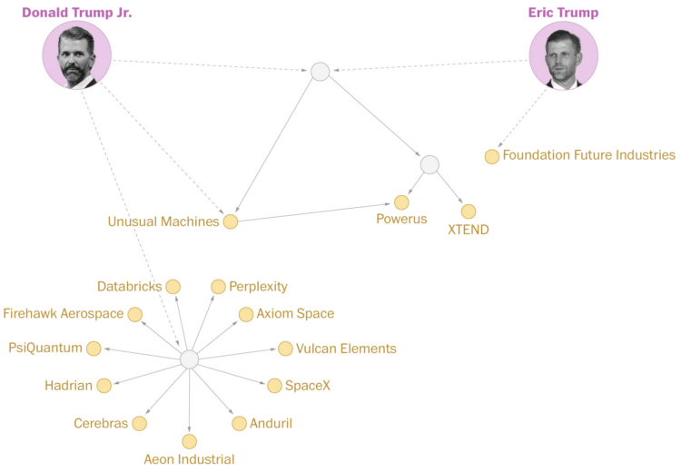
The Washington Post reports on the large investments in defense tech by the Trump sons:
Neither Eric Trump nor Trump Jr., vice presidents at the Trump Organization who do not hold official roles in the federal government, had notable experience in the defense tech industry before they began investing heavily in companies seeking Pentagon and other federal contracts.
A network diagram shows the links to the various investments, which are definitely in no way linked to their father and the spike over the past couple years is purely coincidence.
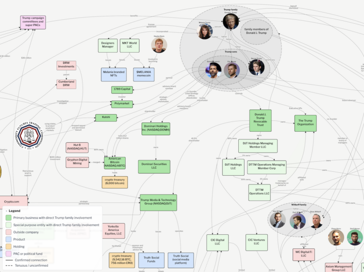
The U.S. president sits atop a crypto network through his family and LLCs, adding billions in wealth, which all feels kind of scammy. Molly White, for Citation Needed, pieced together the network using data from financial filings.
Read More
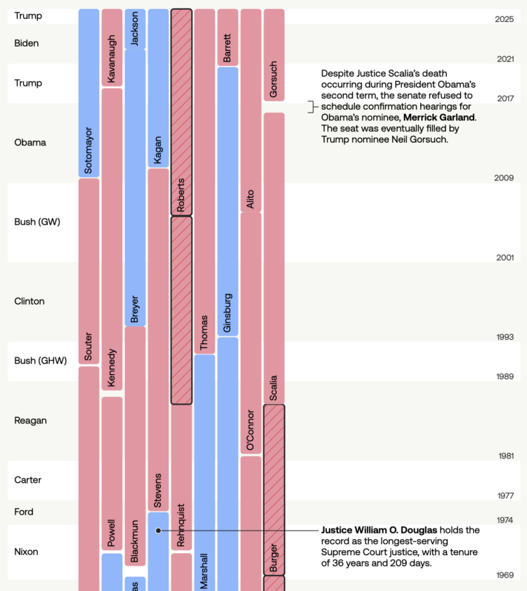
The U.S. Supreme Court has had 116 justices over all American history. USAFacts made a timeline that shows the tenure of each justice, alongside who appointed them.
In grade school, we learned about checks and balances that were held in such high esteem. It’s a different feeling as an adult.
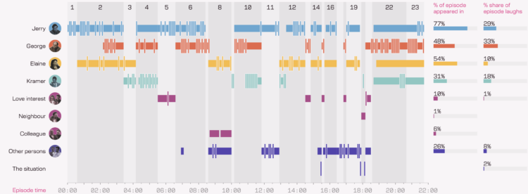
Several years ago, Andy Kirk watched every episode of the sitcom Seinfeld, all the while collecting data in five-second increments. He visualized the data in book-form, but now there’s a fun digital version of the project he calls The Seinfeld Chronicles.
The data collection process, while watching each episode twice, sounds like the most tedious part of the project:
[W]ith so many episodes to work through, a pragmatic approach was required to ensure the best quality data could be obtained in the most efficient way. Typically, each episode’s data was gathered through two full viewings. The first viewing would focus on recording the times of when discrete scenes started and finished, the locations in which these scenes were set, and when characters appeared on-screen in those scenes. The second viewing was done to validate the first-pass data and additionally capture details about which characters caused the observed audience laughter.
To help with the efficiency of the data collecting, all measurements were recorded in and against units of 5-seconds periods. This approach offered sufficient granularity to accurately quantify a character’s appearance and laughter contributions and, as explained earlier, aligned with the typical length of a moment of audience laughter.
That’s a lot to watch. I don’t think I have the patience or stamina to collect data like that, even for my favorite shows at their peak. So kudos to Andy for this very “unnecessary” exploration.

Reuters reports on the strain of natural gas supplies due to the war in Iran:
When the war with Iran broke out, fertilizer and nitrogen quickly became front-page news. The war cut off 17% of the world’s natural gas supply and more than 30% of world nitrogen fertilizer supply. Almost half of the world’s exported sulfur, a critical component for another type of fertilizer, was trapped in the Middle East Gulf.
The graphics team at Reuters has gotten really good at illustrative transitions over the years. The parallax effect to show movement through fields adds depth, and the treemap reveal through the clouds is tops.
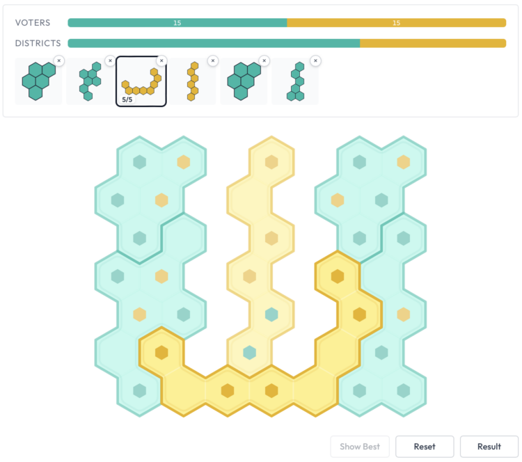
Gerrymandle is a daily game that shows areas with voting preferences, and the goal is to create districts to swing the election in your favor. If you can’t beat ’em.
See also gerrymandering golf, a visual guide to redistricting, and the font that uses gerrymandered districts for letters.
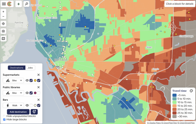
When deciding where to live, most people want to know what’s nearby so you don’t have to drive an hour to get to the nearest grocery store or school. Close is a mapping tool that shows what’s within walking, biking, and transit distance in a given city.
The fun part is that you can choose the combination of location, amenity, and travel mode relevant to you. The map updates to show how long it takes to get to the places.
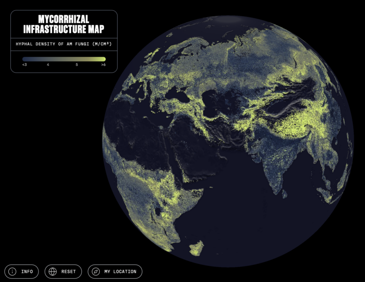
Researchers are studying an underground, global network of fungi that acts as a circulatory system, transporting carbon, water, and nutrients between plants and soils. SPUN, in collaboration with Moritz Stefaner, mapped the network, which they estimate to be 110 quadrillion kilometers less than ten centimeters underground.
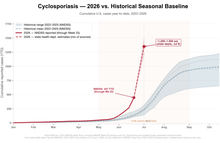
Since the U.S. federal government is of little help in providing information about the diarrhea outbreak spreading through contaminated food, epidemiologist Katelyn Jetelina ran through the known facts.
This outbreak, the largest in U.S. history, has topped 3,000 cases, and it’s not slowing down. That number comes from adding up state-level case counts, which are running well ahead of the counts on CDC’s website. For context, the U.S. typically sees around 3,000-4,000 cyclosporiasis cases in an entire year—so this single outbreak has already matched a normal year’s total, and it’s still climbing.
Note that the real number is almost certainly higher: most people with a few days of watery diarrhea ride it out at home rather than see a doctor, and those who do see a doctor may or may not get tested for cyclosporiasis (it’s an expensive test!).
With so many people spending more time on the toilet, this seems bad for efficiency. If only there were some system in place to track this sort of thing.
Upon discovery of a generated biography on Amazon about her, NYT journalist Kashmir Hill followed the path to more slop.
Two business school professors, curious about A.I. books and whether anyone actually likes them, gathered data about 10 million books published on Amazon over the last five years. They found that the number of e-books published per month had tripled since the release of ChatGPT, to more than 300,000 at the end of last year, from around 100,000 in 2022. (Amazon said that its internal metrics did not show that level of growth, but would not share its figures.)
Because romance sells, the professors thought it would be the genre most susceptible to A.I. intervention, but instead it was nonfiction — a term that should probably be used loosely in this context. While A.I.-assisted books received lower customer ratings than human-made ones, they deemed A.I.’s entry into the market a positive development, because the books were selling, if modestly. As economists, they told me, they’re less concerned with literary quality or customer satisfaction than revenue growth and market expansion.
For A Rabbit’s Foot, Andy Hazel interviewed Star Wars creator George Lucas, mostly about the Lucas Museum of Narrative Art. But towards the end, there is a question of generative AI in movies, because of course:
“Artificial intelligence means it’s much easier for us to make movies,” he says. “It’s very much like sitting here saying, ‘Well, I believe the horse and the buggy is really where it’s at. These cars, they break down, they need gas, there’s all kinds of problems with them and pretty soon they’ll be making them into tanks, and then they’ll be killing people. It’s terrible.’ There’s nothing you can do about it,” he says, raising his hands. “That’s progress, it’s the future.”
I wonder if his opinion would change if he were still making movies.
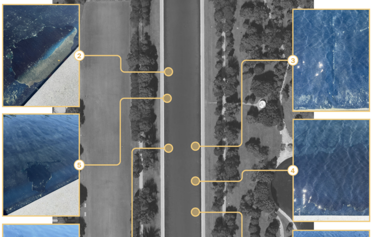
The Washington Post used satellite imagery, photos, and videos from when the blue paint was applied to the Reflecting Pool to figure out what caused the tears in the lining.
Of the identified locations with tears, every failure occurred where a layer of paint overlapped another. So the installers with the no-bid contracts probably did a terrible job.
We are in strange times.
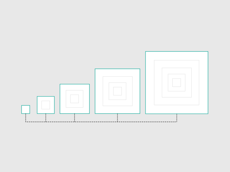
This week, I provide an update on my own process from start to finish, in 2026.

If you’re into visualizing networks, cosmos.gl looks like a fun library to play with. At a glance, it seems quick and responsive, and even my old computer can run the demos without the fan whirling.
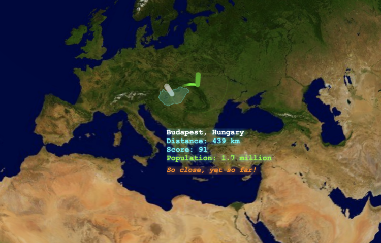
MapTap is a daily guessing game for geography. You get a location in the world, you mark where you think that location is, and you see how close you are. The closer the guess to the actual location, the higher the score.
I am not good at this game.
 Visualize This: The FlowingData Guide to Design, Visualization, and Statistics (2nd Edition)
New tools, refined process.