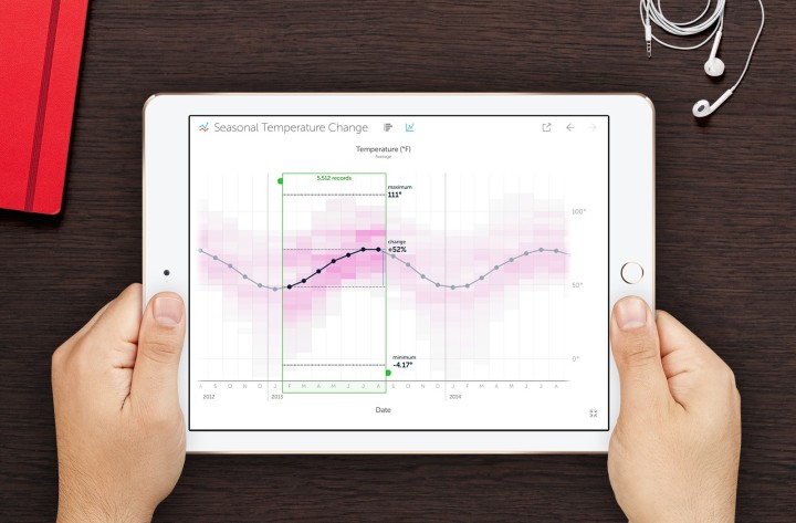
Vizable is a free iPad app from Tableau Software that helps you explore data, specifically through tap interactions. The focus seems to be exploration that’s quick, easy, and fun. Gonna have to find a working iPad to try this with.
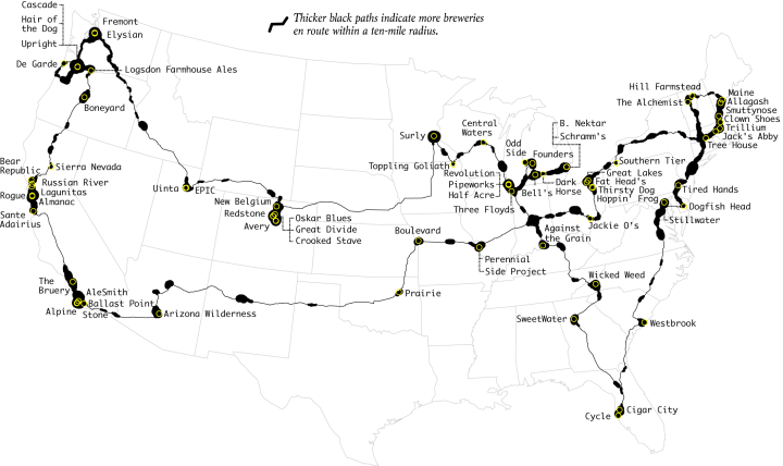
There are a lot of great craft breweries in the United States, but there is only so much time. This is the computed best way to get to the top rated breweries and how to maximize the beer tasting experience. Every journey begins with a single sip.
Vizable is a free iPad app from Tableau Software that helps you explore data, specifically through tap interactions. The focus seems to be exploration that’s quick, easy, and fun. Gonna have to find a working iPad to try this with.
Gavin Schmidt shows different types of particles that swirl around in our atmosphere:
“Different kinds of particles are a different color,” explains climate scientist, Gavin Schmidt. “The easiest to see are the reddy-orange particles; those are dust and you can see them streaming them off the Sahara,” Also worth noting: white particles (pollution from burning coal and volcanoes); red dots (fires over a particular period); and blue color (seasalt being whipped up into air by the wind).
Nice.
Data wrangling — formatting and cleaning — is a sore spot and stumbling block for many, but you often can’t do much visualization- or analysis-wise until the data is in order. My projects folder is filled with one-off Python scripts written for specific datasets (and steps within steps).
Trifacta Wrangler aims to streamline the process with a click interface and automation. The desktop software is free to use and available for PC and Mac.
Read More
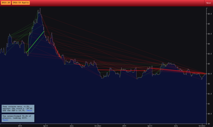
Bloomberg Business has an interesting stock trading game with a simple premise. A time series line starts at the beginning of a stock’s life and runs its course all the while you buy and sell trying to profit.
Click and hold the mouse button to buy, and release to sell. The key is to click when the stock price is low and to release when it’s high. Of course, this is when uncertainty comes into play and is what makes the game fun.
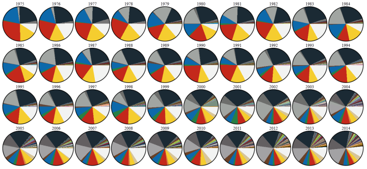
DaveE from the Brickset Forum was curious about the changing LEGO color palette, so he looked at newly released bricks over the years and charted the color results. I would’ve preferred a stacked area chart (more like this) over the multiple pies, but I appreciate the topic more than I dislike the layout.
Nicholas Felton released his 10th and final annual personal report. It’s the end of an era and what I can only imagine as a sense of freedom and completion by Felton.
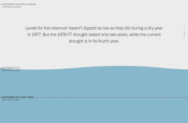
Here’s a nice scroller from Katie Park for the Washington Post. It shows dwindling water levels in major reservoirs in California. At its core, there’s only a handful of data points to look at, but instead of a line to represent the top of a bar chart, Park used an animated water line that makes the numbers feel less abstract. I like it.
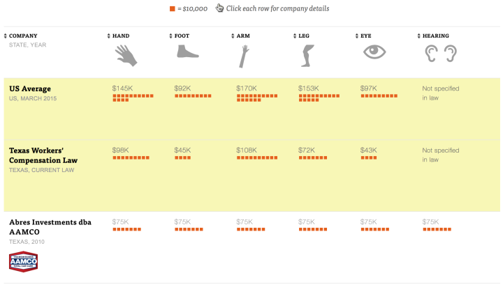
Earlier this year, ProPublica reported on the decline of Workers’ Compensation at the state and national levels. Continuing their efforts, they look specifically at Texas, where companies are “allowed to opt out and write their own benefit plans.”
An interactive shows the plans of about 40 companies in the state. Each row is a company, and each column is a body part. Orange squares represent the value that each plan places on a body part, and you’ll notice a wide range. Probably the most noticeable is what’s missing.
According to the New York Times, 158 families funded about half of the presidential campaigns so far. With great effect, the Times used Monopoly house and hotel pieces to show this number. The main point of impact comes from the scaled comparison at the beginning, against the backdrop of the White House.

Looking at educational attainment, income, work hours, and commute, this is who has the same work life as you do.
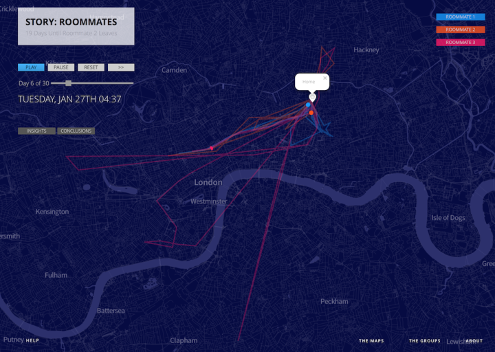
Data researcher and artist Mimi Onuoha looked at the personal location and messaging data from four groups of people in a project called Pathways. It’s less about how much we can find out from a person’s traces and more about what the data doesn’t capture.
The interesting thing about this group was the degree to which their data couldn’t capture the reality of what they were experiencing. I was present for the goodbye their data leads up to, and I witnessed every bit of its difficulty. But data visualizations add a level of abstraction over real world events; they gather the messiness of human life and render it in objective simplicity. In life, goodbyes can be heartbreaking affairs, painful for all involved.
But on a map, a goodbye is as simple as one dot moving out of view.
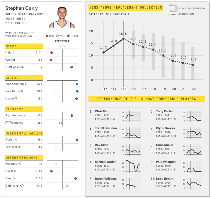
As the NBA basketball season gets started, FiveThirtyEight has their player projections for how much each will contribute to their team not just this year but in future seasons. The system is called CARMELO. It stands for Career-Arc Regression Model Estimator with Local Optimization but mostly an excuse to name it CARMELO.
Nate Silver describes how they produced the projections and its similarities to his work in 2003 with baseball player projections. Two main steps: define player skills, and then find similar players in NBA history and look at how they performed.
And naturally, attach a whole lot of uncertainty.
Finally, bringing it all together: win-loss record projections for every team.
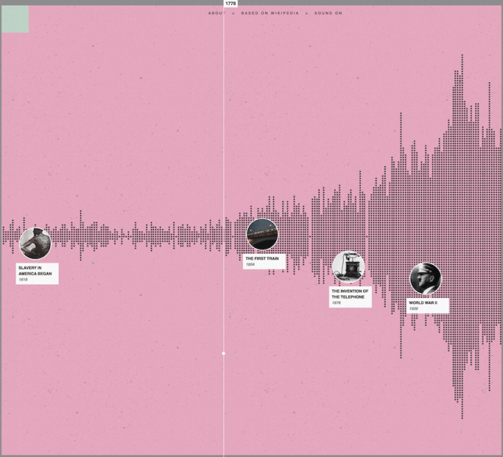
“I wish there was a timeline browser for all the historical events documented on Wikipedia, from the Big Bang up to present,” you thought to yourself. Well look no more. Histography, a final project by Matan Stauber at the Bezalel Academy of Arts and Design, is an interactive timeline that lets you sift through events and eras. It’s updated with new events on the daily.
Read More
In 2004, Annie Duke won the World Series of Poker Tournament of Champions, taking home a prize of $2 million. She was the only woman at the final table and wasn’t expected to win, largely because she was a woman. In this short segment from NPR, Duke describes how she used gender stereotypes to her advantage, making her own generalizations for her opponents.
[via @waxpancake]

Network Effect by Jonathan Harris and Greg Hochmuth is a gathering of the emotions, non-emotion, and everyday-ness of life online. It hits you all at once and overwhelms your senses.
Read More
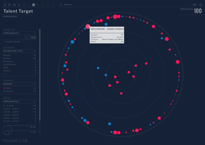
Talent Lab is an application for human resource professionals to evaluate a work force. (I’m going to pretend that sentence didn’t make me feel slightly dirty.) To demonstrate, they put in data for superheroes, so that you can explore abilities, talents, and demographics. This is great for me, because I’m building an Avengers-like workgroup.
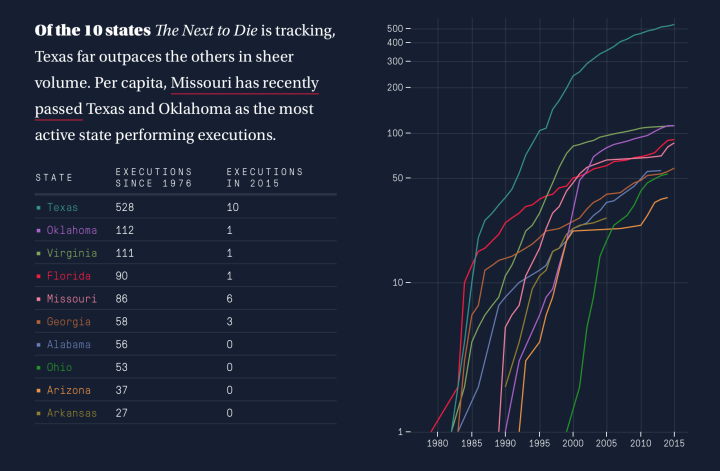
There are ample records of executions in the United States, but looking at them through the data lens can feel disconnected and horribly robotic. In a more humanized view of the subject, The Next to Die by the Marshall Project provides context for those next scheduled for execution.
On one side, a person is scheduled to die. On the other, the person did horrible things. It’s complex and the project doesn’t try to sway opinions one way or the other, but it does provide a view into what’s happening, along with a historical view of states and their laws.
 Visualize This: The FlowingData Guide to Design, Visualization, and Statistics (2nd Edition)
New tools, refined process.


