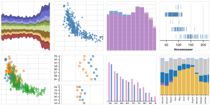
Here’s a nice scroller from Katie Park for the Washington Post. It shows dwindling water levels in major reservoirs in California. At its core, there’s only a handful of data points to look at, but instead of a line to represent the top of a bar chart, Park used an animated water line that makes the numbers feel less abstract. I like it.
-
Earlier this year, ProPublica reported on the decline of Workers’ Compensation at the state and national levels. Continuing their efforts, they look specifically at Texas, where companies are “allowed to opt out and write their own benefit plans.”
An interactive shows the plans of about 40 companies in the state. Each row is a company, and each column is a body part. Orange squares represent the value that each plan places on a body part, and you’ll notice a wide range. Probably the most noticeable is what’s missing.
-
According to the New York Times, 158 families funded about half of the presidential campaigns so far. With great effect, the Times used Monopoly house and hotel pieces to show this number. The main point of impact comes from the scaled comparison at the beginning, against the backdrop of the White House.
-
Looking at educational attainment, income, work hours, and commute, this is who has the same work life as you do.
-
-
Data researcher and artist Mimi Onuoha looked at the personal location and messaging data from four groups of people in a project called Pathways. It’s less about how much we can find out from a person’s traces and more about what the data doesn’t capture.
The interesting thing about this group was the degree to which their data couldn’t capture the reality of what they were experiencing. I was present for the goodbye their data leads up to, and I witnessed every bit of its difficulty. But data visualizations add a level of abstraction over real world events; they gather the messiness of human life and render it in objective simplicity. In life, goodbyes can be heartbreaking affairs, painful for all involved.
But on a map, a goodbye is as simple as one dot moving out of view.
-
As the NBA basketball season gets started, FiveThirtyEight has their player projections for how much each will contribute to their team not just this year but in future seasons. The system is called CARMELO. It stands for Career-Arc Regression Model Estimator with Local Optimization but mostly an excuse to name it CARMELO.
Nate Silver describes how they produced the projections and its similarities to his work in 2003 with baseball player projections. Two main steps: define player skills, and then find similar players in NBA history and look at how they performed.
And naturally, attach a whole lot of uncertainty.
Finally, bringing it all together: win-loss record projections for every team.
-
“I wish there was a timeline browser for all the historical events documented on Wikipedia, from the Big Bang up to present,” you thought to yourself. Well look no more. Histography, a final project by Matan Stauber at the Bezalel Academy of Arts and Design, is an interactive timeline that lets you sift through events and eras. It’s updated with new events on the daily.
Read More -
In 2004, Annie Duke won the World Series of Poker Tournament of Champions, taking home a prize of $2 million. She was the only woman at the final table and wasn’t expected to win, largely because she was a woman. In this short segment from NPR, Duke describes how she used gender stereotypes to her advantage, making her own generalizations for her opponents.
[via @waxpancake]
-
-
Network Effect by Jonathan Harris and Greg Hochmuth is a gathering of the emotions, non-emotion, and everyday-ness of life online. It hits you all at once and overwhelms your senses.
Read More -
Talent Lab is an application for human resource professionals to evaluate a work force. (I’m going to pretend that sentence didn’t make me feel slightly dirty.) To demonstrate, they put in data for superheroes, so that you can explore abilities, talents, and demographics. This is great for me, because I’m building an Avengers-like workgroup.
-
There are ample records of executions in the United States, but looking at them through the data lens can feel disconnected and horribly robotic. In a more humanized view of the subject, The Next to Die by the Marshall Project provides context for those next scheduled for execution.
On one side, a person is scheduled to die. On the other, the person did horrible things. It’s complex and the project doesn’t try to sway opinions one way or the other, but it does provide a view into what’s happening, along with a historical view of states and their laws.
-
-
Lithium-ion batteries power the iPhone (among other things), but what if we could use a different power source like coal or diesel? With some back-of-the-napkin math, Jon Keegan for the Wall Street Journal imagines what if. It’s all about the body fat-powered iPhone with nine days of battery life.
-
In a straightforward map, Jason Allen for Thrillist replaced station names on the London Tube map with median rent prices for a one-bedroom apartment in the area. I’m sure someone is working on U.S. subway maps at this very moment.
-
The ethics and future of ads to keep sites running is still up in the air. But one thing’s for sure: Ads and their trackers take up a lot of the bandwidth and load time for many sites. This is a problem especially for mobile where data caps and speed are more often an issue than on desktops. The New York Times ran tests on 50 major news sites to estimate the true cost of ads on your phone.
-
How to Make Bivariate Area Charts in R
Quickly compare two time series variables with this line-area chart hybrid that originated in the 1700s. Also known as: difference chart.
-
[iframe id=”https://player.vimeo.com/video/139407849?color=ffffff&portrait=0″ mode=”normal” autoplay=”no”]
In most depictions of the Solar System, planets are drawn big enough to show details and placed side-by-side to show order. The scale of the planets and the space in between them are usually a footnote. Alex Gorosh and Wylie Overstreet were curious about what you would get if you placed scale in the foreground. So they built a 7-mile model of the Solar System to scale in the middle of the desert, with Earth the size of a marble.
See also: if the moon were one pixel.
-
In 2014, five people died in New Orleans in a house fire. Three of them were children. There was no working smoke alarm. So the city analytics team and New York-based data group Enigma developed a model to predict which blocks in the city were at high risk.
If the city knew the areas that tended not to have smoke alarms, they could allocate resources appropriately to assure more people had the proper safeguards.
Enigma just expanded the project to more Metropolitan Statistical Areas in what they call Smoke Signals. See what areas near you look like.
Read More