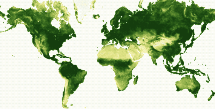
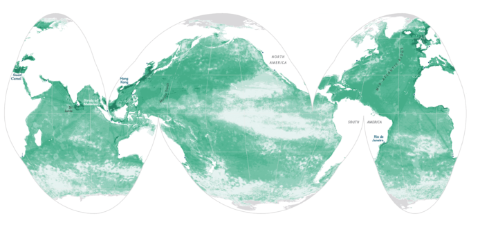
Using data from NOAA STAR, Nadieh Bremer creates a breathing Earth that shows the seasonal cycles of vegetation over the course of a year.
The animation happening in the map above, through all 52 weeks of 2016, visualizes these seasonal cycles. The rise and fall of the growing season in the Northern Hemisphere is particularly visible. However, when focusing on different parts of the planet other cycles & different seasons become noticeable as well; the Southern regions of Africa, Brazil, and New Zealand, having the reverse cycle as the North, or India getting drier and drier up until the July when the monsoons start. The more often you watch the year go by, the more small details will start to stand out.
See also John Nelson’s project from a while back of the same name, which made use of satellite imagery.

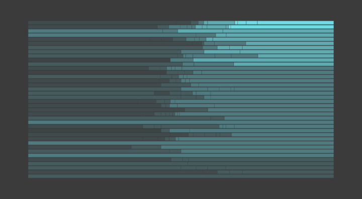
 Gerrymandering is the practice of manipulating boundaries in such a way that favors a political party. If you slice and group in various ways, you can end up with different election results.


 Visualize This: The FlowingData Guide to Design, Visualization, and Statistics (2nd Edition)


