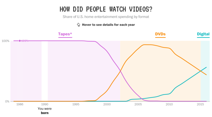
• Membership
  • Newsletter
  • Projects
  • Learning
  • About
  • Member Login
  • Census director resigns

    May 11, 2017

    Topic

    News  /  Census Bureau

    The U.S. Census director John H. Thompson resigned and will leave June 30. Seems not good. And a horrible time for government data in general.

    The news, which surprised census experts, follows an April congressional budget allocation for the census that critics say is woefully inadequate. And it comes less than a week after a prickly hearing at which Thompson told lawmakers that cost estimates for a new electronic data collection system had ballooned by nearly 50 percent.

    Isn’t this supposed to be the age of big data or something? I thought data was the new oil. Measure things to improve them. Etc. Census data — not just the decennial stuff — is core in so much policy-making to make sure people are properly represented. The direction government data seems to be headed confuses and frustrates to no end, and to think that just a few years ago I’d think happy thoughts with the prospect of where it was going.

  • Data Underload  /  time use

    How the Average Working Adult Spends Days

    This is what you get when you add up all the days the average American adult spends sleeping, eating, commuting, and doing other activities.

    Read More
  • Life expectancy by state, against the US average

    May 9, 2017

    Topic

    Maps  /  FiveThirtyEight, mortality, small multiples

    FiveThirtyEight continues their look at mortality by geography. This graphic by Anna Maria Barry-Jester compares life expectancy over time for each state. Purple means below average and orange means above.

    The good news is that all the lines trend upward. The bad news is that some states are trending upwards much more slowly than the rest.

  • X-Ray of the oceans

    May 8, 2017

    Topic

    Maps  /  environment, ocean, pollution

    Using satellite data and spatial models, researchers estimate human influence in the ocean. Darker means more impact.

    Two-thirds of the ocean shows increased strain from human-related factors, such as fishing and climate change. And more than three-quarters of coastal waters suffer from climate change and increases in the effects of harmful land-based activities, including pollution. In all, the researchers classified more than 40 percent of the ocean as “heavily impacted” by human activity.

    It looks like you can find much of the data used here, under the Cumulative Impact Mapping section.

  • Criticism vs. Creation

    May 5, 2017

    Topic

    Design  /  criticism

    [arve url=”https://www.youtube.com/watch?v=jYaIMyEoqic” /]

    Filmmaker Kevin Smith talks about making things versus critiquing them. He’s talking about movies, but you can so easily plug in visualization. I just kept nodding yes. [via swissmiss]

  • Most popular colors used by most popular sites

    May 4, 2017

    Topic

    Statistical Visualization  /  color

    Paul Hebert was curious about the colors used on the web’s larger sites, so he scraped the top ten ranked by Alexa. Then he plotted the colors in the stylesheets.

  • Data Underload  /  baby boomer, income, millennial

    Shifting Incomes for Young People

    Compare incomes for young people from the Millennial generation and the baby boomer generation.

    Read More
  • Same summary statistics, completely different plots

    May 2, 2017

    Topic

    Statistics  /  mean, median, summary

    Summary statistics such as mean, median, and mode can only tell you so much about a dataset. Their scope is limited because for them to be useful, you have to assume things like distribution and dependencies. Visualization helps you see what else there is.

    Justin Matejka and George Fitzmaurice demonstrate in their paper for the ACM SIGCHI Conference, in which they developed a method to generate datasets that “are identical over a range of statistical properties, yet produce dissimilar graphics.

  • Sandwich alignment chart

    May 2, 2017

    Topic

    Infographics  /  humor, sandwich

    By @matttomic, this chart speaks to me.

  • xkcd: Algorithms are hard

    May 1, 2017

    Topic

    Statistics  /  algorithm, xkcd

    Yeah, but what if you combine and overlay all these datasets? [xkcd]

  • YouTube plays for ‘It’s Gonna Be May’

    April 30, 2017

    Topic

    Statistical Visualization  /  May, NSYNC

    It’s that time of year again. Turn up the volume and blast It’s Gonna Be Me by NSYNC. No one will judge you.

  • Life expectancy if all diseases were magically cured

    April 28, 2017

    Topic

    Infographics  /  mortality, simulation

    Here’s a fun what-if simulation that imagines a world where all natural causes of death were gone. People only die of things like car crashes and homicide. The result: people who live to thousands of years old.

    Of course, this assumes that the likelihood of dying from external causes stays the same. With such a long life expectancy, do people start to take more risks? Or do we become more sloth-like because we have all the time in the world? Ah, that’s a thinker.

    Want a simulation closer to reality? Here you go.

  • Data exploration banned

    April 28, 2017

    Topic

    Design  /  exploration, John Tukey, teaching

    Statistician John Tukey, who coined Exploratory Data Analysis, talked a lot about using visualization to find meaning in your data. You don’t always know what you’re looking for, so you explore it visually. Etyn Adar, who teaches information visualization at the University of Michigan, makes a good case for banning the phrase in his students’ project proposals.

    For all the clever names he created for things (software, bit, cepstrum, quefrency) what’s up with EDA? The name is fundamentally problematic because it’s ambiguous. “Explore” can be both transitive (to seek something) and intransitive (to wander, seeking nothing in particular). Tukey’s book seems emphasize the former — it’s full of unique graphical tools to find certain patterns in the data: distribution types, differences between distributions, outliers, and many other useful statistical patterns. The problem is that students think he meant the latter.

    I see this sort of thing in my suggestion box too. Data exploration with visualization is good, but when someone describes their project as an exploration tool, it often means it lacks focus or direction. Instead it looks like generic graphs that don’t answer anything particular and leave all interpretation to the reader.

  • Data Underload  /  traffic

    Fatal Traffic, When and Where

    These are the traffic crashes that resulted in deaths in 2015, categorized by month, time of day, and factors involved.

    Read More
  • Mapping death in America, 1980 to 2014

    April 26, 2017

    Topic

    Maps  /  FiveThirtyEight, mortality

    Nationwide mortality data relies on death certificates, and when cause of death is unknown, sometimes “garbage codes” are used to fill the space on the form. This leads to unwanted noise, because garbage in, garbage out as the saying goes. The Institute for Health Metrics and Evaluation tried to soften the noise and strengthen the signal. Ella Koeze for FiveThirtyEight mapped the results. Flip through causes and animate over time.

  • Data Underload  /  taxes

    Income Taxes You Would Pay in Each State

    Some states have high rates. Some have low. But whether a state is lower or higher for you depends on more than just the high brackets.

    Read More
  • How disinformation spreads in a network

    April 24, 2017

    Topic

    Network Visualization  /  disinformation, simulation

    Disinformation is kind of a problem these days, yeah? Fatih Erikli uses a simulation that works like a disaster spread model applied to social networks to give an idea of how disinformation spreads.

    I tried to visualize how a disinformation becomes a post-truth by the people who subscribed in a network. We can think this network as a social media such as Facebook or Twitter. The nodes (points) in the map represent individuals and the edges (lines) shows the relationships between them in the community. The disinformation will be forwarded to their audience by the unconscious internet (community) members.

    Set the “consciousness” parameter and select a node to run.

  • NFL draft performance vs. expectations

    April 24, 2017

    Topic

    Statistical Visualization  /  draft, football, Washington Post

    Reuben Fischer-Baum for The Washington Post looks at professional football expectations given their draft picks versus performance.
    Read More

  • Stephen Curry for MVP, because he makes his teammates better the most

    April 24, 2017

    Topic

    Statistical Visualization  /  FiveThirtyEight, sports, Stephen Curry

    The choice for Most Valuable Player in the NBA is only minimally about the numbers, but it’s fun to look anyways. FiveThirtyEight makes the case for Stephen Curry. I particularly like the chart that shows how other players on a team fare when an MVP candidate doesn’t play.

    Not only do virtually all of his teammates (10 of 11 players with at least 30 shots, representing over 1,700 shots taken without him3) shoot worse without Curry on the court to draw attention, they shoot dramatically worse. Overall, Curry’s teammates shoot 7.3 percentage points worse with Curry off the court, with his average teammate4 shooting 8.3 points worse. Among our MVP candidates, LeBron has the next-highest impact on average teammate shooting (3.9 points), followed by Westbrook (2.5 points). When it comes to opening up a team’s offense, Curry has no equal.

    Full player breakdowns.

  • Solar System in a bottle

    April 21, 2017

    Topic

    Data Art  /  scale, space

    From Little Planet Factory, a Solar System in a bottle made to scale:

    A small bottle attempting to maintain the correct scale between the 8 planets of the solar system at a scale of 1:5,000,000,000. Much as in reality the entire bottle is almost entirely dominated by the volume (and mass) of the four gas giants while the four solid planets settle almost dust like in comparison at the bottom of it.

    Cute. [via @alykat]

  • Page 162 of 392
  • <
  • 1
  • ...
  • 159
  • 160
  • 161
  • 162
  • 163
  • 164
  • ...
  • 392
  • >

Analyze, visualize, and communicate data usefully, beyond the defaults.

Become a member →

Recently for Members

May 8, 2025
When the data is not what it seems

May 1, 2025
Finding the Right Charts

April 24, 2025
Visualization Tools, Datasets, and Resources – April 2025 Roundup

April 17, 2025
Breaking Out of Chart Software Defaults

April 15, 2025
Line Chart with Decorative Neon Accents

Browse by Chart Type See All →

Spike Map Surface Plot Bubble Chart Square Pie Chart Timeline Baseline Chart Dot Map Bar Chart Race Pyramid Chart Table

Browse By Topic

  • Visualization

    Seeing data

  • Maps

    Seeing geographic data

  • Infographics

    Explaining data

  • Networks

    Connecting data

  • Statistics

    Analyzing data

  • Software

    Working with data

  • Sources

    Getting data

  • Design

    Making data readable

Get the Book

Visualize This: The FlowingData Guide to Design, Visualization, and Statistics

Available now.

Order: Amazon / Bookshop

Made by FlowingData

  • The Process

  • Data Underload

  • Chart Everything

  • Guides

  • Books

  • Shop

  • About
  • Contact
  • Newsletter
  • LinkedIn
  • Instagram
  • Bluesky
  • RSS
Copyright © 2007-Present FlowingData. All rights reserved.