 Visualization is a relatively new field. Sort of. The increased availability of data has pushed visualization forward in more recent years, but its roots go back centuries. Michael Friendly and Howard Wainer rewind back to the second half of the 1800s, looking at the rise of visual thinking.
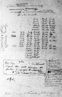
On the first construction of the periodic table of elements:
On February 17, 1869, right after breakfast, and with a train to catch later that morning, Mendeleev set to work organizing the elements with his cards. He carried on for three days and nights, forgetting the train and continually arranging and rearranging the cards in various sequences until he noticed some gaps in the order of atomic mass. He later recalled, “I saw in a dream, a table, where all the elements fell into place as required. Awakening, I immediately wrote it down on a piece of paper.” (Strathern, 2000) He named his discovery the “periodic table of the elements.”
I sometimes wonder what they will say about current visualization work a couple of centuries from now. At what point will the historians say, “This is when visualization crashed and burned, never to be seen again.” Or, maybe it’ll go the other way: “This is when everyone understood and communicated with data, and visualization was the vehicle to do it.”


 Visualize This: The FlowingData Guide to Design, Visualization, and Statistics (2nd Edition)


