Baseball’s batting lineup has changed from what seemed to make sense to what…
Results for baseball
-

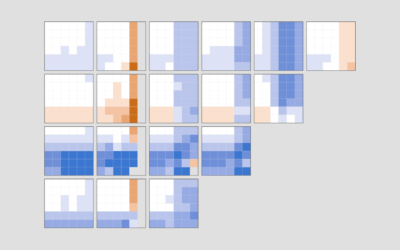
Reordered baseball lineup over decades
-
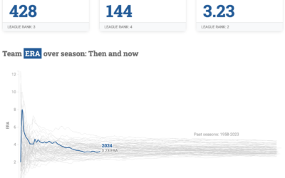
Dashboard for L.A. Dodgers baseball
To keep track of performance, Matt Stiles made the Dodgers Data Bot, which…
-
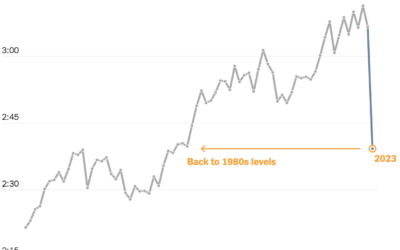
Shortening baseball games
Baseball games grew longer over the decades, with the average length well over…
-
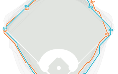
Comparing home run in distance different stadiums
In Major League Baseball, a player hits a home run when the ball…
-
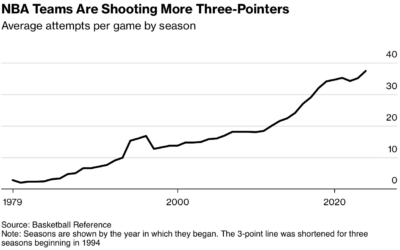
Optimizing basketball, too much
For Bloomberg, Ira Boudway reports on NBA basketball going too far with the…
-
Members Only
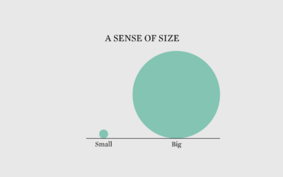
Scale of Things
Whether a difference seems big or small, important or not, depends on the scale you choose.
-
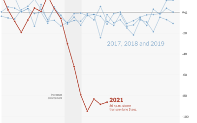
Falling spin rates in baseball after rule enforcement
NYT’s The Upshot analyzed spin rate on pitches before and after enforcing a…
-

Chartball is sports data visualized in a playful way
With Chartball, Andrew Garcia Phillips has visualized sports data for a while, publishing…
-
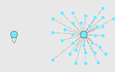
Machine learning to steal baseball signs
Mark Rober, who is great at explaining and demonstrating math and engineering to…
-
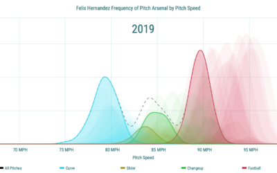
Pitch speed distribution, a decrease with age
Pitch speed starts to decrease with a baseball player’s age at some point.…
-

All the Foreign Bodies That Got Stuck
Many things get stuck in people’s bodies. This is the percentage breakdown for the most common objects that end up in the emergency room.
-
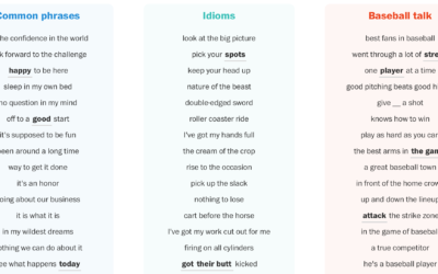
Counting baseball cliches
Post-game sports interviews tend to sound similar. And when you do say something…
-
Members Only
Visualization for Analysis vs. Visualization for an Audience (The Process #59)
The visualizations are used and read differently, which requires that you approach their design differently.
-
Members Only
Visualization Tools and Resources, July 2019 Roundup (The Process #50)
Every month I collect useful visualization tools and resources. Here’s the good stuff for July.
-

Little League baseball analytics that would change the game forever
Oh. So that’s why I was always placed in right field that one…
-
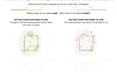
Umpire strike zone changes to finish games earlier
When watching baseball on television, we get the benefit of seeing whether a…
-
Members Only
Making Comparisons Easier When Presenting Data (The Process #40)
Visualization is all about making comparisons. If you have nothing to compare to, then the chart fails. In this issue I describe some of the ways you can make your charts more comparable.
-
Basketball Stat Cherry Picking
Wow your friends during the game with random win percentages, based on various player stats.
-
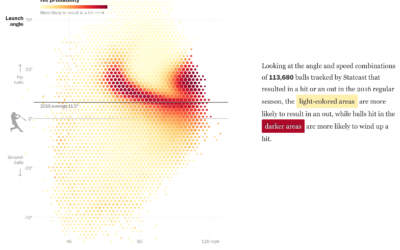
Baseball hitting angles on the rise
After the crackdown on performance-enhancing drugs, home runs in professional baseball dipped the…
-
Statistical detection of potential child abuse cases
Dan Hurley, reporting for The New York Times, describes the use of statistical…
Recently for Members
Second Edition
 Visualize This: The FlowingData Guide to Design, Visualization, and Statistics (2nd Edition)
 Visualize This: The FlowingData Guide to Design, Visualization, and Statistics (2nd Edition)
New tools, refined process.
Browse by Chart Type See All →


