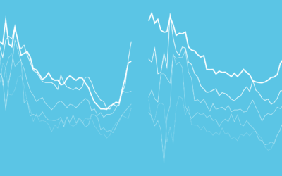
Line Chart
Typically used to show trends over time, the slope of the line between two points shows patterns of change.
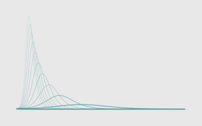
How to Flatten the Curve, a Social Distancing Simulation and Tutorial
Using R, we look at how your decreased interaction with others can help slow the spread of infectious diseases.
How to Make Line Charts in Python, with Pandas and Matplotlib
The chart type can be used to show patterns over time and relationships between variables. This is a comprehensive introduction to making them using two common libraries.
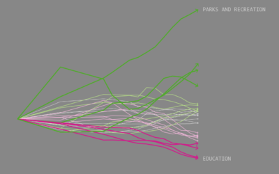
Occupation Growth and Decline
We looked at shifts in job distribution over the past several decades, but it was difficult to see by how much each occupation group changed individually. This chart makes the changes more obvious.

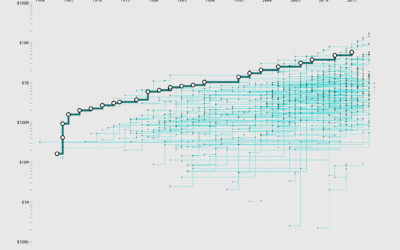
Saving for Retirement and Age
People tend to have more money saved up over time, but range and variation also grow, and often it’s not enough.
How to Make Baseline Charts in R
By shifting the baseline to a reference point, you can focus a line chart on relative change, which can improve the visibility of smaller categories.
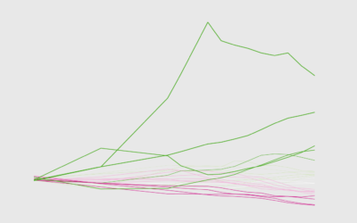
Bachelor’s Degree Movers
As industries change and interests shift, some bachelor's degrees grow more popular while others become less so.
Billions at the Franchise Box Office
There's big money in wizarding worlds, galaxies far away, and various time-shifted universes. Let's take a stroll through the billions of dollars earned by franchises over the years.

Goodbye, Mid-Range Shot
There's a space on the basketball court called "mid-range." It's actually not off-limits. In fact, people used to shoot these so-called "mid-range" shots.

Ask the Question, Visualize the Answer
Let's work through a practical example to see how asking and answering questions helps guide you towards more focused data graphics.

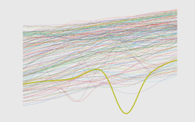
Visualizing Patterns on Repeat
Things have a way of repeating themselves, and it can be useful to highlight these patterns in data.

How to Make (and Animate) a Circular Time Series Plot in R
Also known as a polar plot, it is usually not the better option over a standard line chart, but in select cases the method can be useful to show cyclical patterns.
Days Without a Mass Shooting
Unfortunately, while of varying magnitude, mass shootings are somewhat regular in the United States.
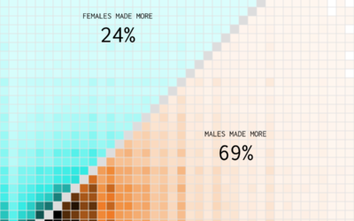
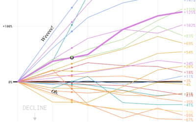
Who Earns More Income in American Households?
Compared to 1970, a shift towards women making the higher income.
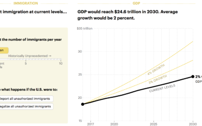
Boost economy with immigration
Want to increase the GDP? Easy. Let more immigrants in. Lena Groeger for…
How to Make Animated Line Charts in R
Sometimes it's useful to animate the multiple lines instead of showing them all at once.
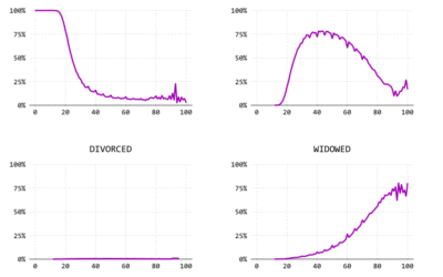
Marrying Later, Staying Single Longer
Using a century of data, we watch the shift of marital status in the United States.

How to Make a Multi-line Step Chart in R
For the times your data represents immediate changes in value.
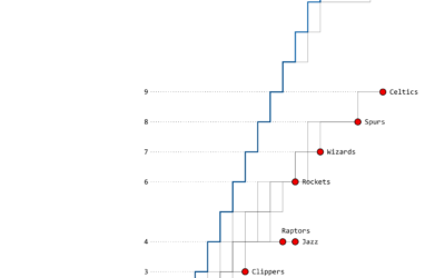
The Warriors’ Championship Path
As expected, this time, the Golden State Warriors won the championship last night.…