Heatmap
Cells or bins are colored based on data. As with all visualization types that use color as the main visual encoding, choose shades carefully.
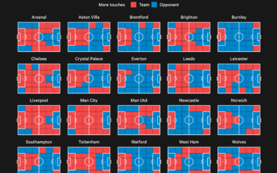
Premier League territory control
The Athletic charted territories on the field to show whether the team of…
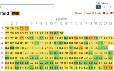
Heatmap of average IMDb ratings for all the shows
Inspired by a graphic on Reddit, Jim Vallandingham expanded the format for all…
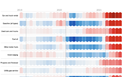
Inflation isn’t that exciting
For NYT Opinion, Josh Bivens and Stuart A. Thompson argue that you don’t…
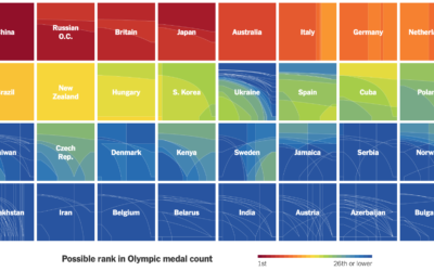
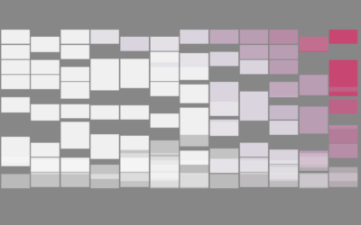
How countries ranked by Olympic medal counts
Ranking countries by medal count change depending on how much value you place…
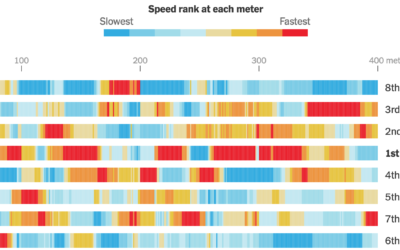
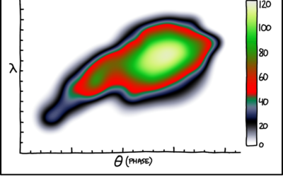
Calculating swim speeds
The New York Times charted speed ranks during the women’s 4×100 freestyle relay.…

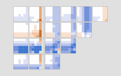
Where chess pieces are most often captured
Reddit user desfirsit made heatmaps to show where on the chess board pieces…
How to Make a Heatmap in Excel
Heatmaps quickly translate data tables into a visual form, making them a great tool to explore a new dataset.
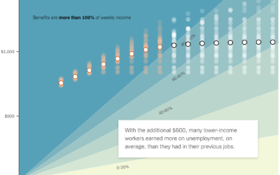
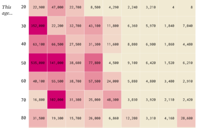
If the unemployed lose $600 per week
A $600 per week benefit expires for the unemployed at the end of…

Sleep Schedule, From the Inconsistent Teenage Years to Retirement
From the teenage years to college to adulthood through retirement, sleep is all over the place at first but then converges towards consistency.
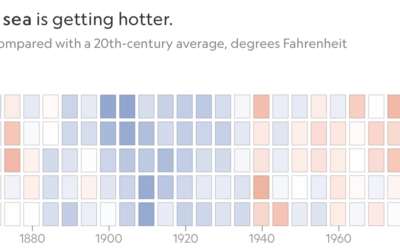
Increasing ocean temperatures, decreasing ice
For National Geographic, Kennedy Elliot made a series of heatmaps that show the…

How People Meet Their Partners
"So how'd you two meet?" There's always a story, but the general ways people meet are usually similar. Here are the most common.

Goodbye, Mid-Range Shot
There's a space on the basketball court called "mid-range." It's actually not off-limits. In fact, people used to shoot these so-called "mid-range" shots.
How to Make Animated (GIF) Heatmaps in R
Using color as the visual encoding, show changes over time in two dimensions.
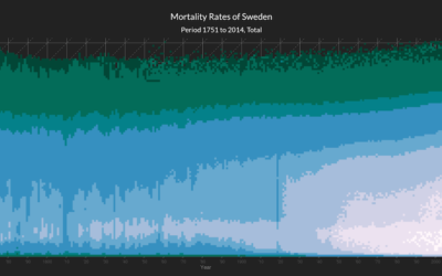
Heatmap shows deaths by age in different countries
This interactive heatmap by Jonas Schöley shows mortality rates by age. Just use…
Shifting Causes of Death
The most common causes of death changed over the years. They vary across sex and age group. This animation shows the details of these changes.

Visualizing Patterns on Repeat
Things have a way of repeating themselves, and it can be useful to highlight these patterns in data.
Basketball Stat Cherry Picking
Wow your friends during the game with random win percentages, based on various player stats.
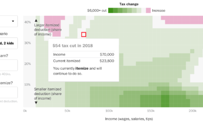
Tax calculator that considers where you live
Here’s a different look at tax cuts and increases from Reuben Fischer-Baum for…