Visualization
Showing the stories in data through statistics, design, aesthetics, and code.

A data visualization magazine
Nightingale is a publication from Data Visualization Society that offers more depth for…
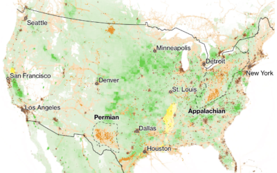
Reducing methane to slow climate change
We often hear about increased CO2 in the context of global warming. Hayley…
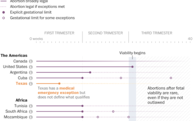
Comparing abortion limits in the U.S. against other countries
The Washington Post, in an effort that I’m sure took more energy and…
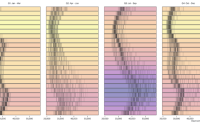
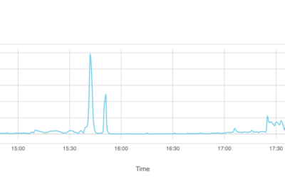
Visualizing time-based data
Zan Armstrong, Ian Johnson, and Mike Freeman for Observable wrote a guide on…
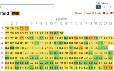
Heatmap of average IMDb ratings for all the shows
Inspired by a graphic on Reddit, Jim Vallandingham expanded the format for all…
How Facebook disappeared from the internet
Cloudflare describes how things looked from their point of view the day that…

Visual guide for protecting your home from wildfire
Aaron Steckelberg and Tik Root for The Washington Post provide a visual guide…
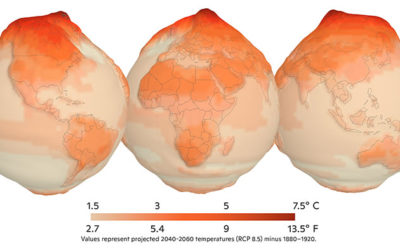
Mapping climate change in the Arctic
UnstableGround is a project from the Woodwell Climate Research Center that focuses on…

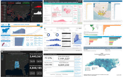
Assessment of the Covid-19 dashboards
Researchers evaluated 158 Covid-19 dashboards, assessing design, implementation, and usefulness. Marie Patino for…
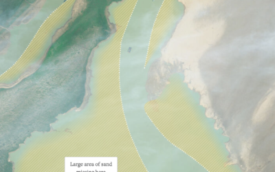
Sand mining viewed from above
Poyang Lake is China’s largest freshwater lake, but sand mining has changed its…

A flag planted for every Covid-19 death
In fall 2020, Suzanne Brennan Firstenberg planted a flag for each American who…
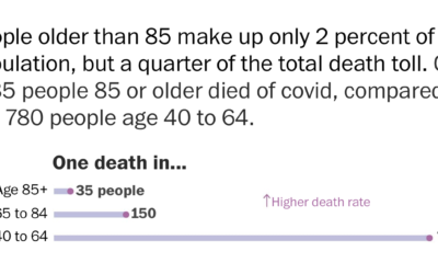
Using rates for more relatable Covid-19 numbers
With millions of Covid-19 deaths worldwide, and hundreds of thousands in the US,…
Data visualization activities for kids
Nightingale has a kid’s section with printable visualization activities. Get the kids started…
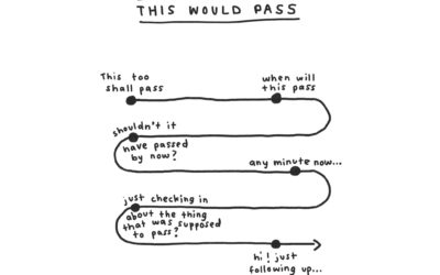
Humorous charts to organize thoughts
When I’m feeling confused about what’s going on around me, I gravitate towards…
Beautiful News, a book charting the good things in the world
From David McCandless and team, who you might know from such books as…
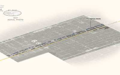
Black neighborhoods split by highways
Rachael Dottle, Laura Bliss and Pablo Robles for Bloomberg on how urban highways…
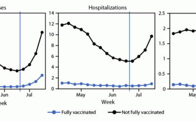
Cases, hospitalizations, and deaths for vaccinated vs. unvaccinated
The CDC released a chart that shows case, hospitalization, and death rates for…