Visualization
Showing the stories in data through statistics, design, aesthetics, and code.
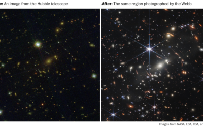
Why the galaxy pictures from the Webb telescope are pretty cool
The first public picture from the James Webb telescope is kind of cool…
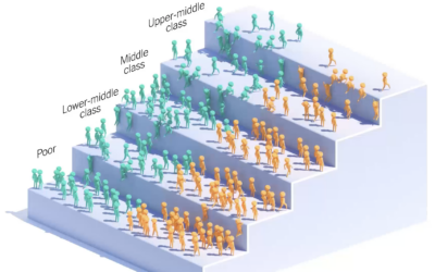
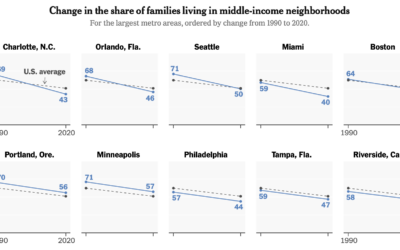
Income ladder for the children of immigrants
You’ve probably seen the moving bubbles that show how something changes over time.…

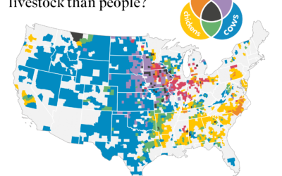
Where there is more livestock than people in the United States
The United States Department of Agriculture provides annual inventory data on livestock, crops,…
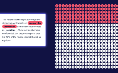
Money distribution for streaming music
From the listener perspective, we pay our monthly or annual fees and just…
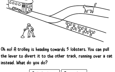
Absurd trolly problems
You’ve probably heard of the trolley problem, a thought experiment that imagines a…
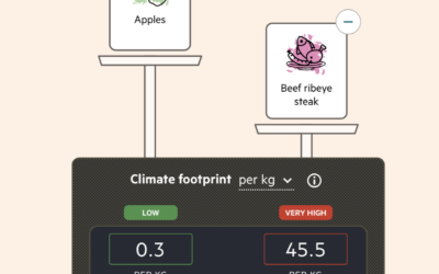
Imagining carbon food labels
By purchasing certain foods, we make decisions about the carbon footprint from the…
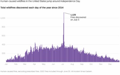
Wildfires caused by fireworks
It’s Independence Day here in the United States, which means there will be…
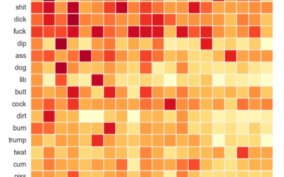
Analysis of compound curse words used on Reddit
As you know, Reddit is typically a sophisticated place of kind and pleasant…
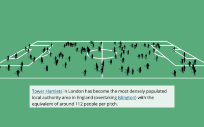
Football field to show population change in the UK
The Office for National Statistics for the UK published an interactive to show…
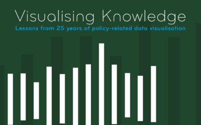
Visualising Knowledge
Visualising Knowledge is an open book from PBL Netherlands Environmental Assessment Agency, based…
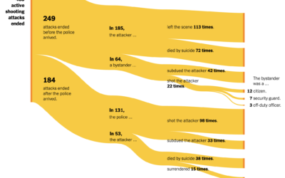
Active shooter endings
For The New York Times, Larry Buchanan and Lauren Leatherby used Sankey diagrams…
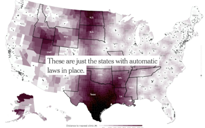
Increased distance to the nearest clinic
With Roe vs. Wade in place, there were areas in the United States…
Diagram of watercolors from the 17th century
In 1692, artist A. Boogert published a guide to watercolors, showing the thousands…
Mapping the boundaries of history
While geographic boundaries can often seem like a semi-static thing, they’ve changed a…
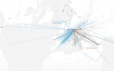
Shifting flight paths for wealthy Russians
For The New York Times, Pablo Robles, Anton Troianovski, and Agnes Chang mapped…