Visualization
Showing the stories in data through statistics, design, aesthetics, and code.

The future of self-service banking
Too many slots. Too many buttons. Spanish bank BBVA and design consultancy IDEO…
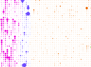
Social life of Foursquare users mapped
Foursquare, the location-based social network, lets people share their location with others in…
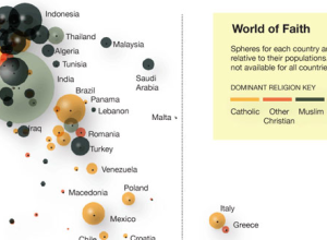
Faith and poverty in the world
Using data from a recent Gallup report showing a correlation between wealth and…
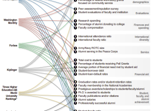
Various ways to rate a college
There are a bunch of college ratings out there to help students decide…

Tracking firefly trails in the forest
Physicist Kristian Cvecek hangs out in the forest sometimes to take these beautiful…
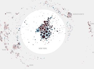
Mapping the moves of New York residents
A couple of months back, WNYC’s The Brian Lehrer Show asked listeners who…
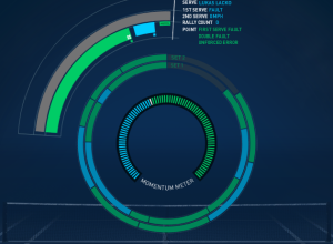
Real-time match display for the US Open
The tennis US Open is in full swing, and since you’re at work,…

What different sorting algorithms sound like
Last month we saw sorting algorithms visualized in rainbow technicolor. Now, by Rudy…

A house that knows when you’re happy and sad
Auger Loizeau, in collaboration with Reyer Zwiggelaar and Bashar Al-Rjoub, describe their smart-home…

The beauty of data visualization
Connoisseur of scaled rounded rectangles, bubbles, and triangles, David McCandless of Information is…

Asteroid discoveries over past 30 years visualized
This animation by Scott Manley of the Armagh Observatory shows a beautiful view…
Icons of the Web scaled by popularity
Nmap visualizes site popularity as scaled icons. Favicons, that is. They’re that little…
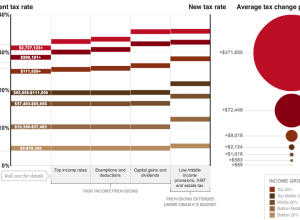
How tax breaks could affect your bottom line
Wilson Andrews and Alicia Parlapiano report for The Washington Post on how the…
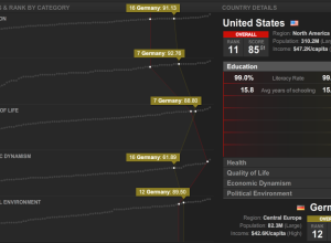
Countries of the world ranked by stuff
What country has the best education? Health? Quality of life? Thomas Klepl and…
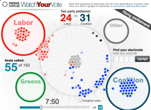
Election night in Australia relived
It was election night a few days ago in Australia, and News.com.au ran…
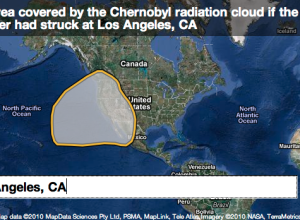
If major environmental disasters happened in your neighborhood…
When major environmental disasters occur, thousands of people are often affected, but it’s…
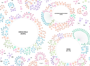
Pseudo-variety and ownership of the soft drink industry
When you buy soft drinks and other beverages at the grocery store, most…