Visualization
Showing the stories in data through statistics, design, aesthetics, and code.
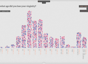
The Sexperience 1000 shows a (statistical) view of what goes on in the bedroom
The bedroom is a private place, and what goes on in the bedroom…
Statistical Graphics and Information Visualization
The two differ in who uses them, how they are used, and who…
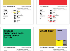
Rethinking the food nutrition label
The food nutrition label is on almost every food item, but it can…

Data visualization freelancing
In an interview with Enrico Bertini, Moritz Stefaner, whose work you’ll probably recognize,…
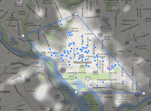
Find popular places to stay with Google Hotel Finder
When you’re picking a hotel to stay at in an area you don’t…
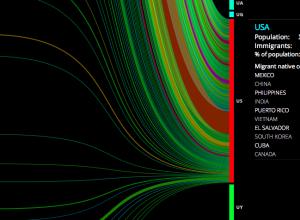
People moving
Hundreds of thousands of people immigrate every year, with some countries seeing higher…
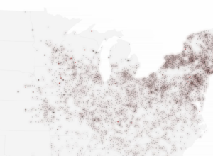
US post offices spreading over time, 1700 to 1900
Using data from the USPS Postmaster Finder and the USGS Geographic Names Information…
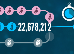
Why Census matters to you
Census is any country is important in making major policy decisions and can…
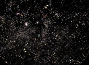
Fly through a survey of the universe
Paul Bourke, a research professor at the University of Western Australia, provides us…
Digital spotlights on landmarks
Think about when you take a picture of something. It’s kind of like…

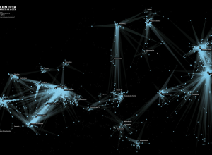
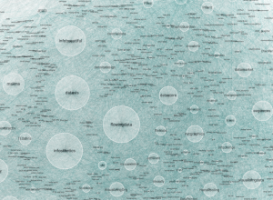
How tech companies are interconnected
Sarah Kessler and Nick Sigler examine the interconnectedness between major tech companies. I…
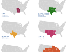
If the world lived in a single city
World population is estimated to be 6.9 billion people, and while that is…
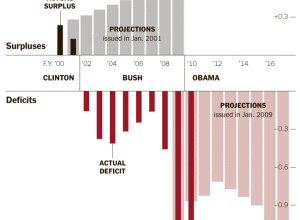
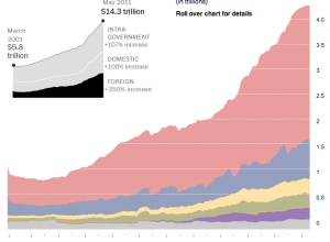
All the countries that the US owes money to
In May 2011, the United States owned $14.3 trillion in debt. A lot…