Visualization
Showing the stories in data through statistics, design, aesthetics, and code.
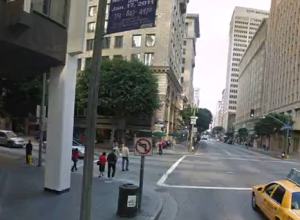
Data reenactment via stolen iPhone
Remember when Joshua Koffman was posting pictures of the guy who had this…
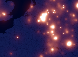
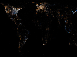
iPhone fireflies across the Europen sky
A few months ago there was a lot of hoopla around the iPhone…
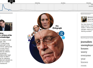
News of the World scandal unfolding on Twitter
All kinds of crazy with News of the World went down this past…

Netflix favorites by location
If you have Netflix, you know that there’s a section for local favorites,…
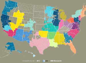
Community connections via SMS and phone call data
We often think of communities in the framework of government-set boundaries, but relationships…
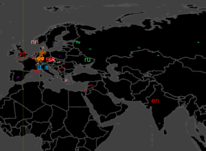
Flickr and Twitter mapped together – See Something or Say Something?
For all the maps by Eric Fischer I’ve posted, it’s amazing how little…
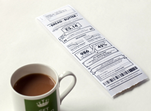
Sales receipt redesign
Design firm Berg rethinks the everyday sales receipt under the premise that registers…
The History of Cartography →
Complete Volume 1 from 1987, available for free…
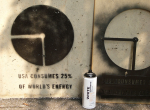
Takin’ data to the streets. Word.
Whenever I’m out late at night with my bottle of black spray paint…

Anatomy of a computer virus explained
Motion designer Patrick Clair tells the story of Stuxnet, “a Microsoft Windows computer…

Elements of Happiness: A happy life depicted in diagrams
For several decades, Harvard Laboratory of Adult Development has chronicled the lives of…

Average color of NYC skies, every five minutes
The color of the sky changes through the day and into the night…
Imagining the future of information graphics
While information graphics have been around for decades, their current form is brand…
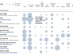
Words used in commencement speeches
If you’ve visited YouTube in the past couple of weeks, you’ve probably noticed…
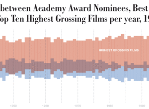
Award-nominated movies vs. highest grossing
Dorothy Gambrell of very small array continues with her fascination of movie quality…