Visualization
Showing the stories in data through statistics, design, aesthetics, and code.
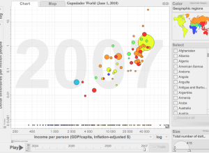
Gapminder makes its way to the desktop
You’ve seen the presentation. You’ve seen the motion graph tool. But up until…
How data travels from phone to computer
Time Warner Cable explains how a picture travels from Jeff’s phone to Vijay’s…
Flowchart to lifelong happiness
The secret to lifelong happiness. If only it were so easy. [Typcut via…
Flowchart shows the startup business cycle
Technology and investment group HackFwd describes what it’s like to work with them…
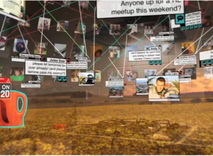
Augmented reality taken to the extreme
Augmented reality, a computer trick to place the virtual within the real world,…
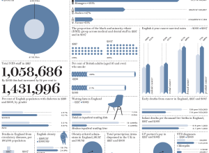
How Britain has changed since 1997
Prospect Magazine takes a look at how Britain has changed by the numbers…
JavaScript InfoVis Toolkit 2.0 released
Visualization in JavaScript is all the rage these days. Just a couple of…
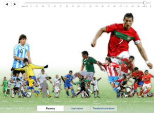
Top World Cup players on Facebook
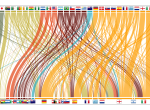
I always know when something exciting happens in the World Cup when my…
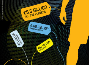
Challenge: What is a FIFA player’s worth?
I really want to like this graphic on the “worth” of FIFA players.…
Mapping what your neighborhood used to look like
In part of their initiative to get young and old people to hang…
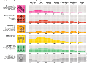
Who participates online, by age
Arno Ghelfi for Businessweek reports on who’s doing what online, separated by age.…
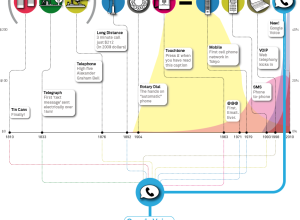
Modern history of human communication
With the announcement of Google Voice for everyone, the big G describes the…
Texting volume during World Cup matches
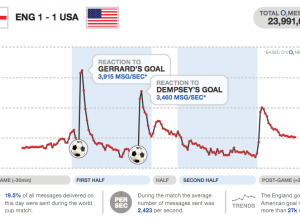
I love how major sporting events can captivate an entire country or region,…
Education crisis explained in motion graphics
Buck, in collaboration with TakePart and An Inconvenient Truth director, Davis Guggenheim, describe…

