Visualization
Showing the stories in data through statistics, design, aesthetics, and code.
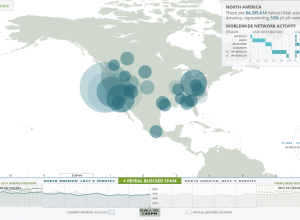
Visualizing Yahoo email in real-time
Hundreds of thousands of emails are sent every second, and yet, you wouldn’t…
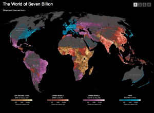
Where people don’t use Facebook
Remember the Facebook connections map from a while back? It showed digital friendships…
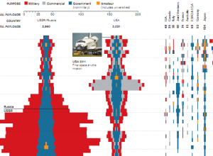
Space launches over time
With the end of NASA’s human spaceflight program, Tommy McCall and Mike Orcutt…
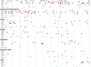
Nobel laureates by country and prize
Nobel Prizes have been awarded every year since 1901. Where are all the…


Picturing the creative process
The creative process changes by person and project, but there are obstacles and…
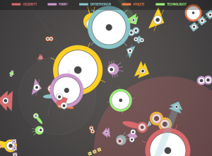
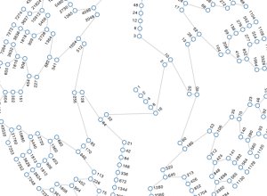
Twitter users as organisms, Tweetures
Twitter is a bustling place of tweets, retweets, and replies, and the growth…
Kill Math makes math more meaningful
After a certain point in math education, like some time during high school,…
All numbers lead to one
In 1937, mathematician Lothar Collatz proposed that given the following algorithm, you will…
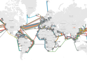
Submarine cable system connecting the world
TeleGeography maps underwater cables that connect countries and continents:
TeleGeography’s free interactive submarine…
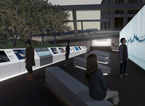
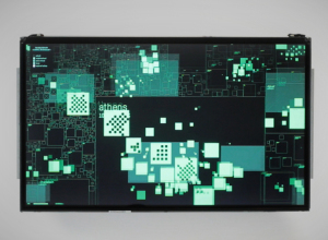
Live data wall and immersive film at THINK exhibit
The THINK exhibit from IBM just opened up at Lincoln Center in New…
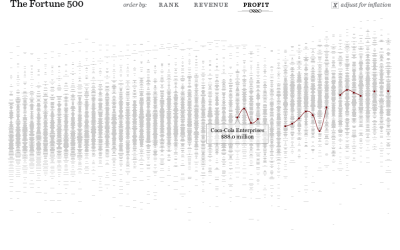
The Fortune 500, 1955 to 2010
Since 1955, Fortune Magazine has published a list of America’s 500 largest companies.…
Deleted Geocities archive visualized as city
In a time long ago, there existed a place on the Internet called…
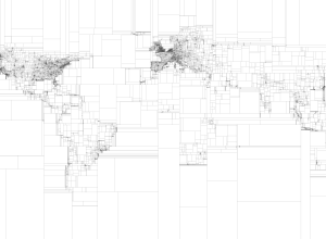
Rectangular subdivisions of the world
Eric Fischer, who continues his string of mapping fun and doesn’t even do…

Musical spectrum analysis
Jon-Kyle Mohr visualizes the musical spectrum of a song in this mesmerizing video.…

Imager shows cross-sections of everyday objects – analog version
GE shows how their body imaging technology can take detailed pictures of insides…