Visualization
Showing the stories in data through statistics, design, aesthetics, and code.
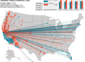
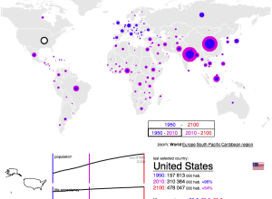
American migration map
Overhauling his migration map from last year, Jon Bruner uses five year’s worth…

24 hours of Flickr photos printed to fill a room
People upload thousands of pictures to Flickr every day, but the numbers and…

Time-lapse of Earth from International Space Station
Beautiful time-lapse video using photographs from crew onboard the International Space Station. I…
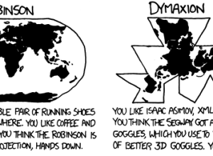
What your favorite map projection says about you
For the map nerds. xkcd says what your favorite map projection says about…
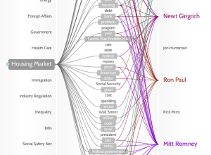
Politilines shows what candidates talk about during debates
If you don’t watch the candidate debates — and let’s face it, that’s…

Manual data design from Stefanie Posavec
Designer Stefanie Posavec talks about her process of data collection, analysis, and design.…
Microsoft envisions the near future in technology and interaction
In a follow-up to last year’s visions of the future, Microsoft imagines interacting…
How we got to a population of 7 billion
NPR explains how we reached a population of 7 billion. Simply put, the…
7 billion people in the world: past, present and future
According to estimates from the United Nations Population Division, there are now over…

Horrors coming to each state this Halloween
So many movies, so many creepy crawlies that go bump in the night.…
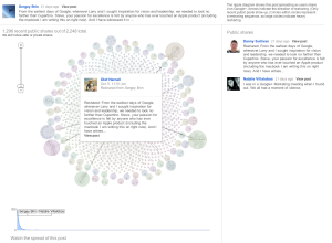
Google+ Ripples show influence and how posts are shared
Posts and links get shared over and over again, but we usually don’t…
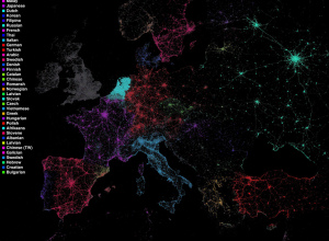
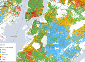
Language communities of Twitter
Eric Fischer maps language communities on Twitter using Chrome’s open-source language detector. Each…
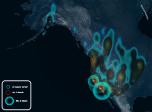
NASA maps a decade of fires, a global tour
Using satellite data that goes back to 2002, NASA maps tens of millions…
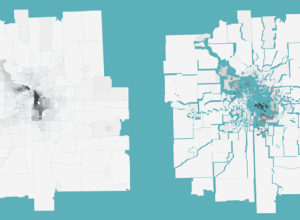
Racial divide mapped with spacial rifts
Jim Vallandingham maps racial divide in major cities using Mike Bostock’s implementation of…

Facebook connections displayed in physical space
For Facebook’s F8 developer conference, creative agency Obscura Digital delivered the Connections installation.…
Geographic data doesn’t always have to be mapped
Matthew Ericson, deputy graphics director at The New York Times, talks maps and…