Visualization
Showing the stories in data through statistics, design, aesthetics, and code.
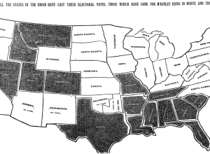
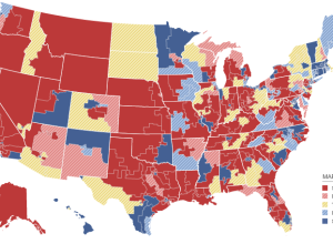
The very first NYT election map
Matthew Ericson, deputy graphics director of The New York Times, dug through the…
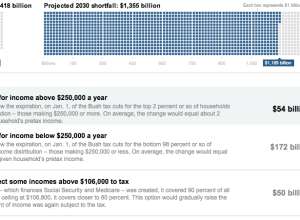
You fix the budget puzzle
Not pleased with how the government is handling the budget and deficit? Fine.…
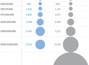
Comparison of Republican and Democratic tax plans
Lori Montgomery of the The Washington Post reports on the difference between the…

Algorithmic architecture with balls
Geometric Death Frequency-141 by Federico Diaz is an algorithm-based sculpture at MASS MoCA,…
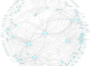
Mexican drug cartel network map
I’m not entirely sure what we’re looking at here, other than relationships between…
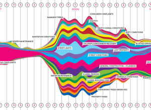
What New Yorkers complain about
Wired, in collaboration with Pitch Interactive, has a look at complaints called in…
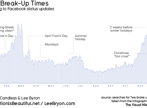
When people break up, according to Facebook updates
For his book The Visual Miscellaneum, David McCandless, along with Lee Byron, had…
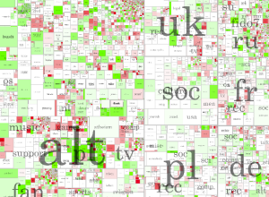
Review: Atlas of Science, Visualizing What We Know
Katy Börner, professor of information science, catalogs visualization and science in Atlas of…
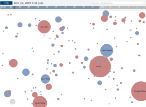
Keeping an eye on election results
All eyes here in the states will be on election results tonight, and…
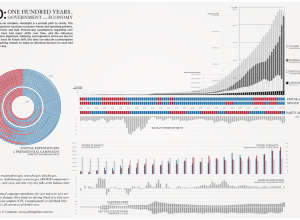
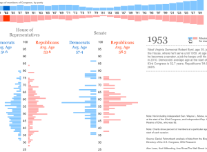
Past century of government and economy
John Palmer has a look at the past 100 years of government and…
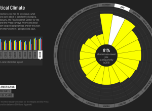
Issues Americans care about
Every year the Pew Research Center asks Americans what their top political priority…
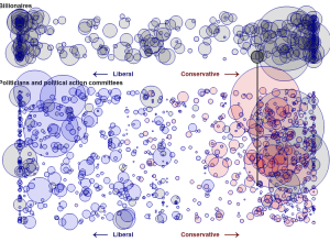
Billionaires’ favorite politicians
Jon Bruner for Forbes reports on billionaire contributions to politicians over the past…
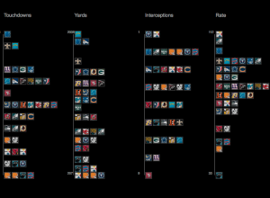
Visualizing NFL statistics
Sports statistics. Always so many tables. Juice Analytics takes a more visual approach…
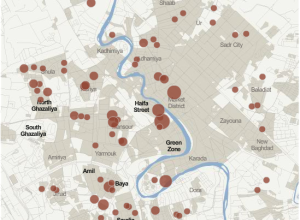
Iraq War logs released by Wikileaks shed new light
This past Friday, Wikileaks released a second batch of reports on Iraq:
At…
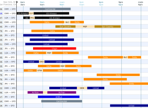
Find your flight via visual interface
Booking flights became so much easier when it all shifted online, but it…