Visualization
Showing the stories in data through statistics, design, aesthetics, and code.
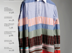
Picturing social order
Gareth Holt designed several charts and graphs for Rank: picturing the social order…
Similarities between PhD dissertations
Certain fields of study tend to cover many of the same topics. Many…
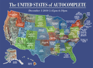
The United States of Autocomplete
Very Small Array has some fun with Google’s autocomplete. Utah… Jazz. Kentucky… Fried…
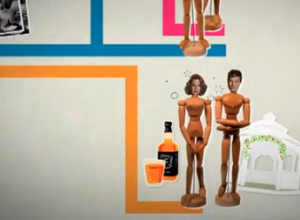
Relationships on the Bold and the Beautiful explained
I don’t get soap operas. People get married, divorced, evil twins show up,…
Amanda Cox on data graphics and stuff
At New Media Days 2010, New York Times graphics editor Amanda Cox talks…
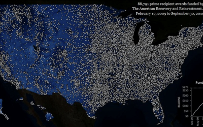
Awards from Recovery and Reinvestment Act
Between February 17, 2009 to September 30, 2010, 88,791 awards have been funded…
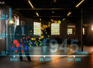
The Joy of Stats with Hans Rosling
The Joy of Stats, a one-hour documentary, hosted by none other than the…
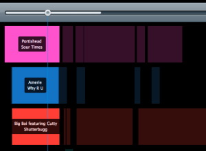
Girl Talk mashup breakdown visualized
In case you missed it, Girl Talk recently released his fifth album All…
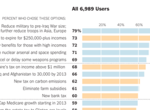
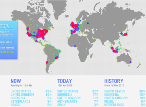
How Twitter users balanced the budget
In a follow-up to their puzzle to balance the budget, The New York…
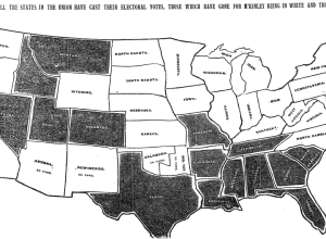
Evolution of the two-party vote during past century
Political science PhD candidate David Sparks has look at the evolution of the…
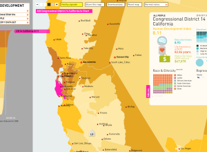
Mapping human development in America
In work with the American Human Development Project, Rosten Woo and Zachary Watson…
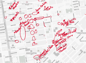
Defining neighborhoods with map scribbles
TenderMaps brings an informal approach to highlighting the parts of neighborhoods:
We wanted…
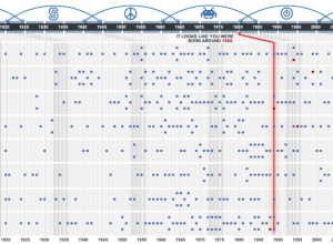
What generation do you belong to?
In this interactive, USA Today guesses your age, based on what influenced you…
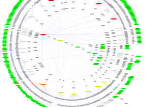
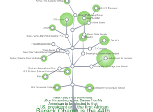
Why network visualization is useful
AT&T Labs’ Infoviz research group describes network graphs and their many uses:
There…
The very first NYT election map
Matthew Ericson, deputy graphics director of The New York Times, dug through the…