Visualization
Showing the stories in data through statistics, design, aesthetics, and code.
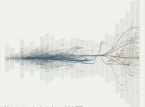
Visualizing citations in research literature
From Autodesk Research, Citeology is an interactive that visualizes connections in academic research…
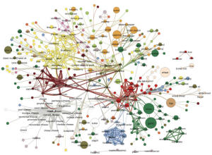
Backbone of the flavor network
Food flavors across cultures and geography vary a lot. Some cuisines use a…
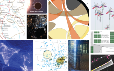
The Best Data Visualization Projects of 2011
I almost didn’t make a best-of list this year, but as I clicked…
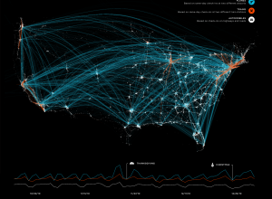
Mapped: Transportation check-ins on foursquare
Transportation check-ins on foursquare. This is from this past Thanksgiving, but relevant again…
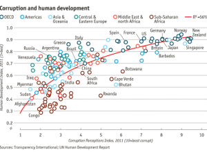
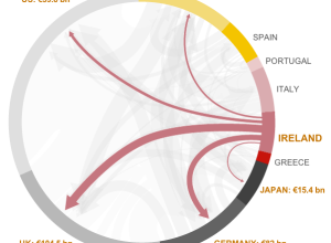
Corruption versus human development
Transparency International released annual data for the Corruption Perceptions Index. The Economist plotted…
Bach Cello Suites visualized
As a resident at Eyebeam, Alexander Chen visualizes the first Prelude from Bach’s…
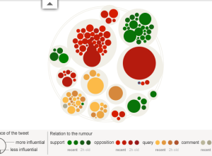
Rise and fall of riot rumors on Twitter
During the riots in London this past summer, a lot of information spread…
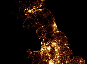
Every death on the road in Great Britain
As part of their series on road accidents, BBC News mapped every recorded…
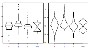
40 years of boxplots
Famed statistician John Tukey created the boxplot in 1970. It shows a distribution…
What seven billion people looks like
Form design intern at Fathom, James Grady, maps population density in Dencity:
Dencity…
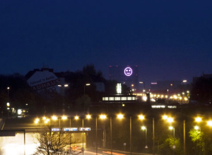
Smiley installation shows the mood of a city
Project Stimmungsgasometer (say what?) is a giant smiley face that changes based on…
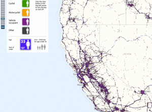
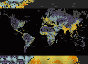
US road fatalities mapped, 9 years
For The Guardian, ITO World maps about 370,000 road-related deaths from 2001 through…

Google Streetview stop motion
Address is Approximate by Tom Jenkins tells the story of a lonely desk…
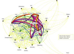
What topics science lovers link to the most
Hilary Mason, chief scientist at bitly, examined links to 600 science pages and…

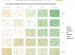
Public opinion of the Occupy movement
To get a gauge of public opinion and the Occupy movement, The New…