Visualization
Showing the stories in data through statistics, design, aesthetics, and code.
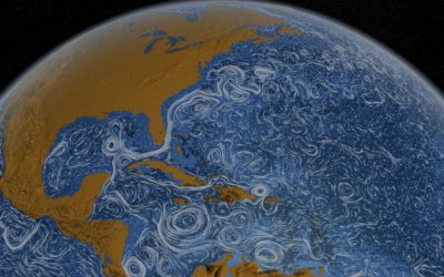
Perpetual Ocean
Using a computational model called Estimating the Circulation and Climate of the Ocean,…
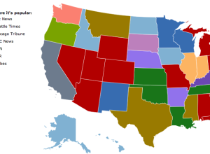
What News Sites People are Reading, by State
Jon Bruner of Forbes, in collaboration with Hilary Mason and Anna Smith of…
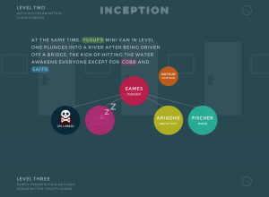
Inception Explained in Animated Infographic
Designer Matt Dempsey explains the storyline of Inception in this fun experiment. There…
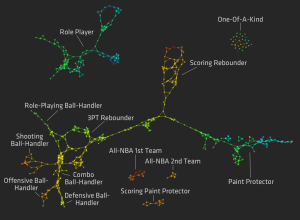
Redefining NBA Basketball Positions
For the MIT Sloan Sports Analytics Conference a few weeks ago, Stanford biomechanical…
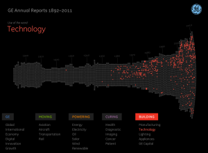
Innovation History via 6,000 Pages of Annual Reports
Fathom Information Design, in collaboration with GE, visualizes GE annual reports from 1892…
Evolution of the Hawaiian Star, 1893 to 1912
UC San Diego student Cyrus Kiani animates 5,930 front pages from The Hawaiian…
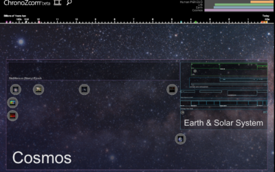
Visualizing the History of Everything
Big History is a field of study that crosses multiple disciplines such as…
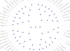
March Madness power rankings
With NCAA March Madness in full swing, the basketball graphics are out in…
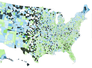
Comparing heritage in the Melting Pot
At first I thought this map, by David Yanofsky for Bloomberg, was your…
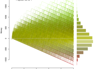
Odds of losing in roulette
Jay Jacobs has some fun with roulette simulations and explores the odds of…
Generative art portrays beauty in movement
Heading towards the 2012 Olympics in London, Quayola and Memo Aktenvia translate athletic…
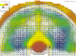
Geography of the basketball court
Kirk Goldsberry, an assistant professor of geography at Michigan State, applies his skills…
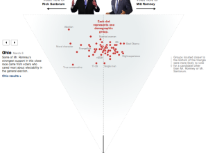
Who voted for Santorum and Romney
As a complement to Shan Carter’s exit poll dancing boxes, The New York…

Geographic news coverage visualized
Kitchen Budapest explores local news coverage in Hungary with sound and a bubbling…