Visualization
Showing the stories in data through statistics, design, aesthetics, and code.
Meshu makes physical objects with your location
Location data typically stays within the realm of online maps and digital check-ins,…
Walt Disney: Story of Menstruation
A previously banned Disney cartoon on menstruation. So informative.
[Thanks, Kevin]…

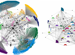
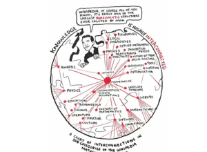
Network diagrams simplified
Network diagrams are notoriously messy. Even a small number of nodes can be…
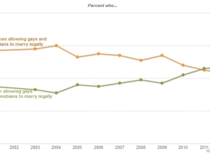
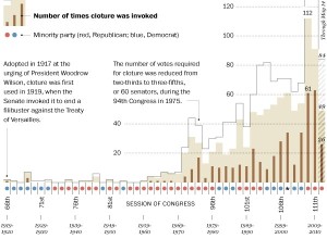
Even simple charts can tell a story
Regardless of your politics, this chart is a great example of how data…
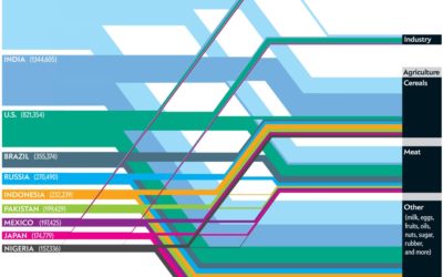
Which nations consume the most water?
This Scientific American article by Mark Fischetti and infographic by Jen Christiansen detail…
Image compositing in TileMill
TileMill is a tool that makes it easy to create interactive maps. Soon…
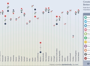
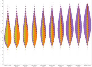
Updated OECD Better Life index
The OECD’s Better Life Index which debuted last year to much fanfare has…
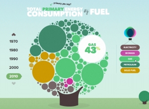
The U.K. energy consumption guide
I’m a sucker for anything cute and bubbly, and the U.K. Energy Consumption…
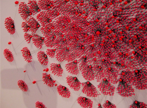
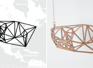
Relational ornaments
Gundega Strautmane, a Latvian textile artist and designer, visualizes social and physical networks…
Good use of pie charts
This Wall Street Journal graphic shows who’s selling (or sold) a percentage of…
Is the filibuster unconstitutional?
Washington Post’s Ezra Klein busts on the filibuster. Gone are the days of…
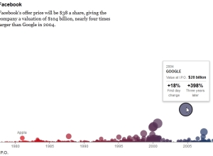
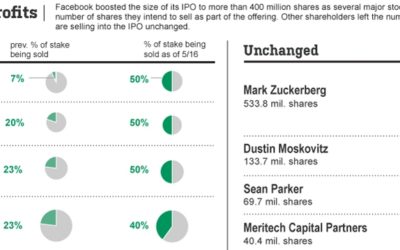
The Facebook Offering: How It Compares
The New York Times does it again with this succinct look at tech…

The Descriptive Camera
The unassuming little Descriptive Camera made me rethink data. This project by Matt…