Visualization
Showing the stories in data through statistics, design, aesthetics, and code.
Mad Men as thousands download via bittorrent
The BitTorrent protocol lets groups of people download parts of a single file…

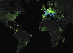
Live flight tracking site shows crash of circling plane
Live flight tracking site FlightAware shows destinations and current routes. It’s everyday stuff…
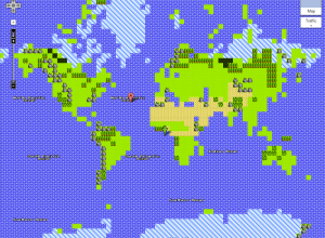
Explore the Solar System like your backyard
Game developer Christopher Albeluhn found himself unemployed, so he started to work on…
Graphs, from paper to pixels
Brian Hayes for American Scientist discusses science publications’ roots in print and the…
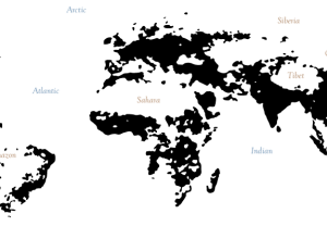
Interactive Islands of Mankind
Geography graduate student Derek Watkins has some fun with population densities in an…
A century of ocean shipping animated
Using hand-recorded shipping data from the Climatological Database for the World’s Oceans, history…
How recruiters look at your resume
In a study by TheLadders (of n equals 30), recruiters looked at resumes…
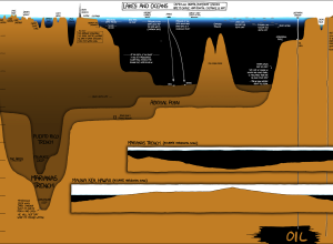
Under the Sea, Under the Sea
In usual xkcd fashion, Randall Munroe plots the depths of lakes and oceans,…

Conducting Demystified
The New York Times, in collaboration with the New York University Movement Lab,…
Explore Geographic Coverage in Mapping Wikipedia
TraceMedia, in collaboration with the Oxford Internet Institute, maps language use across Wikipedia…

GM Uses LEGOs for Visual Management Tool
I thought this was a joke, but it appears GM really is using…

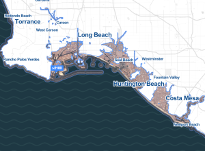
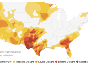
Rising Water Levels in the Immediate Future
Stamen Design, in collaboration with Climate Central, shows major areas that could be…
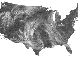
Live Wind Map Shows Flow Patterns
I get kind of giddy whenever I see a tweet from Martin Wattenberg…

Where Campaign Spending is Going to
Making use of data from the Federal Election Commission and The New York…