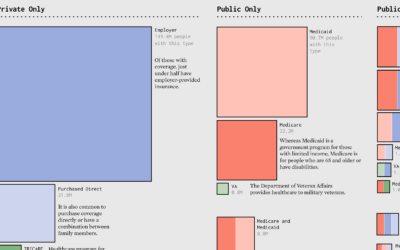
Areas represent total counts and the colors indicate categories. Together, the symbols show the distributions in a population.
Make the Chart
-
Members Only
Make the Chart: Scaled Squares with Color Bands
-
Members Only
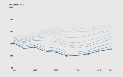
Make the Chart: Interactive Line Chart with Ghost Trails
Using faded lines to show the overall changes in a time series and to provide a point of reference for the present.
-
Members Only
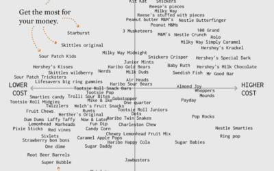
Make the Chart: Scatterplot Using Text Instead of Dots
I made a chart about Halloween candy. Even dumb charts need attention and require that choices are made.
-
Members Only
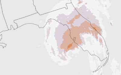
Make the Chart: Precipitation Map as Animated GIF
Weather. Data. Map. Animation. They go well together to show sudden changes over time.
-
Members Only
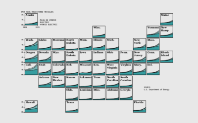
Make the Chart: Grid Map with Stacked Areas
Breaking it down to the small steps and choices with data, code, and editing that lead to a finished chart.

 Visualize This: The FlowingData Guide to Design, Visualization, and Statistics (2nd Edition)


