Interaction designer Christian Swinehart takes a careful look at the popular Choose Your…
Infographics
Telling stories with data and graphics.
-
Choose Your Own Adventure – Watch the Stories Unfold
-
The Future: Embedding Data in the Everyday
Imagine a world where data becomes the everyday, simply embedded in what you…
-
Review: The Visual Miscellaneum by David McCandless
David McCandless’ The Visual Miscellaneum: A Colorful Guide to the World’s Most Consequential…
-
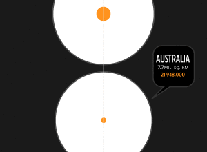
Land Mass and Population by Country
From Herald Daily is this giganto view of land mass and population size…
-
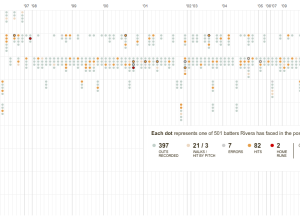
The Pitching Dominance of Mariano Rivera
The New York Yankees just won the World Series. I don’t know much…
-
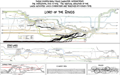
Fictional Character Interactions Over Time
Popular nerd comic xckd takes a look at character interactions over time in…
-
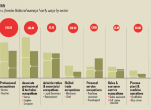
A Land Where Men and Women are Paid Equally
We all know (or at least should know) about the pay gap between…
-
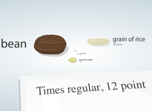
Putting Cell Size in Perspective
It’s hard for us, cognitively speaking, to imagine things that are really really…
-
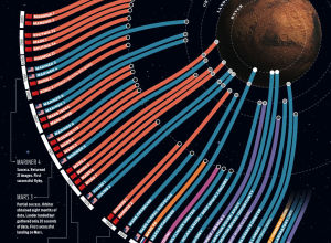
Failed Space Missions to Mars
The above graphic shows missions to mars starting in 1960 to present (top…
-
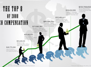
How Much Do CEOs Make in the United States?
GOOD magazine’s most recent transparency contest asked designers to focus their powers on…
-
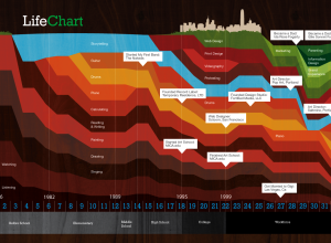
One Life, One Stacked Area Chart
Ben Fogarty uses a stacked area chart to represent his life. To us…
-
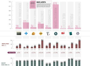
Mass Layoffs by Industry
As we all know, many people, much more than usual, have lost their…
-
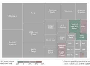
Watch the Giants of Finance Shrink… Then Grow
From Karl Russel and Shan Carter of The New York Times is this…
-
Infographic Music Video on the Elements – They Might Be Giants
It’s not often you get a Grammy-winning band to play a song for…
-
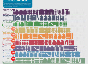
Food Assistance on the Rise
GOOD magazine, in collaboration with Gavin Potenza, takes a look at food assistance…
-
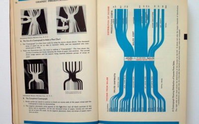
Vintage Infographics From the 1930s
Someone needs to get me a paper copy of Willard Cope Brinton’s Graphic…
-
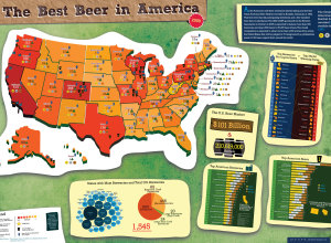
Best Beer in America 2009
Following up from last year’s beer graphic, Mike Wirth looks at medal winners…
-
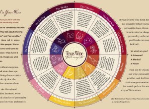
What is Your Wine Personality Profile?
The Texas in a Bottle guide to Texas Wine [pdf] reads:
Ever listen…

 Visualize This: The FlowingData Guide to Design, Visualization, and Statistics (2nd Edition)


