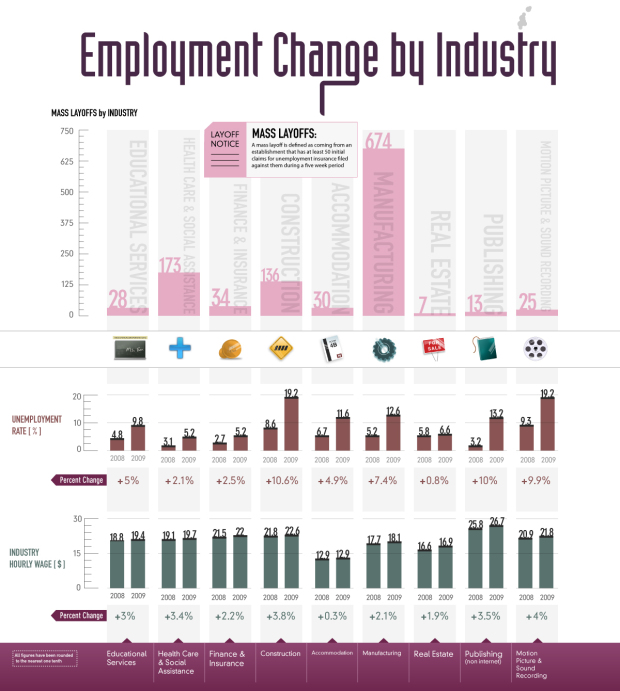
As we all know, many people, much more than usual, have lost their jobs during the past few years. Visual Economics shows layoffs and changes in unemployment rate by industry over the last year. Obviously manufacturing has taken a huge hit along with construction.
Health care and social assistance has also seen a lot of mass layoffs, but that one I don’t really get. I’ve been under the impression there was high demand in that area. Maybe I’m wrong.
In any case, one thing that I would definitely change in this graphic, other than getting rid of those out-of-place icons, is the percent change for unemployment rate.
I thought to myself, “That bar for 2009 is over twice as tall and it’s not even a 100% increase?” Then I realized they were percentage differences, which isn’t as important the actual percent change of the rates.
Then we’d see that the unemployment rate for manufacturing has increased over 140% and for construction it’s gone up over 120%.
[Thanks, Jason]
 Visualize This: The FlowingData Guide to Design, Visualization, and Statistics (2nd Edition)
I thought to myself, “That bar for 2009 is over twice as tall and it’s not even a 100% increase?” Then I realized they were percentage differences, which isn’t as important the actual percent change of the rates.
No: It is better to see the actual rate of unemployment for both years. A change from 0.05 to 0.1 would look the same as a change from .2 to .4 by your transform. The plot is fine as is- though hey might remove the unecessary percent change text underneath the bars which is redundant and patronising in the extreme.
right – the bars are fine. i’m talking about the “patronising” percent changes underneath. so instead of +7.4%, it’d read something like +140%
oh yeah– sorry I misunderstood you. We agree then ;)
The least they could have done is labeled it correctly: Unemployment rate was measured as a “percentage point change”, and Industry Hourly Wage is measured as the actual “percent change”.
I just wanted to add some insight regarding healthcare layoffs, particularly with respect to nursing. My wife works as a nurse educator and your graphics really do illustrate an interesting phenomenon that she has been following in her industry.
Because there are more women in nursing than men and because it is a career with an above-average burn-our rate, it is not uncommon for women to leave the nursing workforce after 5-10 years to either raise their family or try other professions. This has been one of the reasons for the growing nursing shortage in the U.S over the past decade. When this economic downturn occurred, however, many of these semi-retired nurses (my wife included) had to return to the workforce because of financial pressures (their husbands were laid off from their jobs, risk of foreclosure due to variable interest rate changes, etc). Within a period a just a year, therefore, hospitals went from extremely desperate for nursing staff ($10,000 signing bonuses were not uncommon then) to being absolutely flooded with job applications. In addition, this occurred at the same time that hospitals were forced to reduce costs, which included cutting staff at all levels and increasing patient to nursing ratios.
Bottom line – your visualization does not lie. There has been layoff in the healthcare industry, despite a general public perception that healthcare demand was high. Score another for the value of visualizations for gaining insight into complex problems. Keep up the good work.
Damon
Pingback: Shared Items – October 10, 2009 | Joseph Nathan Cohen
Here’s an interactive visualization of mass layoff data. You can filter by date or industry, and see the detail for individual announcements by company. http://visualizefree.com/public.jsp?id=sQrGbtfo