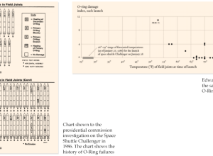
It’s true. Sometimes it’s okay for the y-axis to start at a non-zero…
Design
Important in presenting data clearly and beautifully.
-
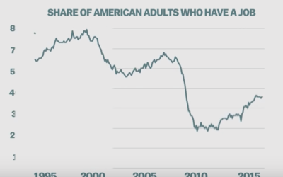
Sometimes the y-axis doesn’t start at zero, and it’s fine
-
Link
Do Visual Stories Make People Care? →
The NPR Visuals team tracked user activity on their visual stories to see how people read or didn’t.
-
Link
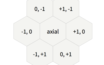
Hexagonal Grids →
More than you ever thought you wanted to know about hexagonal grids.
-
Link
Taking Data Visualization From Eye Candy to Efficiency →
Sifting out some of the styles of contemporary data visualization.
-
Link
What Chicken Nuggets Taught Me About Using Data to Design →
Ask yourself what the numbers represent.
-

Game tests your color-matching skills
Simple and surprisingly challenging.
-
Link
Using BuzzFeed’s listicle format to tell stories with maps and charts →
Peter Aldhous on his workflow and speeding up the visualization process for the news.
-
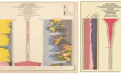
Steampunk infographics
Geoff McGhee for National Geographic highlights a handful of projects that form a…
-
Link
Truthful mapping →
How choice of scale changes a view completely, even with the same data.
-
Link
Wes Anderson Palettes →
Primary colors used in frames of the director’s films. Someone made an R package for this a while back.
-

On visualizing data well
On Writing Well by William Zinsser is a bestselling guide on writing well.…
-
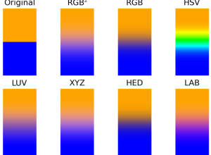
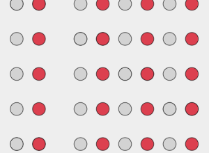
Testing broken computer colors
Computers can calculate an infinite number of colors, but our brains can only…
-
Link
More on Gestalt principles for visualization →
-
Gestalt principles for visualization
Gestalt refers to our ability to see a whole from the parts, and…
-
A path for redesign as critique in visualization
Redesigning a visualization can be useful in teaching a point. Make a graphic…
-

Multi-layered storytelling with visualization
Quick and simple. It is a common theme in visualization that preaches clarity…
-
Visualization constraints
In a discussion of context and visualization, Jen Christiansen pulls out a good…
-
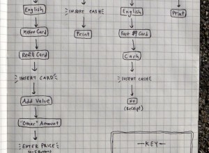
Metrocard purchasing workflows compared
The process to purchase a MetroCard for the New York Subway is different…
-
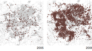
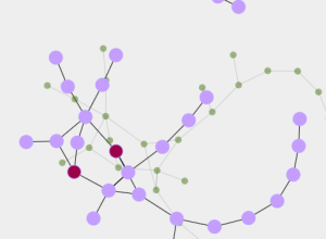
The dots are people
The simple analysis is to approach data blind, as machine output. But this…
-

Chart none of the things
When it comes to storytelling, copious amounts of data often means lots of…
Recently for Members
Second Edition
 Visualize This: The FlowingData Guide to Design, Visualization, and Statistics (2nd Edition)
 Visualize This: The FlowingData Guide to Design, Visualization, and Statistics (2nd Edition)
New tools, refined process.
Browse by Chart Type See All →


