Data Underload
People worry about data overload. Fooey. Charts and musings by Nathan Yau.
Restaurant Reopenings, a Comparison to Last Year
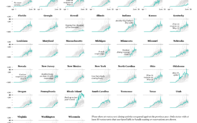
Restaurants are reopening for dining across the United States. Some states are doing it faster than others.
Racial Divide
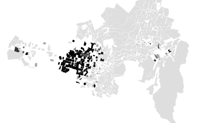
It's hard to think of much else. These maps show the racial divide between black and white people in major cities.
Impact on Households in the United States
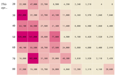
The Census Bureau has been running the Household Pulse Survey since April 23, 2020 to get some gauge for how the pandemic is changing things at home. Here's how things look so far.
Who Funds the World Health Organization
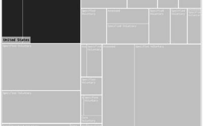
A couple of weeks ago — or maybe it was a couple of years ago, I’m not sure — the administration announced it would withdraw funding from the World Health Organization. Here's what that does to the overall picture.
Game of Distraction
They say a watched pot never boils. So here's a game where you try to make the pot boiling by looking somewhere else.
Toilet Paper Calculator
Maybe you're starting to run low. Here's how much you'll need when you go to restock.
Guessing Names Based on What They Start With
I'm terrible at names, but maybe data can help. Put in your sex, the decade when you were born, and start putting in your name. I'll try to guess before you're done.
Best Directors Who Were Not White Men
From 1928, the year of the first Academy Awards, to 2019, there have been 455 nominations for Best Director. Of those, 18 of them went to non-white men.
Occupation Growth and Decline
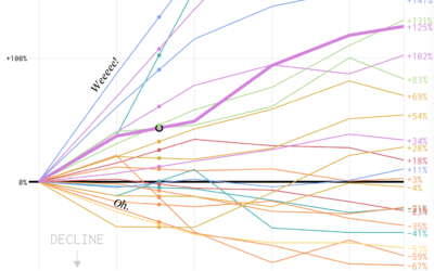
We looked at shifts in job distribution over the past several decades, but it was difficult to see by how much each occupation group changed individually. This chart makes the changes more obvious.
Shifts in Job Distribution
In the 1950s, almost half of all employed people were either in farming or manufacturing. As you can imagine, work changed a bit over the years.
All the Foreign Bodies That Got Stuck
Many things get stuck in people's bodies. This is the percentage breakdown for the most common objects that end up in the emergency room.
Salary and Occupation, in 2018
Salaries vary across occupations. Here are some charts that show by how much for 800 of them.
How Much You Should Be Saving for Retirement
There are a lot of variables to consider, but for people of middle income, here's a suggestion, based on when you start saving and when you want to retire.
Saving for Retirement and Age
People tend to have more money saved up over time, but range and variation also grow, and often it’s not enough.

