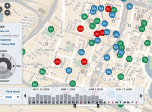
There’s a lot of crime data. For almost every reported crime, there’s a…
Nathan Yau
-
20 Visualizations to Understand Crime
-
The Devil is in the Digits?
Photo by Leo Reynolds
Undoubtedly you’ve been seeing a lot of headlines about…
-
BBC News Explains European Groups with Chocolate Cake
Oh why not, it’s Friday. Have a good weekend, everyone. Go have yourself…
-

Review: Beginning Python Visualization
Python is a powerful programming language that’s good for a lot of things.…
-
Business Valuation Calculator Like Trendalyzer With Style
Inc.com just released their annual valuation guide for 2009, which allows business owners…
-
From the FlowingData Forums [June 10-16]
Visualize This (and win)
This round of Visualize This is a fun one.… -
Thanks to Our FlowingData Sponsors
A big thank you to our FlowingData sponsors who help keep the servers…
-
The Current State of Social Data
Check out my guest post on The Guardian’s Data Blog on the current…
-
6 Easy Steps to Make Your Graph (Really) Ugly
We spend so much time trying to make our graphs accurate, simple, understandable,…
-
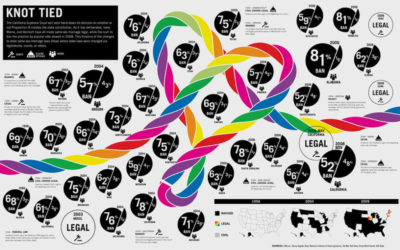
Abortion Rates in the United States, 1970-2005
I’ve been working on my mapping skills lately in preparation for the first…
-
Non-profit Seeks Infographic Designer
Are you an information designer looking for a project?
The East-West Center in… -
Google Fusion Tables Helps You Visualize and Manage Your Data
As the newest release from Google Labs, Fusion Tables is a tool that…
-
Poll: Will Data Always Be Just For Geeks?
Photo by penmachine
I threw out a random thought a couple of months…
-

Ask Me Anything About Data Visualization (in the forums)
Do you have some data on your hands and don’t know what to…
-
Designing Interfaces for the Star Ship Enterprise
We’ve all seen the new Star Trek by now. If you haven’t, you…
-
World Map of Social Network Dominance
Vincenzo Cosenza maps social network dominance around the world according to traffic data…
-
FlowingData Upgrades to WordPress 2.7.1, Plus Threaded Comments
I finally upgraded to the most recent WordPress, and everything seems to have…
-
Javascript InfoVis Toolkit – New Version Released
As we’ve seen, javascript is growing into a viable solution for visualization on…
-

Rise of the Data Scientist
Photo by majamarko
As we’ve all read by now, Google’s chief economist Hal…
-
GOOD Magazine’s Infographics Now Archived on Flickr
You know all those infographics that you like so much from GOOD Magazine?…
Recently for Members
Second Edition
 Visualize This: The FlowingData Guide to Design, Visualization, and Statistics (2nd Edition)
 Visualize This: The FlowingData Guide to Design, Visualization, and Statistics (2nd Edition)
New tools, refined process.
Browse by Chart Type See All →


