The New York Yankees just won the World Series. I don’t know much…
Nathan Yau
-
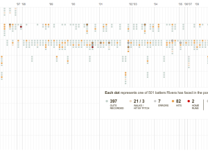
The Pitching Dominance of Mariano Rivera
-
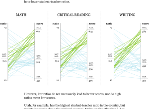
Class Size and SAT Scores By State
Are there any differences in student performance between schools with small classes (as…
-
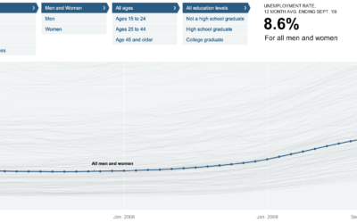
Unemployment Rate For People Like You – NYT Interactive
Shan Carter, Amanda Cox, and Kevin Quealy of The New York Times explore…
-
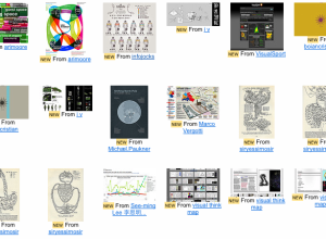
7 Visualization Groups On Flickr to Find Inspiration
I’ve always thought of Flickr as a place where I can share my…
-
Make Thematic Maps With Cartographer.js
Like it or not, Google Maps mashups continue to be a Web favorite.…
-
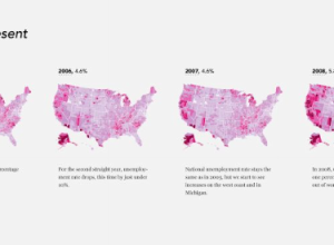
Unemployment, 2004 to Present – The Country is Bleeding
The Bureau of Labor Statistics released the most recent unemployment numbers last week.…
-
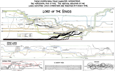
Fictional Character Interactions Over Time
Popular nerd comic xckd takes a look at character interactions over time in…
-
FlowingData is On CNN – A new way of looking at the world
Just a quick note. There’s an article up on CNN right now by…
-
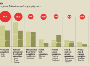
A Land Where Men and Women are Paid Equally
We all know (or at least should know) about the pay gap between…
-
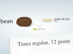
Putting Cell Size in Perspective
It’s hard for us, cognitively speaking, to imagine things that are really really…
-
Poll: Why Do You Read FlowingData?
I tend to post a wide array of subjects from the data spectrum,…
-
Using Flickr as a Paintbrush
Andy Woodruff from Cartogrammar uses average color in Flickr photos to map the…
-

This Would Be Perfect for a Roomba Commercial
You know the Roomba from iRobot? It’s the robot vacuum cleaner that is…
-
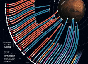
Failed Space Missions to Mars
The above graphic shows missions to mars starting in 1960 to present (top…
-
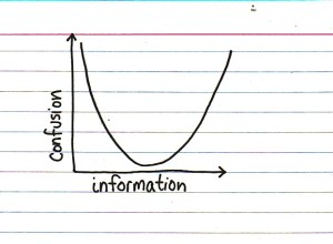
Information vs. Confusion
You gotta love Jessica Hagy. If you’ve got the skills you should be…
-
Thank You FlowingData Sponsors
A BIG thank you to our sponsors. You keep FlowingData running smoothly, make…
-
Target Store Openings Since the First in 1962 – Data Now Available
FlowingData readers who have been around for a while will remember I made…
-

Open Thread: What the **** is Visualization Anyways?
I think ever since visualization got started, people have been asking this question.…
-
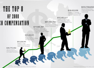
How Much Do CEOs Make in the United States?
GOOD magazine’s most recent transparency contest asked designers to focus their powers on…
-
When Twitter Says Good Morning Around the World
Jer Thorp, an artist and educator from Vancouver, Canada, visualizes when people “wake…
Recently for Members
Second Edition
 Visualize This: The FlowingData Guide to Design, Visualization, and Statistics (2nd Edition)
 Visualize This: The FlowingData Guide to Design, Visualization, and Statistics (2nd Edition)
New tools, refined process.
Browse by Chart Type See All →


