Tarot cards don’t cut it anymore as a predictors. We turn to data…
Nathan Yau
-

Predicting the future of prediction
-
Link
A Slopegraph Update →
Read the original summary of the method first
-

Teamwork and collaboration that built Watson
Team lead, David Ferrucci, recalls the early days of putting together the team…
-
Link
Map your Twitter followers in R →
Quick hack that shows where your Twitter followers are from
-
Link
NASA open sources code →
“Will your code someday escape our solar system or land on an alien planet?” [via]
-
Link
Facts are Sacred →
Guardian’s short eBook on how they do data
-
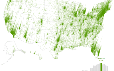
Where people are looking for homes
In August 2006, real estate search site Trulia had 609,000 visitors. Five years…
-
Link
‘Data journalism’ draws the line between the quick and the dead →
Maybe there’s something to this numbers thing
-
Members Only
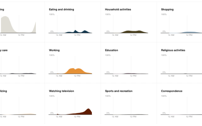
Build Interactive Area Charts with Filters
When you have several time series over many categories, it can be useful to show them separately rather than put it all in one graph. This is one way to do it interactively with categorical filters.
-
Link
indiemapper is free →
-
Introducing FlowingData Membership
It was about five years ago when I got into visualization. Before I…
-
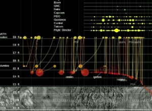
Apollo 11 lunar landing told through data
From Yanni Loukissas of the MIT Laboratory for Automation, Robotics, and Society, comes…
-
Link
A Histogram is not a Bar Chart →
-
Link
What is a chart? →
A lot of things, and if anything it’s subjective
-
Dynamic face substitution
Kyle McDonald and Arturo Castro play around with a face tracker and color…
-
Algorithm estimates who’s in control
Jon Kleinberg, whose work influenced Google’s PageRank, is working on ranking something else.…
-
Link
Art and Technology Will Change Everything →
Collision in a good way this year [via]
-
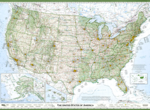
Hand-crafted wall map of the United States
Seth Stevenson, for Slate Magazine, covers cartographer David Imus’ hand-crafted wall map, which…
-
Link
Arguments with Graphics →
“The bottom line: in their tests, rebutting misinformation with graphics was shown to be more effective than conveying the same information in written form.”
-
Link
Iowa Republican Caucuses →
NYT graphics’ election coverage about to kick into full gear
Recently for Members
Second Edition
 Visualize This: The FlowingData Guide to Design, Visualization, and Statistics (2nd Edition)
 Visualize This: The FlowingData Guide to Design, Visualization, and Statistics (2nd Edition)
New tools, refined process.
Browse by Chart Type See All →


