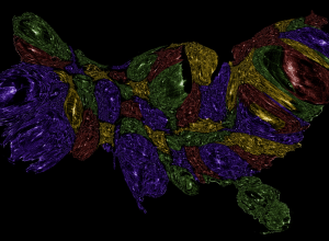
Plenty of potential but a long way to go for real accuracy
Nathan Yau
-
Link
Tweets as Poll Data? Be Careful →
-
Link
The Age of Big Data →
More hoorah for the data. Something in the water over at NYT or data is just that cool. Latter.
-
Abstract maps of the United States
Esquire invited a handful of map-makers to represent the United States outside its…
-
Jeremy Lin is no fluke
Nate Silver looks at past players who have scored 20 or more points,…
-
Link
Mathematica: A Love Story →
Expressing his ultimate love for the software
-
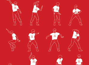
Famous dances in television and cinema illustrated
In a tongue-in-cheek tribute to the Dancing Plague of 1518, Niege Borges illustrates…
-
Link
Revamped Knight News Challenge →
A refocused challenge to provide the news, now “more nimble and more focused” with three rounds per year. Should be some great things that come out of this [via]
-
Link
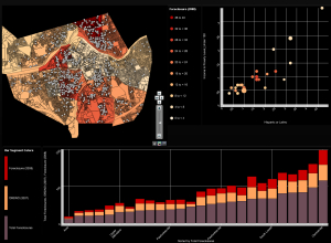
Deceptive in their beauty? →
Critique of a Charles Booth poverty map rework
-
Link
What’s the Matter With Chernoff Faces? →
The method in real life
-
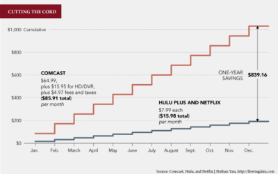
Why I Want to Quit Cable
There are good reasons to cancel cable, but there were a few channels and programs that kept me on. When you look at it in dollars though, it’s hard to justify the value for the cost.
-
Link
The Visual Language of Dashed Lines →
How we perceive and how we should use them
-
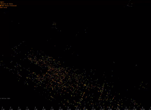
Taxi migration in Manhattan
While we’re on the topic of things moving on a map of changing…
-
Animation shows national migration patterns
Even Westvang uses tax return data to visualize migration patterns of 300,000 Norwegians.…
-
Link
How to correctly report numbers in the news →
“What we have to learn to do, and the best way of stopping ourselves from getting embarrassed, is to stop and check that something makes sense.”
-
Link
Interview with AdAge →
I did a Q&A that I thought was for a larger, more general article on visualization. They posted the whole thing. Edward Tufte answered some questions in the first interview of the series.
-
Weave for visualization development
Web-based Analysis and Visualization Environment, or Weave for short, is open source software…
-
Members Only
How to Make a Contour Map
Filled contour plots are useful for looking at density across two dimensions and are often used to visualize geographic data. It’s straightforward to make them in R — once you get your data in the right format, that is.
-
Link
A data mess →
Fixing a busted pie chart
-
Link
Visual Storytelling and New Languages in Journalism →
Short interview with Francesco Franchi, art director for IL-Intelligence. From Visual Storytelling book [via]
-
Tracking the grizzly bear in emotional interactive documentary
In a blend of data and storytelling, Jeremy Mendes and Leanne Allison dig…
Recently for Members
Second Edition
 Visualize This: The FlowingData Guide to Design, Visualization, and Statistics (2nd Edition)
 Visualize This: The FlowingData Guide to Design, Visualization, and Statistics (2nd Edition)
New tools, refined process.
Browse by Chart Type See All →


