Not out yet, but it looks promising
Nathan Yau
-
Link
Data Journalism Handbook →
-
GM Uses LEGOs for Visual Management Tool
I thought this was a joke, but it appears GM really is using…
-
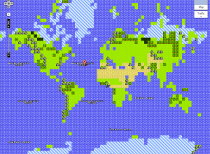
8-bit Google Maps, Start Your Quest
If you go to Google Maps right now, there’s an option in the…
-
Link
Designing great data products →
Apps that actually do something with data other than spit it out
-
How Much More Women Pay for Health Insurance
So the Obama campaign posted this yesterday. Discuss.…
-
Link
Data Visualization Landscape →
A back and forth between just the facts vs. storytelling, and form vs. function
-
Link
You’re Doin’ it Wrong →
Quick talk highlighting not so good visualization examples
-
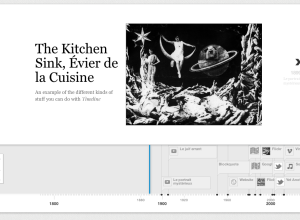
Timelines that are Easy to Make and Use
As a project of the Knight News Innovation Lab, Timeline by Verite is…
-
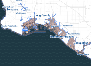
Rising Water Levels in the Immediate Future
Stamen Design, in collaboration with Climate Central, shows major areas that could be…
-
Missing Pieces
Leave it to Robert Krulwich to bring us back to life in the…
-
Link
Infographics Lessons from Malofiej →
25 fine tips on designing graphics that matter
-
Link
Using Google Refine to Clean Messy Data →
Thorough step-by-step
-
Link
Jake Porway →
A Q&A with Jake Porway, Data Without Borders founder and all-around good guy
-
Link
A Taxonomy of Data Science →
Obtain, scrub, explore, model, and interpret [via]
-
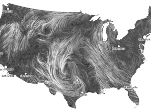
Live Wind Map Shows Flow Patterns
I get kind of giddy whenever I see a tweet from Martin Wattenberg…
-
Link
Data in an Alien Context →
Jer Thorp releases the source code for his Kepler visualization
-
Where Campaign Spending is Going to
Making use of data from the Federal Election Commission and The New York…
-
Link
Political Ad Money →
“If TV stations won’t post their data on political ads, we will.”
-
Link
Infographic that Made Me Cry →
Former Director of Information Graphics at Newsweek remembers one stressful night of infographic-making.
-
Link
Watercolor Process →
Steps behind Stamen’s beautiful computer-generated maps that easily pass for handmade



 Visualize This: The FlowingData Guide to Design, Visualization, and Statistics (2nd Edition)


