Kat Downs, Laura Stanton and Karen Yourish of The Washington Post look at…
Nathan Yau
-
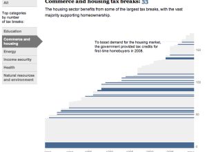
History of tax breaks →
-
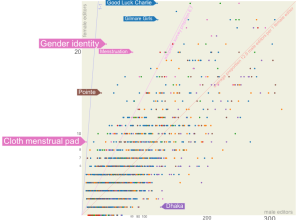
Wikipedia is dominated by male editors
After he saw a New York Times article on the gender gap among…
-
Link
Building a Bubble Cloud →
Tutorial based on the NYT graphic on word use at the National Conventions
-
Link
Some ggplot2 themes →
Including the Economist, Stata, and oh yes, Excel 2003 [via]
-
Humans predicting the weather
Nate Silver says the weatherman is not a moron.
Still, most people take… -
Link
Art and Design continuum →
From data graphics to art, it’s a continuous spectrum; last sentence of article includes a lot more people though
-
Link
Hacker Journalism 101 →
A wishful syllabus by NPR news app head
-
Link
Visual Encoding →
Ways to display data based on vision and variables
-
Link
Evolution of a SciAm Information Graphic →
Taking it from paper and pencil sketch to illustration
-
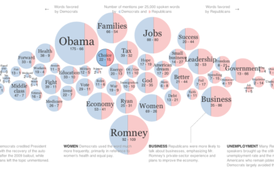
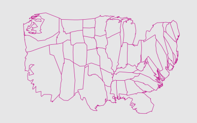
Words used at the National Conventions
The elections season is in full swing, and the New York Times graphics…
-
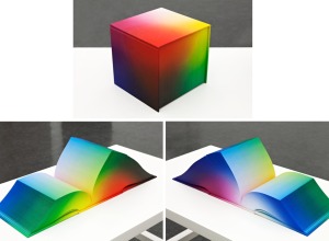
RGB Colorspace Atlas shows every shade in a cubic book
The 8-inch cube RGB Colorspace Atlas by artist Tauba Auerbach shows every color…
-
Link
The Functional Art →
Just got a copy, and it looks like a good one. Review to come.
-
Link
Statistical machine →
With new tools that make running statistical tests straightforward, the two statisticians worry about pseudo-analysis. On the other hand, if the tech is trivial, there’s more time for learning the concepts (and teaching them).
-
Link
Designing data →
Visualization for stories that move you
-
Link
Style your ggplot2 charts with Themes →
The popular R graphing package now lets you easily change aesthetics
-

Man takes picture of himself every day for 12 years
Remember photographer Noah Kalina? He took a picture of himself every day for…
-
Members Only
Mapping with Diffusion-based Cartograms
Sometimes these cartograms can distort areas beyond recognition, but they can also provide a better visual representation for a region with a wide range of subregions. At the least, they’re fun to look at.
-
Analyzing text messages to save lives
Nancy Lublin, CEO of Do Something, gives a five-minute TED talk on the…
-
Link
Getting to “Hello world” with D3 →
A straightforward and detailed introduction
-
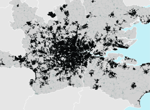
Mapping urban footprint
After identifying 129 metropolitan regions that represent 35 percent of the world’s urban…
Recently for Members
Second Edition
 Visualize This: The FlowingData Guide to Design, Visualization, and Statistics (2nd Edition)
 Visualize This: The FlowingData Guide to Design, Visualization, and Statistics (2nd Edition)
New tools, refined process.
Browse by Chart Type See All →


