Numbers is a short film by Robert Hloz where some people see numbers…
Nathan Yau
-
Too many numbers
-
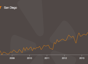
A decade of Yelp review trends →
Yelp released an amusing tool that lets you see how the use of…
-
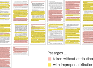
Senator John Walsh plagiarism, color-coded →
John Walsh, the U.S. Senator from Montana, is in the news lately for…
-
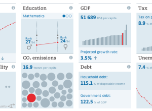
A more visual world data portal →
One of the most annoying parts of downloading data from large portals is…
-
Members Only
How to Make an Interactive Treemap
Treemaps are useful to view and explore hierarchical data. Interaction can help you look at the data in greater detail.
-
Large-ish data packages in R
If you’ve played around with R enough, there comes a time when you…
-
Editing photos as if they were audio files →
Masuma Ahuja and Denise Lu for the Washington Post applied a technique called…
-
Voter approval rates as butt plugs
From a couple of years ago, but still relevant, I think. Matthew Epler…
-
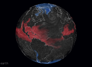
Misery index based on perceived temperature →
Late last year, Cameron Beccario made a wind map for earth, inspired by…
-
You get a personal data site, and you get one, and you too →
Personal data collection keeps getting easier and more efficient. Much of what was…
-
Flights around Ukraine →
The New York Times is covering Malaysia Airlines Flight 17 with a series…
-
Geologic map of Mars
The USGS released a more detailed geologic map of Mars, not just renderings…
-
Spiky betting odds during LeBron James decision →
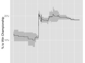
LeBron James decided to head back to Cleveland, so naturally the odds that…
-
How much underwear to bring on a trip →
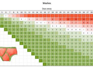
Packing underwear for a short trip is easy. You just pack a pair…
-
Visualization Education Mailbag
It’s around that time of year when more people than usual ask for…
-
Changing World Cup fans →
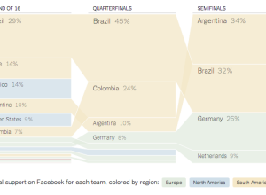
Shan Carter and Kevin Quealy for the Upshot have a look at sports…
-
Mosquitos: The deadliest animal
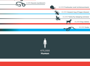
This graphic from the Gates Foundation is from a few months ago, but…
-
FoamTree: Visualize hierarchical data with a lot of groups
For small-ish amounts of hierarchical data, most JavaScript libraries can handle the load.…
-
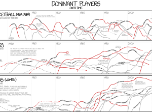
xkcd: Dominant players in chess and basketball →
I’m pretty sure xkcd is the only one who gets away with showing…
-
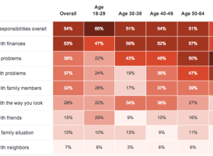
Polling for stress →
NPR, the Robert Wood Johnson Foundation and the Harvard School of Public Health…







 Visualize This: The FlowingData Guide to Design, Visualization, and Statistics (2nd Edition)


