Western cities are growing but water supplies are decreasing. That’s not good. ProPublica,…
Nathan Yau
-
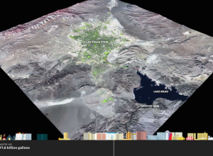
Growth of Las Vegas metro and skyline
-

Counting people killed by police
The US government doesn’t keep a complete record of fatal shootings by police,…
-
Link
WikidataR →
An API client for the ‘Wikidata’ store of semantic data.
-

Chess piece moving patterns
Million Base is a database of 2.2 million chess games. Steve Tung visualized…
-
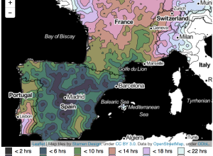
From European cities, how long it takes to travel elsewhere
After seeing an isochrone map drawn by Francis Galton, Peter Kerpedjiev was curious…
-
Why the subway isn’t getting a move on already
You’re headed to the subway platform and you hear a train coming. The…
-

Size of Minecraft
I tried playing Minecraft a couple of times but quickly lost interest. Clearly…
-
Science formally retracts LaCour paper
Last week, graduate student Michael J. LaCour was in the news for allegedly…
-
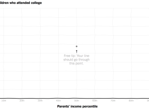
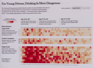
Compare your curve to reality for income versus college attendance
Those who grow up in poorer families are less likely to go to…
-
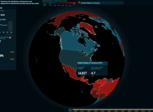
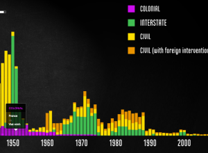
Homicide Monitor shows distribution of violence worldwide
It’s difficult to grasp the severity of homicide around the world. Homicide Monitor…
-
Interactive documentary connects World War II data to the events
Millions of peopled died during World War II, but it’s difficult to grasp…
-

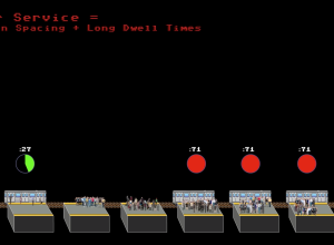
Why buses bunch at single stops
Maybe you’ve waited at a bus stop for longer than usual, and your…
-

Statistics PhD ranked as best graduate degree
I usually don’t read much into job and degree rankings. The criteria are…
-
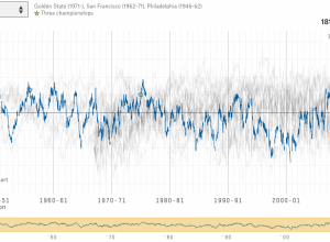
Every NBA team rated over several decades
Which NBA basketball team is the greatest ever? Instead of a circular debate…
-

How far Frodo and Sam walked compared to real geography
If you read the books or watched the movies, you get the sense…
-
Rise of data art
Data art is on the rise. Jacoba Urist for the Atlantic gets into…
-
Power of the reveal
Hannah Fairfield, who does graphics at the New York Times, talks about using…
-
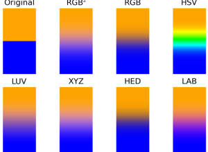
Testing broken computer colors
Computers can calculate an infinite number of colors, but our brains can only…
-
Graduate student makes up data for fake findings
Last month, This American Life ran a story about research that asked if…
-
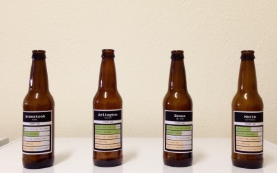
Brewing Multivariate Beer
I was toying around with the idea of multivariate beer, where the ingredients varied by county demographics. Could I taste the difference? Here’s how the experiment went.
Recently for Members
Second Edition
 Visualize This: The FlowingData Guide to Design, Visualization, and Statistics (2nd Edition)
 Visualize This: The FlowingData Guide to Design, Visualization, and Statistics (2nd Edition)
New tools, refined process.
Browse by Chart Type See All →


