Visualizing Differences
Visualization is meant to compare and contrast data, which lets you see patterns, glean insights, and all that. However, if we focus specifically on finding or displaying differences, some methods are more helpful than others. In this guide, I describe five ways to get this focus.
Straightforward Visualization
Visualize data like you normally would, without thinking specifically about differences. This is the “let the data speak” route, which comes with its own challenges, but allows readers to make their own conclusions (because it forces them to). Or, you can annotate to direct readers where to go, which is usually the best option for presentation graphics.
Examples
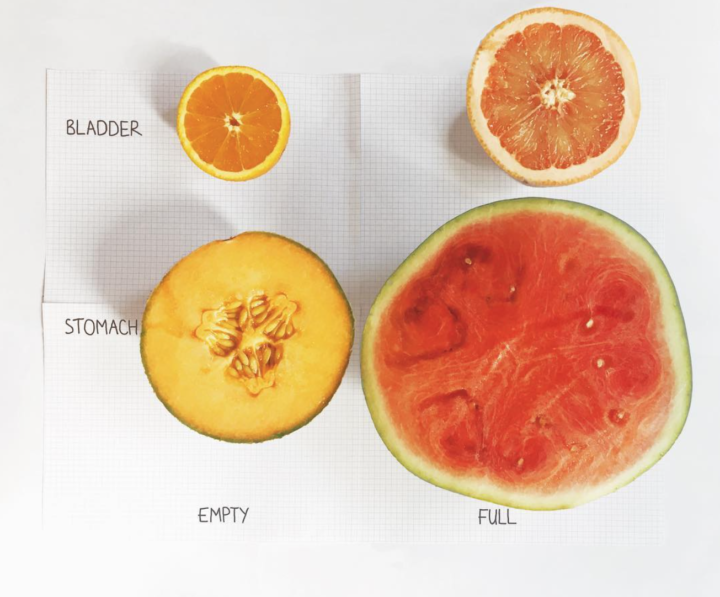
Mona Chalabi often employs this direct comparison in her Data Sketches and then uses related metaphors in the form of drawings and physical objects to further communicate a point. The sketch below for example contrasts bladder and stomach sizes when empty and full:
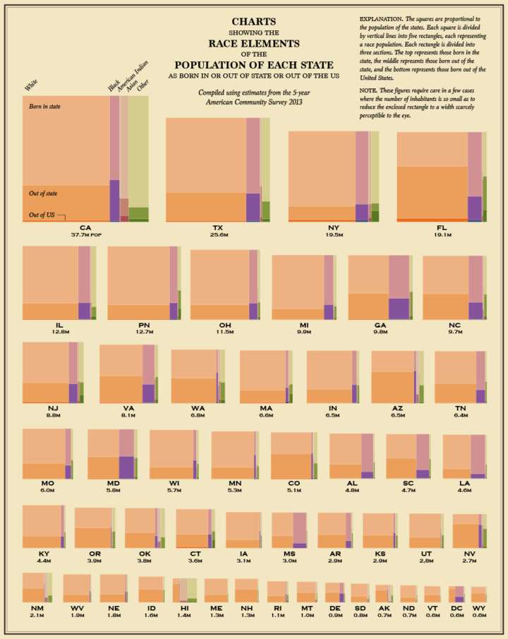
We see this with state-level data a lot too. Try to sort by a facet of the data that allows quick comparison. In the chart below, you can quickly see the differences in population makeup between the greatest populated state, the least, and everything in between.
Visual Encodings that Diverge
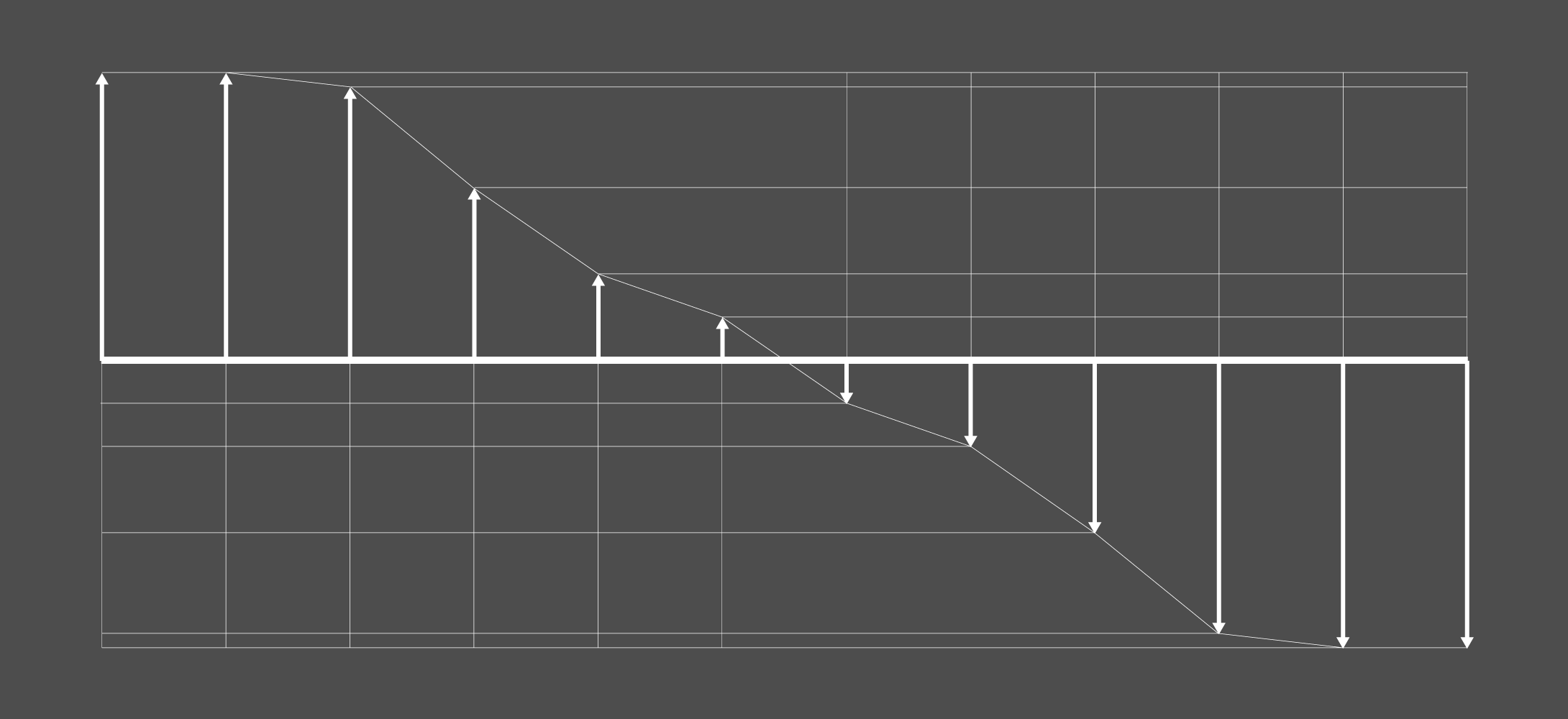
But hey, we’re talking about visualizing differences. If that’s what you’re after, it’s good to show the differences explicitly with visual encodings that diverge.
Maybe it’s a color scale that indicates a greater than, lesser than, and a neutral. Maybe the coordinate system uses a positive and negative side. Whatever it may be, encode the data in a way that visually divides the differences.
Examples
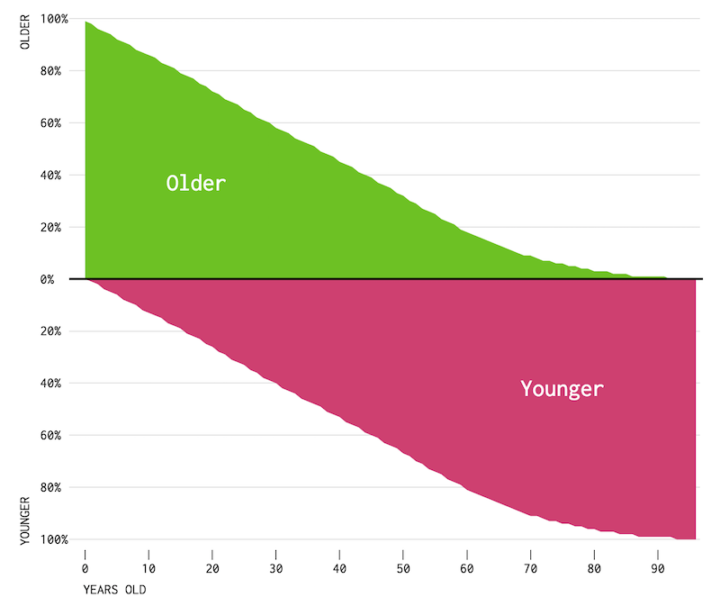
When comparing the older and younger population, I used a stacked area chart, but to emphasize the division, I placed older percentage values on the top and the younger percentage value on the bottom.
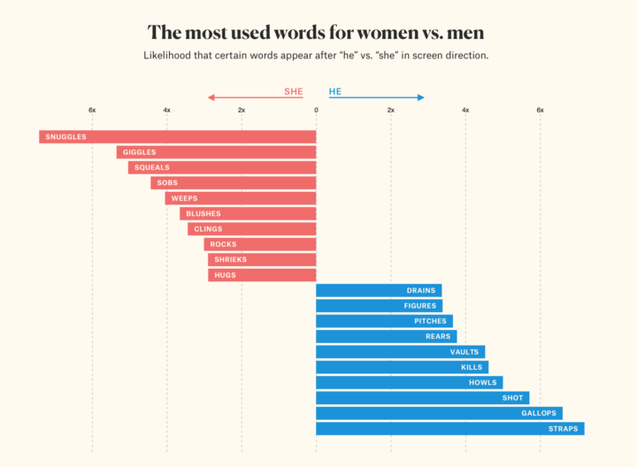
Similarly, we often contrast data for men and women. Julia Silge for The Pudding did this in her look at gender tropes in screen direction.
Alternatively, you could express the likelihood as a percentage of directions written for men, in which case the percentage of the directions for women would be implied. But that would focus on one sex. Some arithmetic allowed for equal visual weight in the straightforward bar chart.
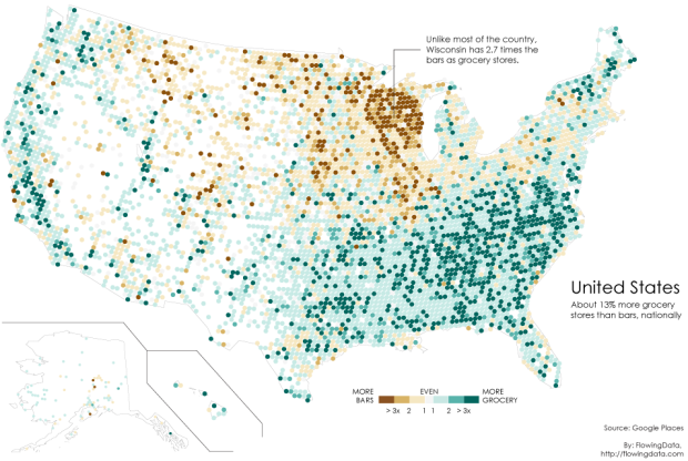
I used a similar method when contrasting the number of bars against the number of grocery stores across the country. Except I focused on differences with a color scale.
Separate Categories
It’s tempting to squeeze all of your data into a single visualization. Sometimes a graphic looks more impressive with a lot of lines, points, and colors in one view. But it can also lead to a jumbled mess. If there’s too much going on, you won’t get anything out of the visual other than a pretty picture.
So when you have several people, places, or things, the visual might benefit from separation and categorization. Maybe that comes as small multiples. Maybe it comes as side-by-side comparisons.
Examples
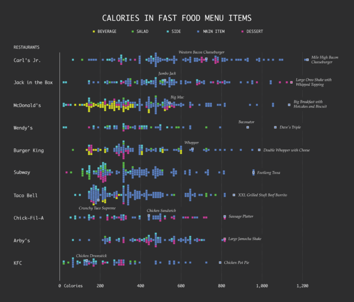
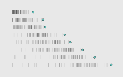
I really like distributions, and I really like to compare them vertically:
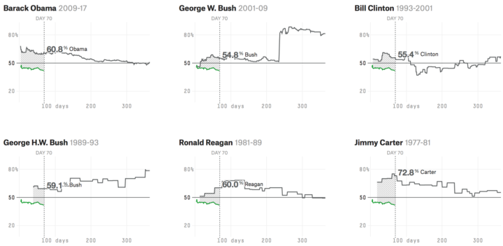
For a more compact presentation, try small multiples. FiveThirtyEight uses them to show presidential approval ratings:
Showing Only What’s Different
If it’s not necessary to show all of the data, which is a common occurrence, filter down to the points of interest, and then only show that. This might mean simply subsetting to a subpopulation, or it might mean a statistical clustering or identifier of some sort.
Either way, this is more of a statistical step than a design tip, but this is also why analysis and data graphics should tightly couple. Each informs the other.
Examples
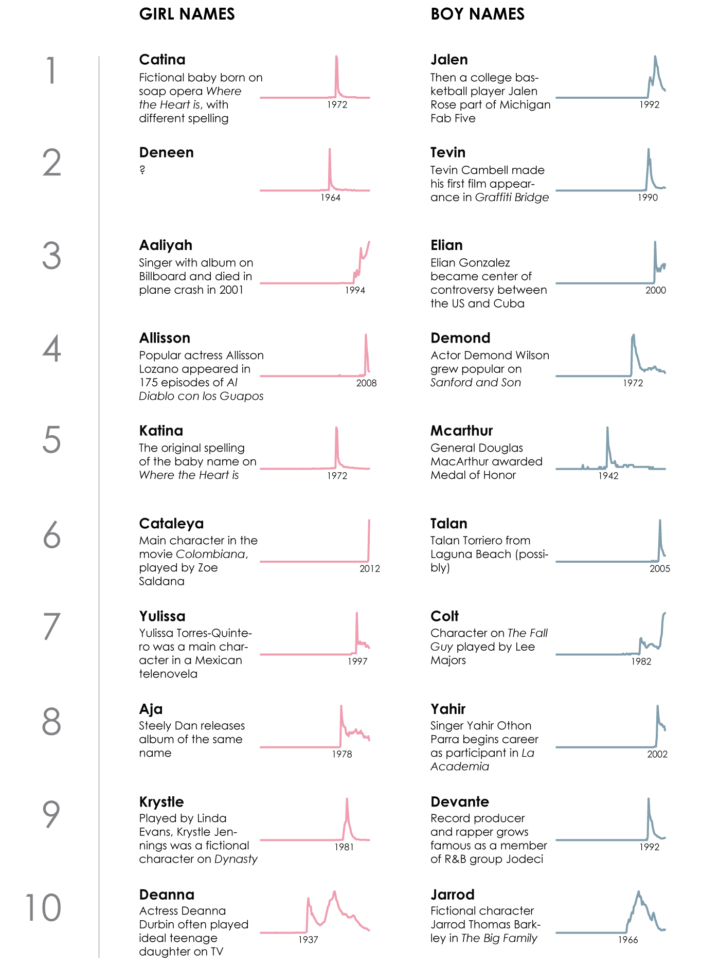
When I looked for the the most trendy names in US history, I first classified names as trendy based on annual usage, and then only showed the most interesting bits.
I did the same when looking for most regional and most unisex names. (I had a kid on the way, so I was really into names at the time.) In all these examples, the statistical uniqueness of the names was the difference, and those that trended closer to the average were filtered out.
Animated Contrasts
Animation is sometimes a tricky beast, but when used with care, the method offers an intuitive view that shows readers how a units shift.
In the case of visualizing differences, a graphic can start in one phase or state and then the animation can show how it all moves to a different phase.
Examples
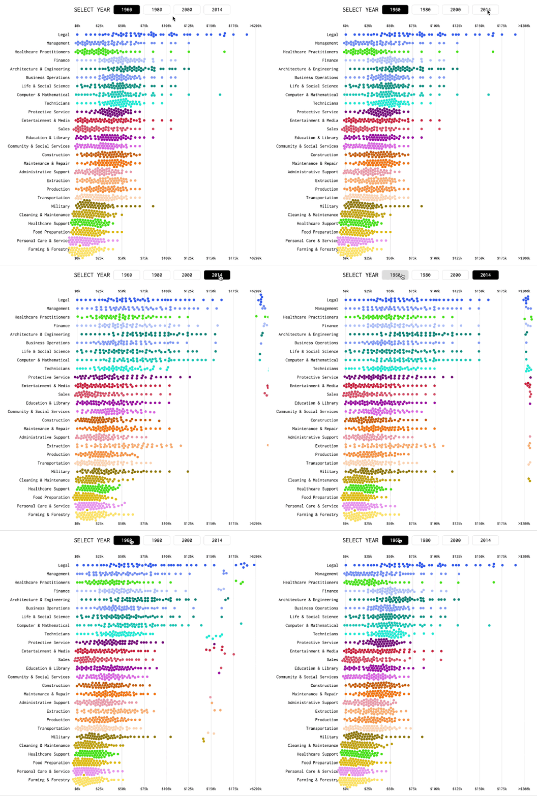
In visualizing income shifts, I used beeswarm plots to show distributions during different years. The initial view starts in 1960, and when a reader selects a different year, the dots move to show a new distribution.
As seen above, the more movement, the greater the difference is between the selected years.
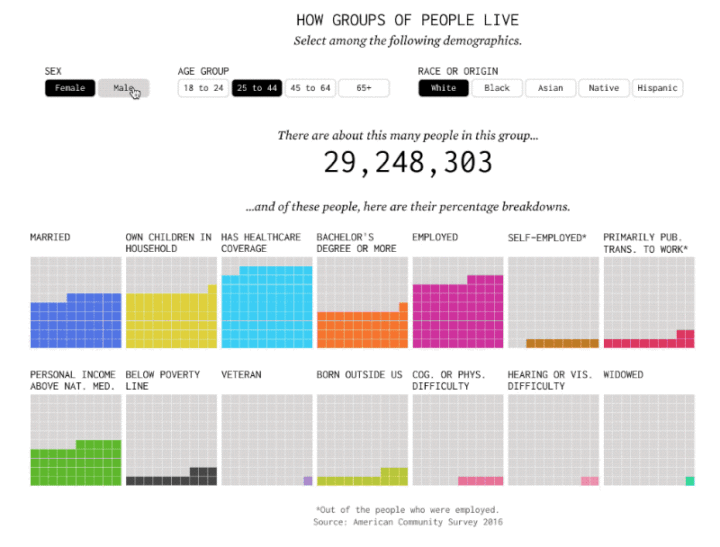
I used a similar visual cue when showing percentages for different demographic groups. Again, the bigger the difference, the longer it takes for a transition to finish.
Wrapping Up
To recap, five options for visualizing differences:
- Straightforward Visualization — Let the reader interpret or direct with annotation.
- Diverging Visual Encodings — Use geometry that highlights differences.
- Separate Categories — Instead of squeezing everything together, split things apart for side-by-side comparisons.
- Filters — Place differences in the foreground and place the rest far in the background.
- Animation — Use movement as the visual cue.
Whatever method you choose, the key is to focus specifically on the differences. So instead of just visualizing your data, you also want to visualize aspects of your data, which in the end, are what matter most.
Become a member. Support an independent site. Get extra visualization goodness.
See What You Get
