Shifting Incomes for American Jobs
With some occupations, people make more annual income than others. Obvious. But we typically see figures in terms of means and medians when in reality, the difference between the person who makes the most and the one who makes the least can be significant.
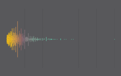
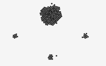
The chart below shows the spread for major occupation groups, for several decades. Imagine you randomly select 50 people from each group, and this is what their annual income probably looks like.
The data for 2000 and earlier comes from the decennial census, and the data for 2010 and 2014 come from the American Community Survey.
As you progress through time, you’ll notice the distributions of income spread out more. This is especially obvious when you switch between 1960 and 2014. With the exception of lower paying jobs in areas such as food preparation and cleaning, it looks like there’s more opportunity to earn a higher salary (among those who have jobs at least).
That said, even if a job typically pays well, there are still people at the lower end of the bracket.
 Make a Moving Bubbles Chart to Show Clustering and Distributions
Here’s how to make a chart similar to this one.
Nerd Notes
- This is total personal income for individuals, as opposed to salary from an employer. I didn’t want to minus out the self-employed, but consequently the dollar values include things like welfare and retirement income.
- The occupation groups are broad. See here for detailed listings.
- I adjusted for inflation and binned by $5,000 increments, but it’s probably worth noting that some of the binning you see is from rounding.
- I downloaded the data from IPUMS, which makes Census microdata much easier to grab.
- I’m not fully sold on using a force-directed graph instead of histograms to show distributions, but I do like that it gets you closer to the individuals that the data represents.
- I analyzed and prepared the data in R and made the final visualization with d3.js.
Chart Type Used

Become a member. Support an independent site. Make great charts.
See What You Get