The elections season is in full swing, and the New York Times graphics…
2012
-
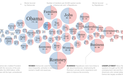
Words used at the National Conventions
-
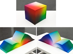
RGB Colorspace Atlas shows every shade in a cubic book
The 8-inch cube RGB Colorspace Atlas by artist Tauba Auerbach shows every color…
-
Link
The Functional Art →
Just got a copy, and it looks like a good one. Review to come.
-
Link
Statistical machine →
With new tools that make running statistical tests straightforward, the two statisticians worry about pseudo-analysis. On the other hand, if the tech is trivial, there’s more time for learning the concepts (and teaching them).
-
Link
Designing data →
Visualization for stories that move you
-
Link
Style your ggplot2 charts with Themes →
The popular R graphing package now lets you easily change aesthetics
-

Man takes picture of himself every day for 12 years
Remember photographer Noah Kalina? He took a picture of himself every day for…
-
Members Only
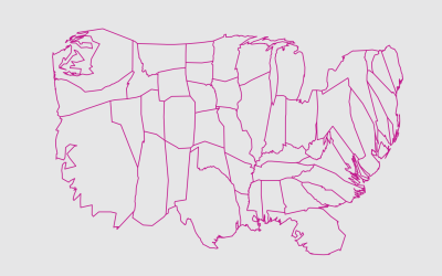
Mapping with Diffusion-based Cartograms
Sometimes these cartograms can distort areas beyond recognition, but they can also provide a better visual representation for a region with a wide range of subregions. At the least, they’re fun to look at.
-
Analyzing text messages to save lives
Nancy Lublin, CEO of Do Something, gives a five-minute TED talk on the…
-
Link
Getting to “Hello world” with D3 →
A straightforward and detailed introduction
-
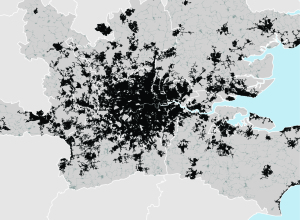
Mapping urban footprint
After identifying 129 metropolitan regions that represent 35 percent of the world’s urban…
-
Link
Three States of Data →
Comparison to gas, selling the stuff that makes it useful vs. the raw material
-
Link
Advice to the Aspiring Interactive Cartographer →
Start with very basic then work your way up
-
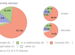
Analyze your Facebook profile with Wolfram|Alpha
Feeding off the momentum from Stephen Wolfram’s personal analytics earlier this year, Wolfram|Alpha…
-
Link
Branding with Infographics →
From the social media point of view
-
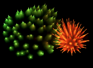
How NASA visualizes large datasets
Horace Mitchell, director of the NASA Scientific Visualization Studio discusses the process behind…
-
Link
Visually weighted regression →
Using gradient to show confidence intervals
-
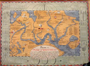
Physics as a geographic map
The fictional map of physics by Bernard H. Porter in 1939 reads:
Containing… -
Link
Making of Perpetual Ocean →
Making of Perpetual Ocean. NASA interview on how they made this; surprisingly, they used Maya and RenderMan
-
Long-exposure fireworks photos
Photographer David Johnson took long-exposure shots of fireworks. Fireworks already leave trails when…
Recently for Members
Second Edition
 Visualize This: The FlowingData Guide to Design, Visualization, and Statistics (2nd Edition)
 Visualize This: The FlowingData Guide to Design, Visualization, and Statistics (2nd Edition)
New tools, refined process.
Browse by Chart Type See All →


