After demolishing the East Wing of the White House and rushing into construction…
Infographics
Telling stories with data and graphics.
-
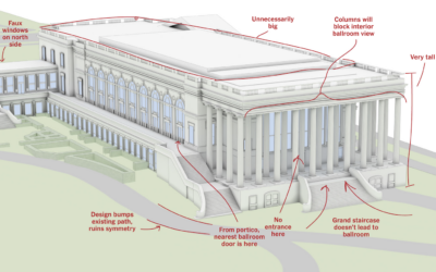
Ballroom design, many notes
-
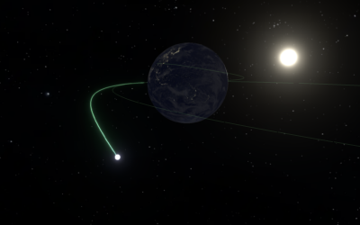
Space journey to scale
Artemis II launches today, scheduled for 6:24 pm EDT. Die Zeit mapped the…
-

A worst-case scenario in a country without vaccines
Researchers at Stanford University, epidemiologists Mathew Kiang and Nathan Lo, estimated the number…
-
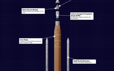
Artemis II flight sequence
For Bloomberg, Loren Grush, Sana Pashankar, and Stephanie Davidson describe the Artemis II…
-
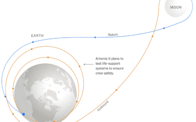
Flying to the moon on Artemis II mission
Four astronauts are rocketing to the moon on April 1. They’ll spend 10…
-

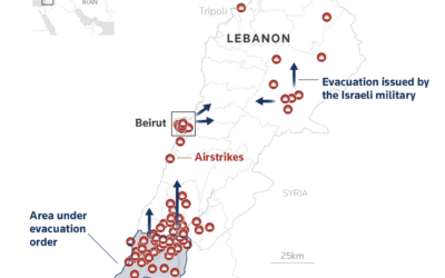
Everyday ripples from the Iran war
The world’s reliance on gas and oil means the war in Iran affects…
-
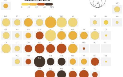
Why rural hospitals close
A large portion of rural hospitals operate at a loss, which causes problems…
-
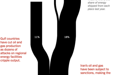
Typical flow of oil and gas through the Strait of Hormuz
For the New York Times, Lazaro Gamio, Blacki Migliozzi, and River Akira Davis…
-
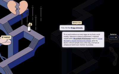
Infertility path from the perspective of mother and child
Getting pregnant and having a child is typically described as an effortless process…
-
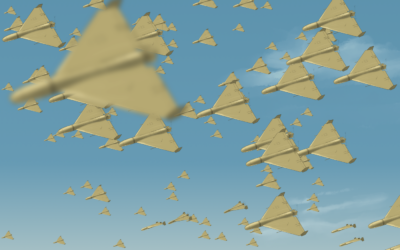
Cheap drones allowing war with volume
Unmanned and relatively cheap drones that can be manufactured in high volume have…
-
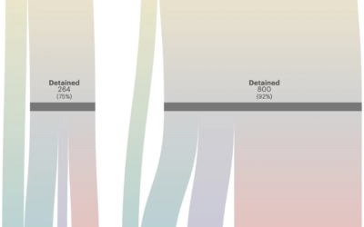
Immigrant mothers separated from U.S. citizen children
Along with more arrests, the current administration has deported mothers at twice the…
-
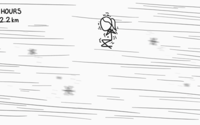
What if you floated upwards one foot every second
xkcd continues to answer the important questions.…
-
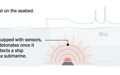
Naval mine mechanics illustrated
Iran is starting to deploy mines in the Strait of Hormuz. For the…
-
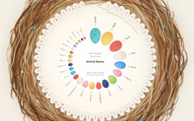
Bird search patterns
By Nadieh Bremer with Emily Barone, this is a charming piece on the…
-
Maps and charts for what is happening in Iran
Reuters Graphics has a feed of maps and charts for updates on Iran.…
-
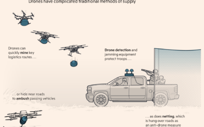
Drones and modern warfare in Ukraine
With hundreds of thousands of Ukrainian drone flights every month, countries have had…
-

Release your lantern
In celebration of the lunar new year, many people release a lantern into…
-
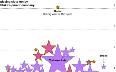
Unusual luck for streamers in the crypto casino Stake
For Businessweek, Cecilia D’Anastasio, Olivia Solon, and Leon Yin analyzed the unusual luck…
Recently for Members
Second Edition
 Visualize This: The FlowingData Guide to Design, Visualization, and Statistics (2nd Edition)
 Visualize This: The FlowingData Guide to Design, Visualization, and Statistics (2nd Edition)
New tools, refined process.
Browse by Chart Type See All →


