The Federal Procurement Data System tracks federal contracts of $10,000 or more. For…
Data Sources
Have fun and play with some numbers.
-
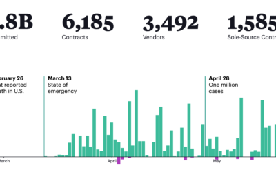
What the federal government has been buying and where from
-
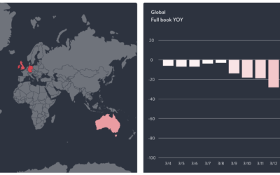
Coronavirus data at the state and county level, from The New York Times
Comprehensive national data on Covid-19 has been hard to come by through government…
-
Restaurant struggles
The restaurant industry is taking a big hit right now, as most people…
-
Nationwide database of credibly accused Catholic clergy
For ProPublica, Ellis Simani and Ken Schwencke compiled an interactive database that you…
-
Dataset for rejected license plate applications
Noah Veltman just posted a dataset of 23,463 personalized license plate applications that…
-
Google Dataset Search moves out of beta
Over a year ago, Google released Dataset Search in public beta. The goal…
-

Scripts from The Office, the dataset
The decade is almost done. You’re sitting there and you’re thinking: “I wish…
-
Deaths from child abuse, a starting dataset
By way of the Child Abuse Prevention and Treatment Act, ProPublica and The…
-
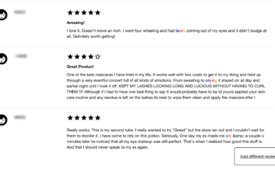
Sephora dataset is a collection of makeup reviews that mention crying
Interested in reviews on the Sephora website for waterproof makeup, Connie Ye figured…
-
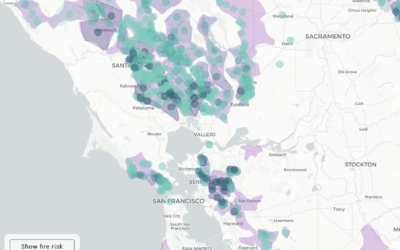
PG&E providing shapefiles, instead of a working map for shutoffs
Here in northern California, PG&E is shutting off power to thousands of households…
-
Search through 3m nonprofit tax records
ProPublica just released a search tool for nonprofit tax records:
The possibilities are… -
Census data downloader to reformat for humans
There is a lot of Census data. You can grab most of the…
-
Data for 200M traffic stop records
The Stanford Open Policing Project just released a dataset for police traffic stops…
-

Looking for common misspellings
Some words are harder to spell than others, and on the internet, sometimes…
-
Google Dataset Search now in public beta
Datasets are scattered across the web, tucked into cobwebbed corners where nobody can…
-
Download 3 million Russian troll tweets
Oliver Roeder for FiveThirtyEight:
FiveThirtyEight has obtained nearly 3 million tweets from accounts… -
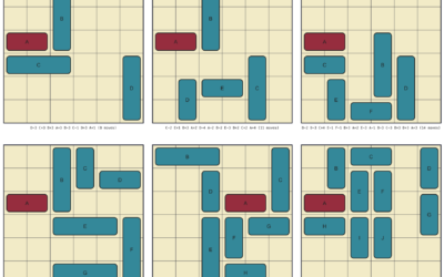
Rush Hour puzzle solver and generator
The Rush Hour puzzle game was invented by Nob Yoshigahara in the 1970s…
-

All the building footprints in the United States
Microsoft released a comprehensive dataset for computer-generated building footprints in the United States.…
-
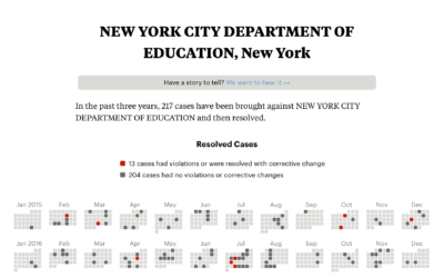
Check if your school district or college was investigated for civil rights violations
The U.S. Department of Education constantly investigates school districts and colleges for civil…
-
Datasets for teaching data science
Rafael Irizarry introduces the dslabs package for real-life datasets to teach data science:…
Recently for Members
Second Edition
 Visualize This: The FlowingData Guide to Design, Visualization, and Statistics (2nd Edition)
 Visualize This: The FlowingData Guide to Design, Visualization, and Statistics (2nd Edition)
New tools, refined process.
Browse by Chart Type See All →


