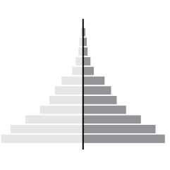
State population dictates the number of seats in the House of Representatives, so…
NPR
-
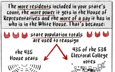
How the Census translates to power, a cat comic
-
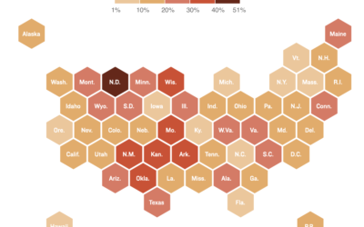
Where there are hospital staff shortages
Reporting for NPR, Sean McMinn and Selena Simmons-Duffins on staffing shortages:
On data…
-

Millions of people experienced unhealthy air in 2020
NPR estimated how many people have experienced unhealthy air this year, largely in…
-
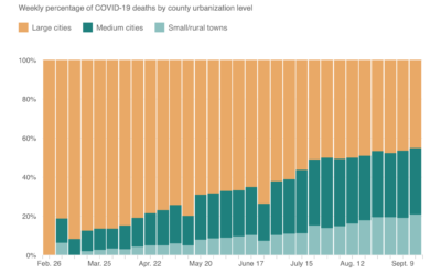
Shift of Covid-19 deaths to medium and small cities
When this all started, Covid-19 was impacting large cities at a much higher…
-
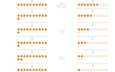
Wearing masks and infection rate
Studies suggest that wide adoption of masks can reduce the spread of the…
-

A comic on spotting misinformation
There’s a lot of misinformation passing through the internets right now. A lot.…
-
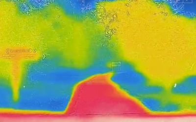
Why the city is hotter than the suburb
NPR used video from a thermographic camera to explain why cities tend to…
-
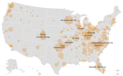
Practical tips for scraping data
It’s an unpleasant feeling when you have an idea for a project and…
-
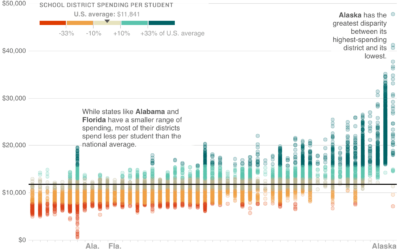
School district spending, against national average
Wrapping up their week-long School Money project, NPR asks: Is there a better…
-
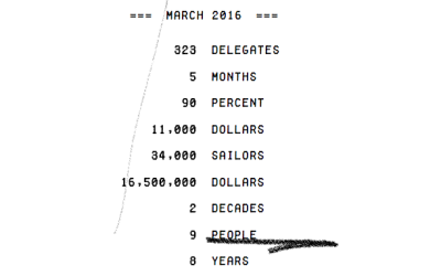
Counting the numbers in the news
Truth & Quantity by Gregor Hochmuth is what happens when you strip out…
-
Link
Do Visual Stories Make People Care? →
The NPR Visuals team tracked user activity on their visual stories to see how people read or didn’t.
-
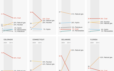
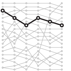
Power sources in each state
A clean and simple set of slope charts to show the change between 2000 and 2014.
-
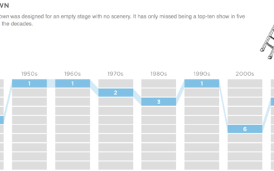
Top high school plays and musicals, by decade
Based on annual high school play and musical rankings from the magazine Dramatics,…
-
Link
mapturner →
“A command line utility for generating topojson from various data sources for fast maps.” Useful for use with D3.
-
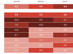
Disaster risk indices estimate impact on people
An earthquake with a magnitude of 7.8 can affect countries differently, depending on…
-

Growth of urban neighborhood Wal-Mart
Maybe you saw the Wal-Mart growth map I made a while back. NPR…
-
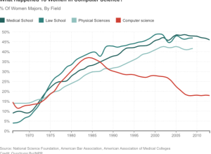
Decline of women in computer science
NPR spent some time on the subject of the decline of women in…
-
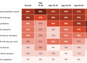
Polling for stress →
NPR, the Robert Wood Johnson Foundation and the Harvard School of Public Health…
-
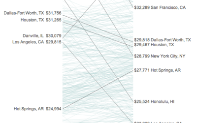
Your income versus what it feels like →
Incomes and the cost of living vary across the country. Some areas might…
-
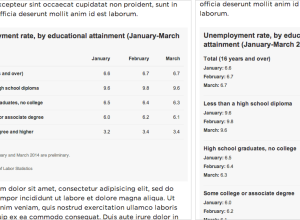
Responsive data tables
Alyson Hurt for NPR Visuals describes how they make responsive data tables for…
Recently for Members
Second Edition
 Visualize This: The FlowingData Guide to Design, Visualization, and Statistics (2nd Edition)
 Visualize This: The FlowingData Guide to Design, Visualization, and Statistics (2nd Edition)
New tools, refined process.
Browse by Chart Type See All →