A visual layer set on top of the video interview makes the feelings understandable.
New York Times
-

Making a hit song with Bieber, Diplo, and Skrillex
-

Same BMI, different body
The index needs an information supplement.
-

Possible float routes for Malaysia Airlines Flight 370
Malaysia Airlines Flight 370 went down a year ago, and with recently found…
-

How stolen data affects you
You typically hear about data breaches in terms of number of records that…
-

See a 150mph tennis serve to your face
Hawk-Eye is a collection of technologies that allows high-granularity sports tracking, most notably…
-

Earth time-lapse from 22,000 miles out
Japan has a new weather satellite in stationary orbit, Himawari-8, that takes a…
-

Journey to Pluto
The New Horizons spacecraft launched on January 19, 2006 and is set to…
-

U.S. women’s soccer gameplan
I know next to nothing about soccer. Like there’s nothing, and then I’m…
-

Refugee migration mapped globally
According to estimates recently released by the United Nations, about 14 million left…
-
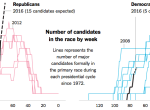
More presidential candidates please
“If it seems as if the list of presidential candidates for 2016 is…
-
Fashion trends seen through Google searches
Fashion trends, such as skinny jeans and Palazzo pants, can spike and fall…
-
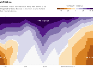
Married couple tax bonuses and penalties
Using calculations by Nick Kasprak from the Center on Budget and Policy Priorities…
-
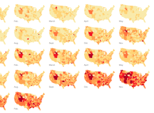
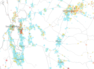
California water use per capita, by district
Matthew Bloch and Haeyoun Park for the New York Times mapped, for about…
-
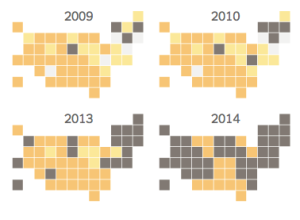
Gay marriage legalized by state
Changes in gay marriage rights had changed slowly over the years, but more…
-
Vaccination rates for every kindergarten in California →
The New York Times mapped the vaccination rate for every kindergarten in California.…
-
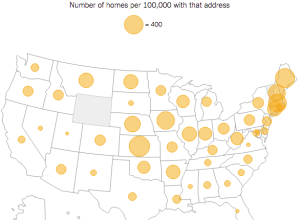
Your street name across the country
Here’s a fun searchable map from the New York Times. Enter a street’s…
-

Sexual insecurities found in Google search results
Seth Stephens-Davidowitz continues with his Google search data-related op-eds for the New York…
-
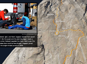
3-D model to show free-climb route
Tommy Caldwell and Kevin Jorgeson are free-climbing almost 3,000 feet up El Capitan,…
-
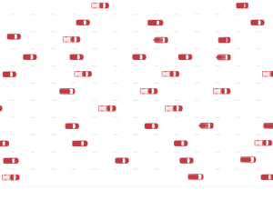
Auto recalls for the year set record
There were a lot of auto recalls — 62 million of them —…
-
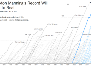
Touchdown passing record
Peyton Manning, quarterback for the Denver Broncos, passed up Brett Favre’s career record…
Recently for Members
Second Edition
 Visualize This: The FlowingData Guide to Design, Visualization, and Statistics (2nd Edition)
 Visualize This: The FlowingData Guide to Design, Visualization, and Statistics (2nd Edition)
New tools, refined process.
Browse by Chart Type See All →


